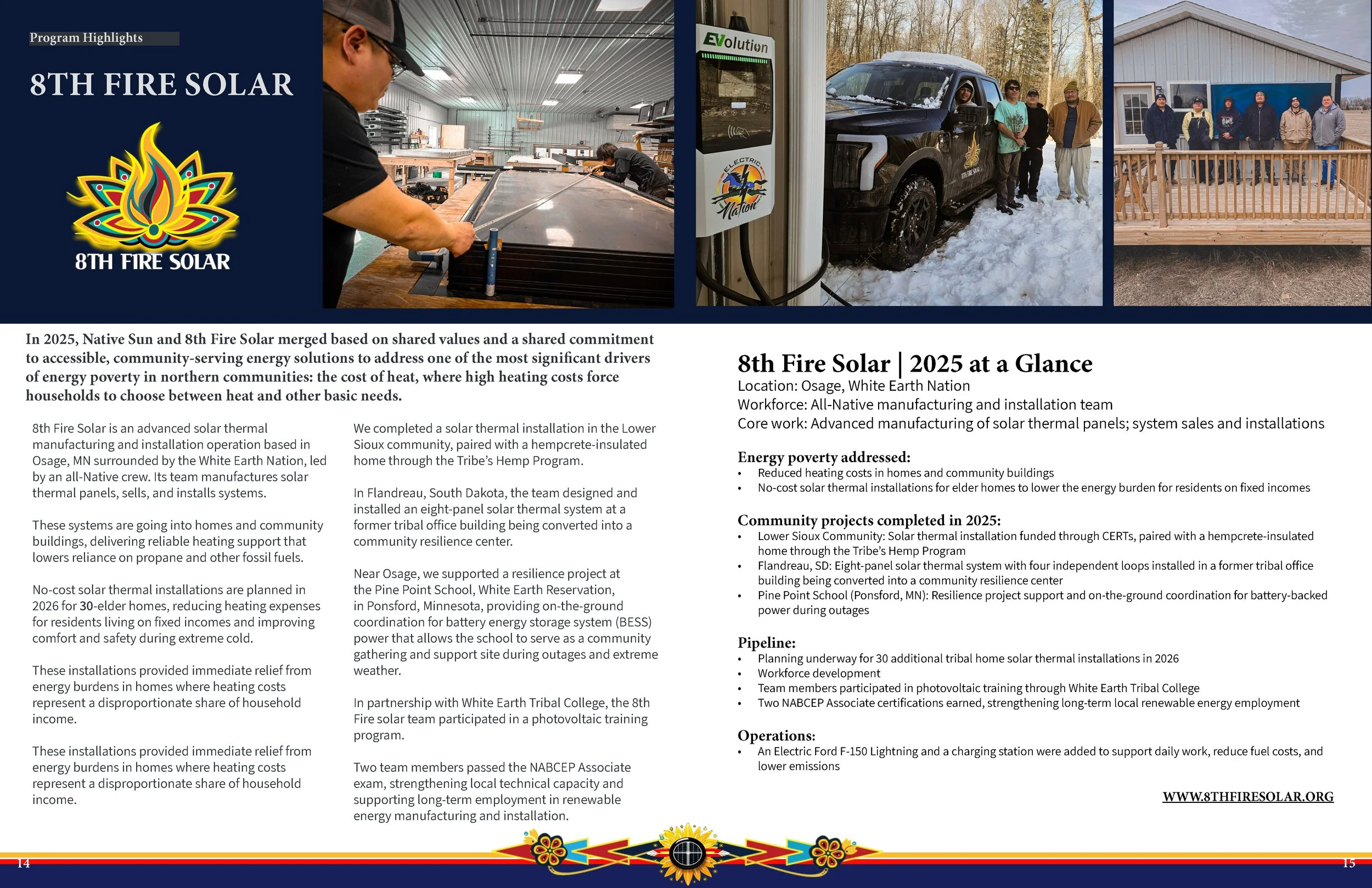
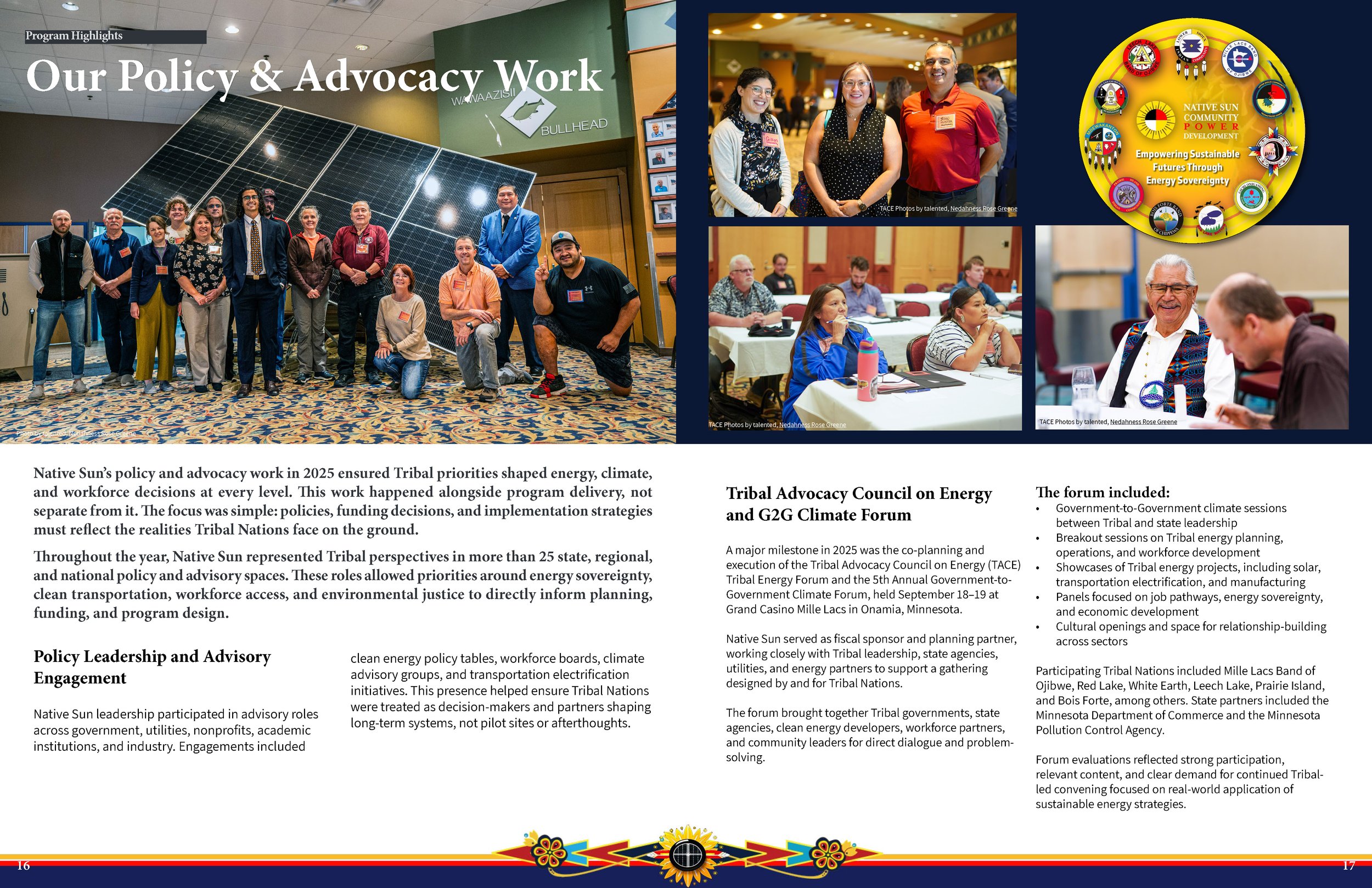
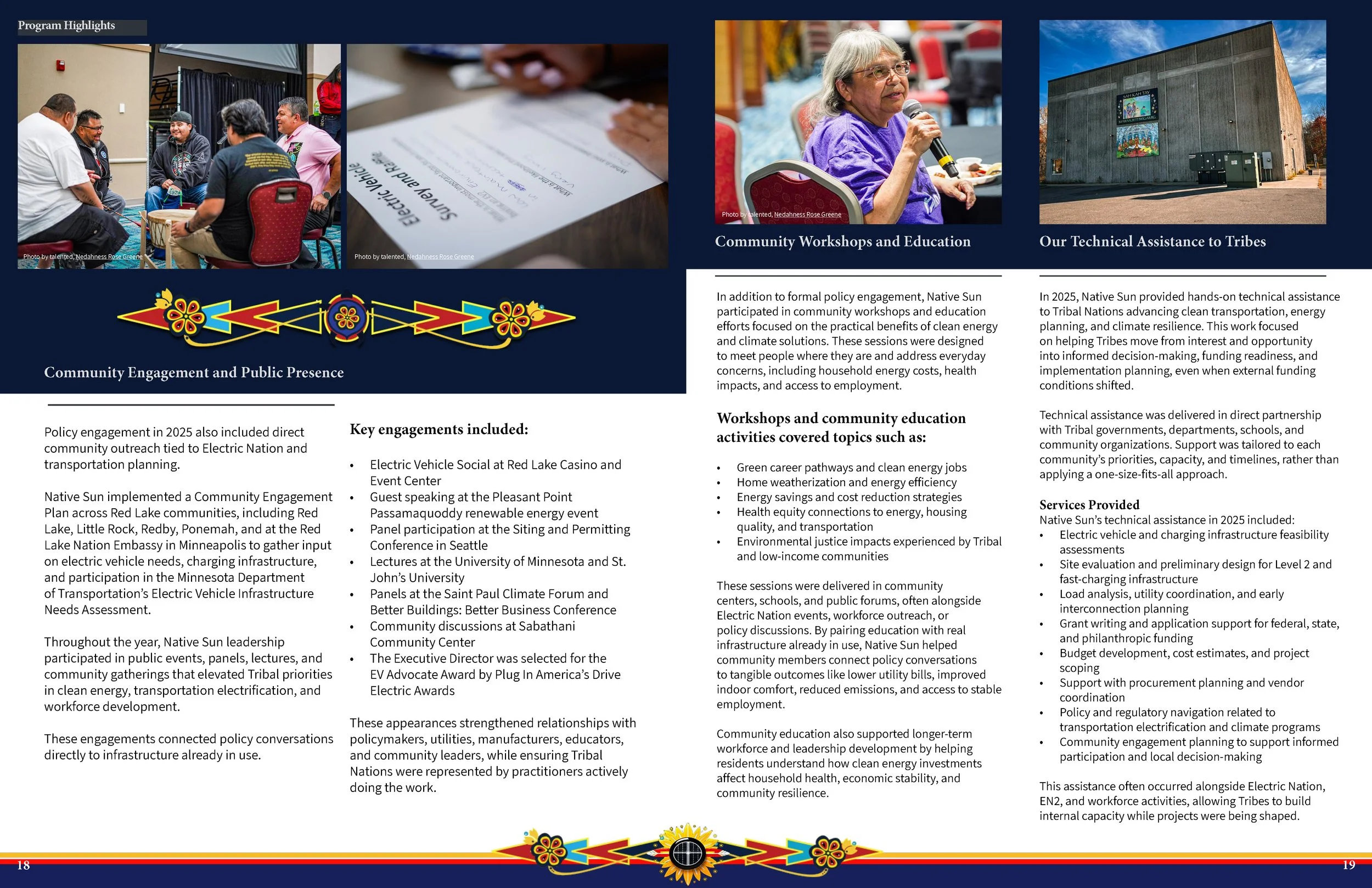
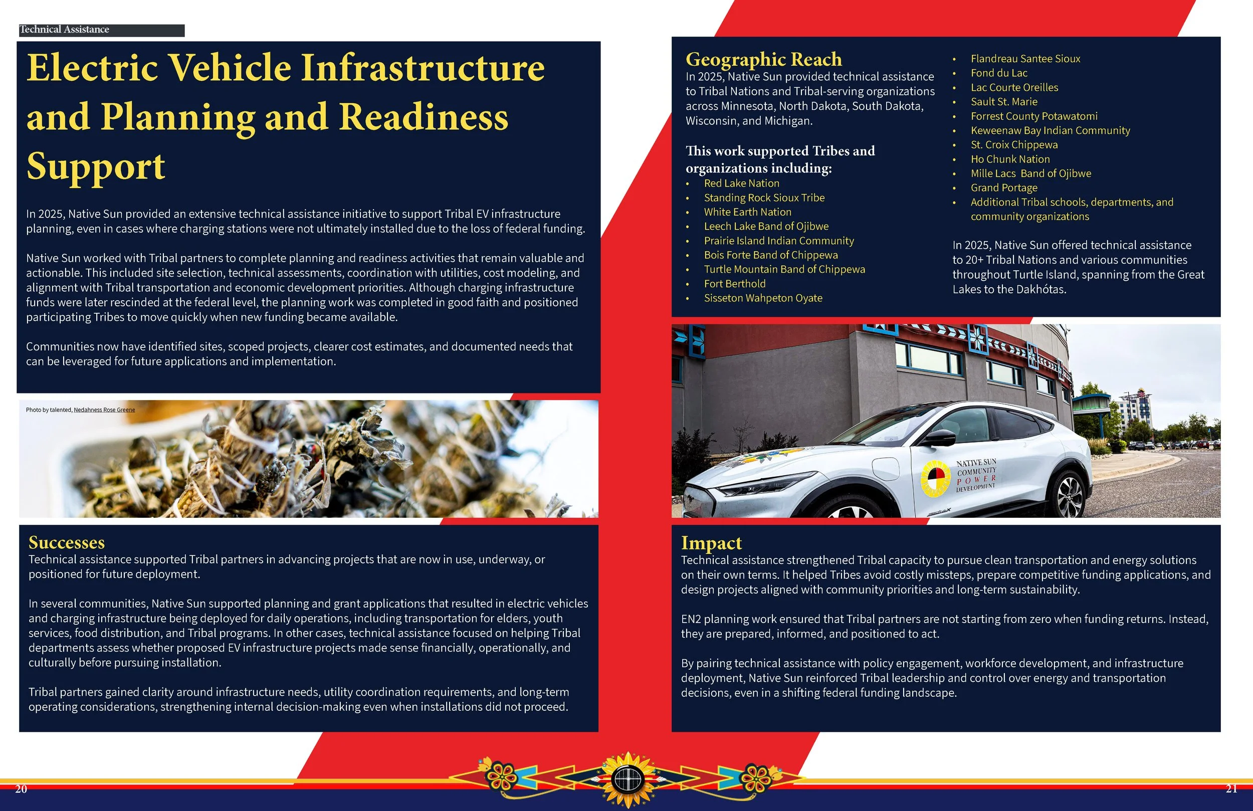
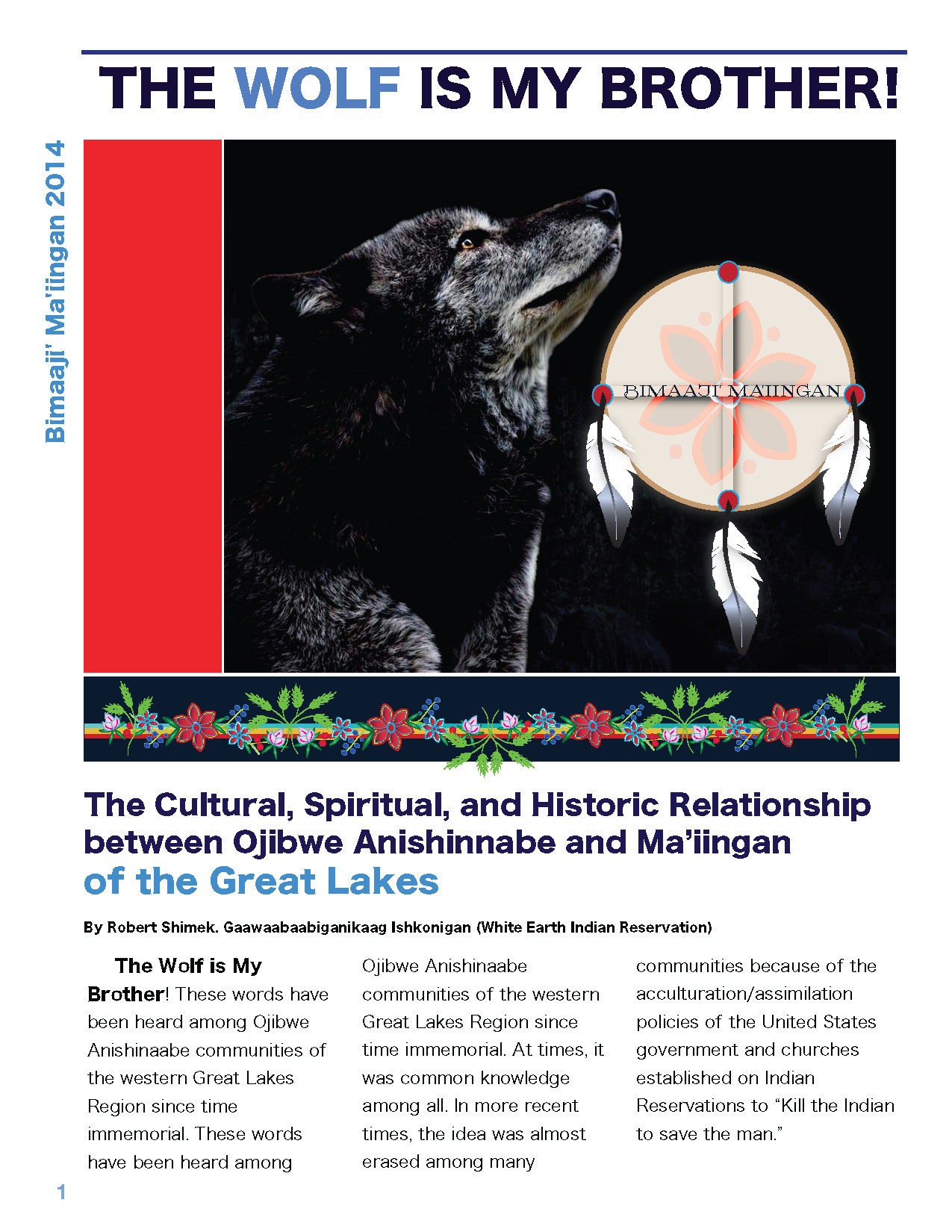
Recent Projects 2025 / 2026


Client
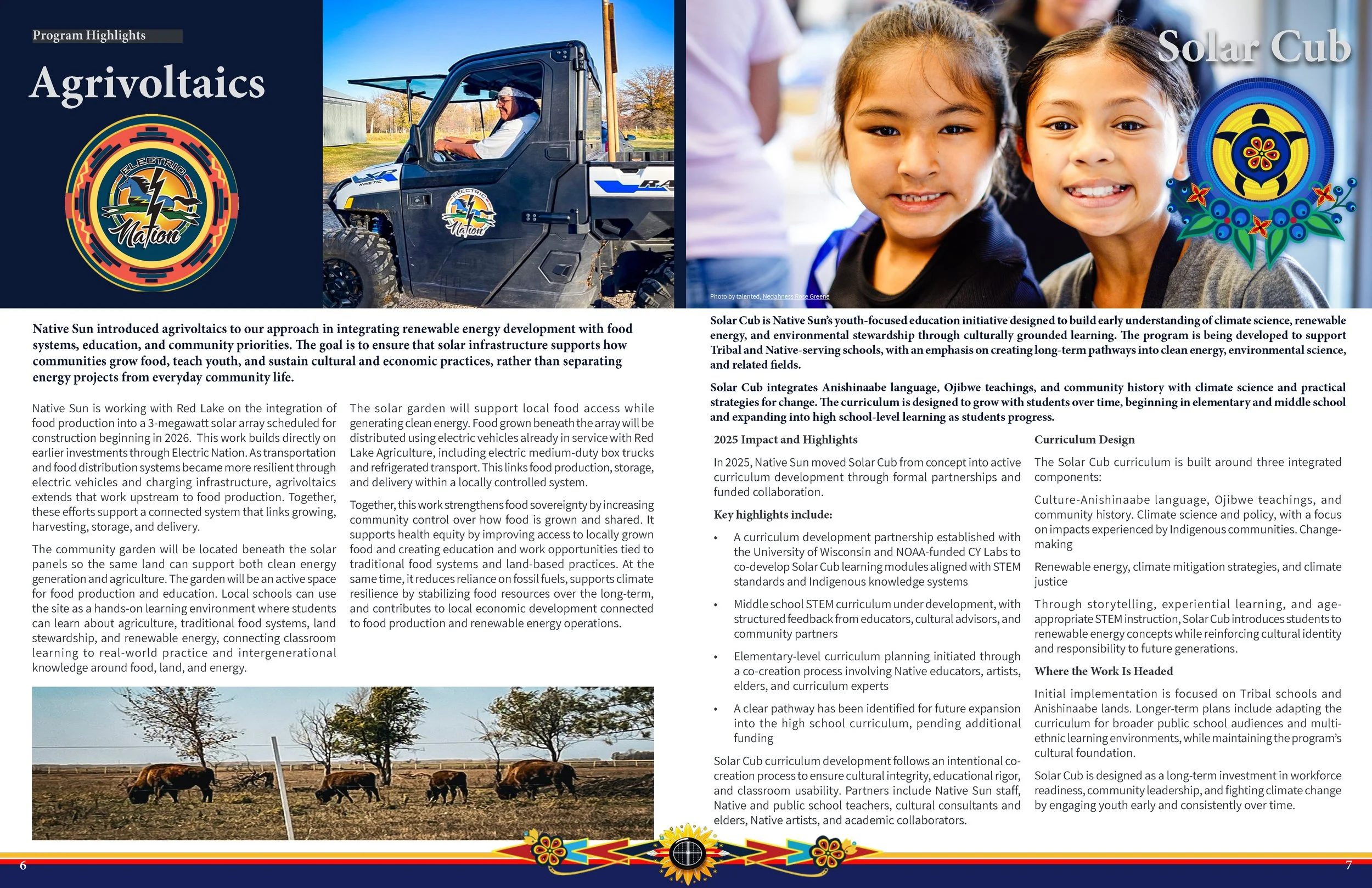
Mukwa Miikana
Stop Hyperscaled Data Centers Campaign with Legislative Advocacy. Logo, Branding, and Marketing Templates, May 2026
Design of an iconic logo and branding for the No Data Centers campaign.
Designed templates with the icon and branding for merchandise, campaign website, marketing printables, and social media templates.
Assisted in the curation of the brand positioning statement, taglines, slogans, and value propositions as part of our branding and design efforts. Copy editing and e-blast design for marketing campaign.
From the Aurora to the River: Illuminate the Path with Indigenous Insight.
In the Flow of Water and the Glow of the Aurora: Indigenous Wisdom Lights Our Way
.Information is a Relation, Not a Commodity.
Where Water Flows, Knowledge Grows: Indigenous Wisdom for a Resilient Future.
Tech Giants, We Say Enough: Protect Our Land, Water, and Future!
Data Over People? Not on Our Watch!
Build Community, Not Data Centers: Protect Our Future!
All my designs are crafted entirely by hand — no AI involved. Each piece is born from a focused creative process, blending photography, sketches, vector work, and illustration to achieve thoughtful, intentional results.
Website: www.mukwamiikana.org/nodatacenters
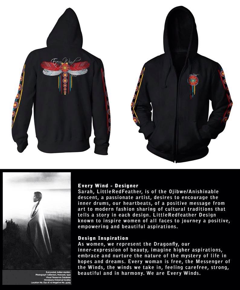
About the Artwork Designed by Sarah LittleRedfeather
Embracing Our Roots: A Design Inspired by Indigenous Wisdom
In contrast to the encroachment of invasive data centers and the dominance of big tech, our design emphasizes the vital essence of our cultural heritage and our intimate connection to the land. Each carefully chosen element intertwines stories and symbols, reminding us of our duty to honor and protect the natural world that nourishes us.
The heart of our design emanates from the Auroras—Waawaate with Ode'imin, or the heart berry, representing the core of our identity.
This branding captures the radiant spirit of the auroras—waawaate—that illuminate the night sky, serving as a symbol of the sacred light that guides us. The vibrant colors reflect the movement of water, evoking the rivers that support our communities, where life thrives, and knowledge flows. Every design decision pays homage to the harmony of nature, culture, and spirit, standing in stark contrast to the lifeless nature of mass data centers.
Key Symbols of Significance:
The lotus rises gracefully from the depths of the water, symbolizing purity and resilience. Just like the lotus, our communities rise above challenges, sharing our wisdom and strength with one another. This design serves as a beacon, radiating brightly like the auroras and reminding us of our collective journey. It underscores the importance of nurturing our shared values against the backdrop of impersonal technology-driven environments.
A Canvas of Community:
Our design invites participation and fosters dialogue, transcending mere aesthetics to represent our interconnectedness. The motifs reflect our lived experiences, the narratives of our ancestors, and the voices of our elders, urging us to draw on the past as we chart our future, while contrasting with the alienation often felt in tech-driven spaces.
An Invitation to Walk Together:
Through this design, we champion a vision rooted in respect for our heritage and optimism for the future. It calls on us to honor our relationships with the land, water, and each other. This design aims to inspire a movement toward collective action, encouraging us to protect our sacred spaces and ensure that future generations can flourish in harmony with nature, rather than within the confines of data centers.
Together, we journey forward, illuminated by the wisdom of our ancestors, lighting the way for those who follow. This is more than just a design—it is a celebration of our identity, a commitment to sustaining our culture, and an open invitation for all to join in safeguarding the sacred connections that unite us. Let our stories shine brightly through this design, inspiring hearts and minds as we walk this path together.


Client
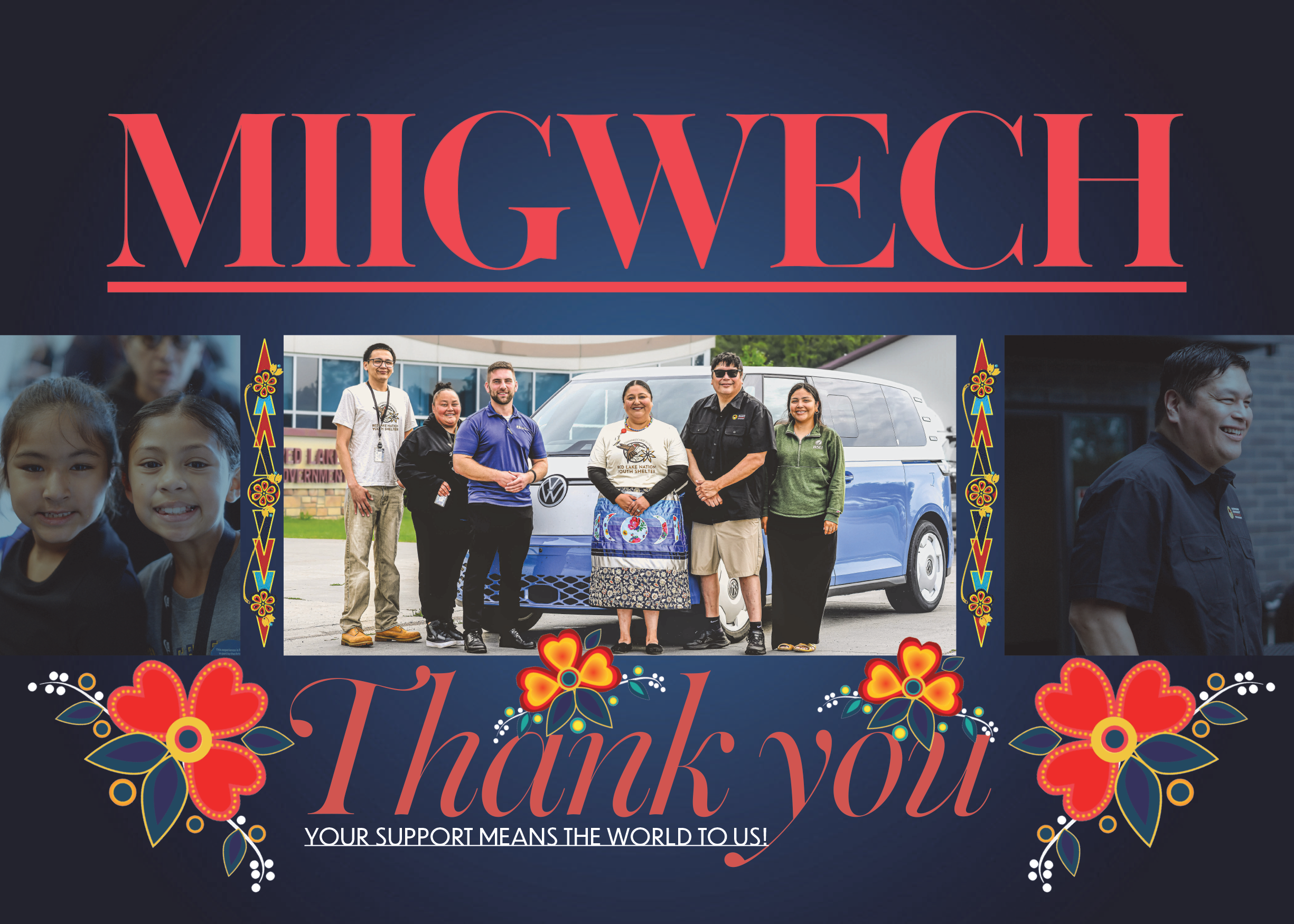
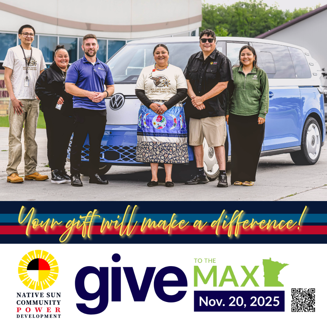
Native Sun Community Power Development
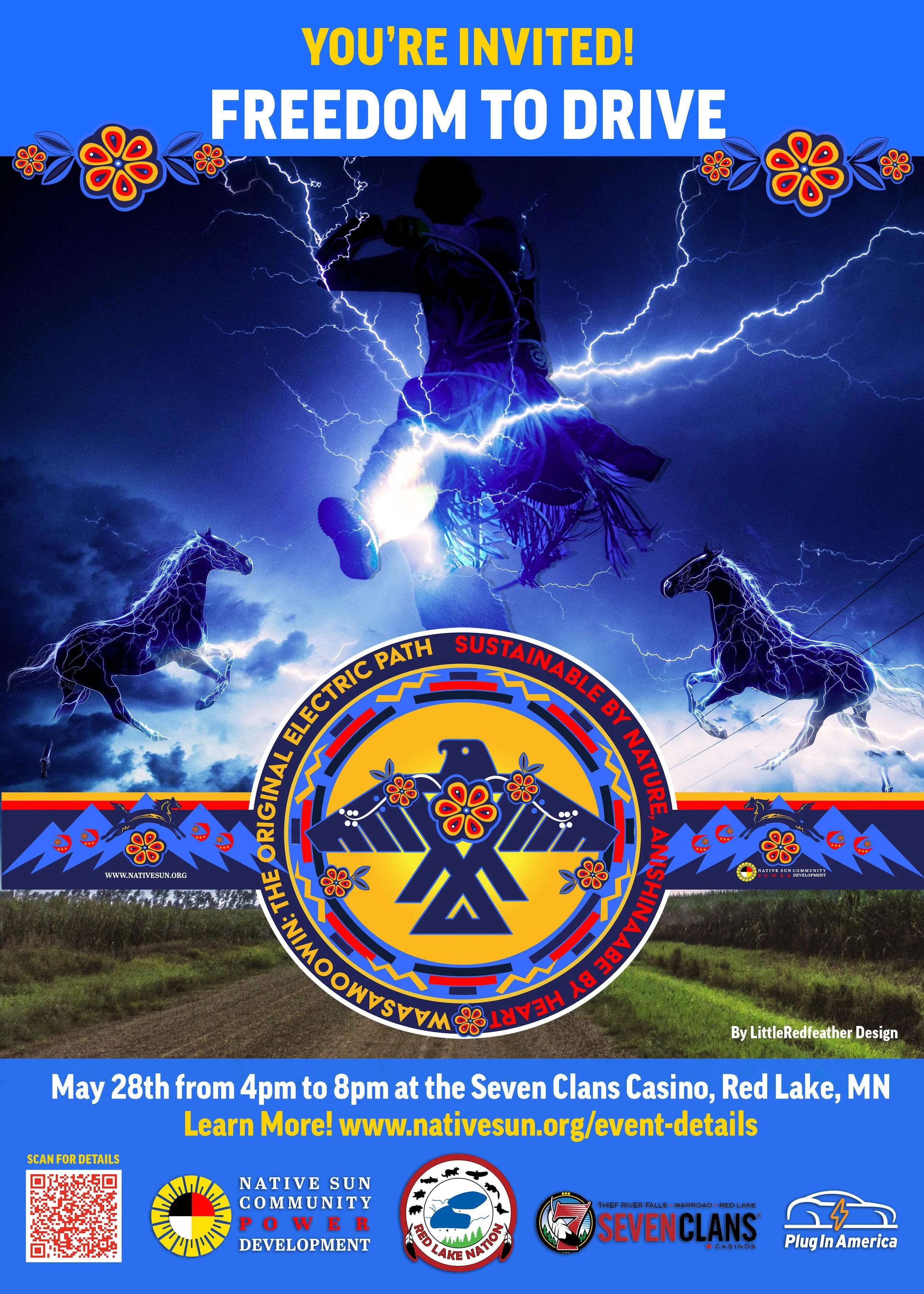
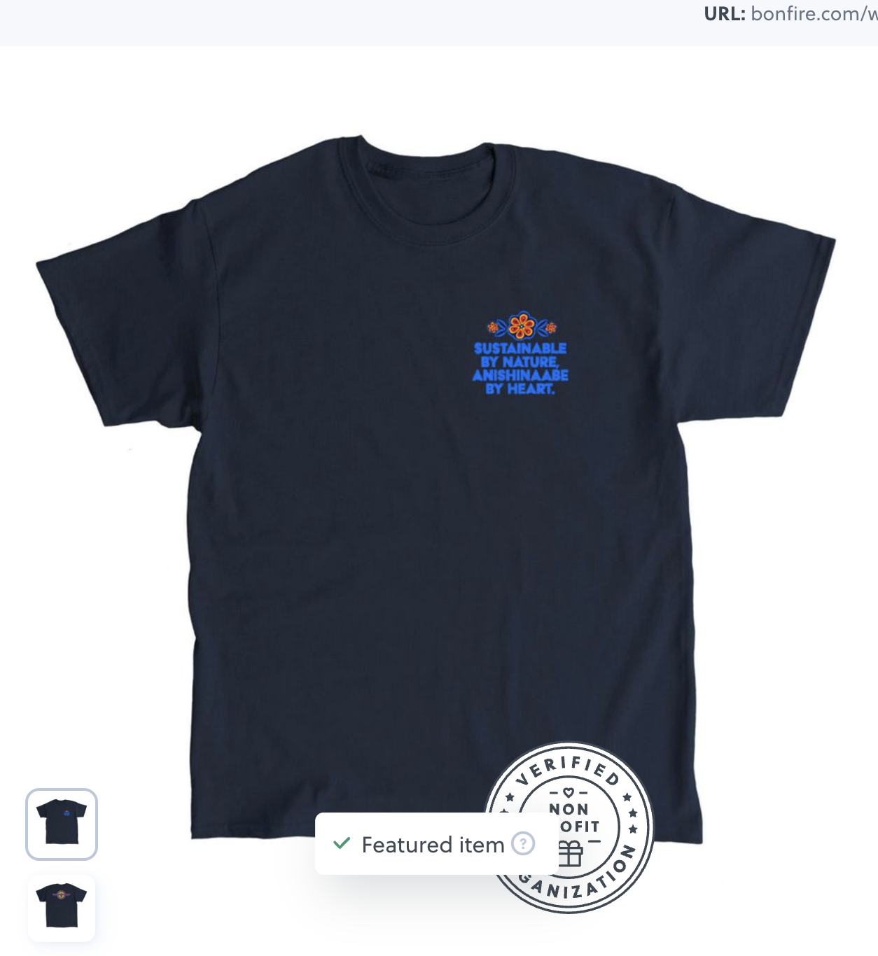
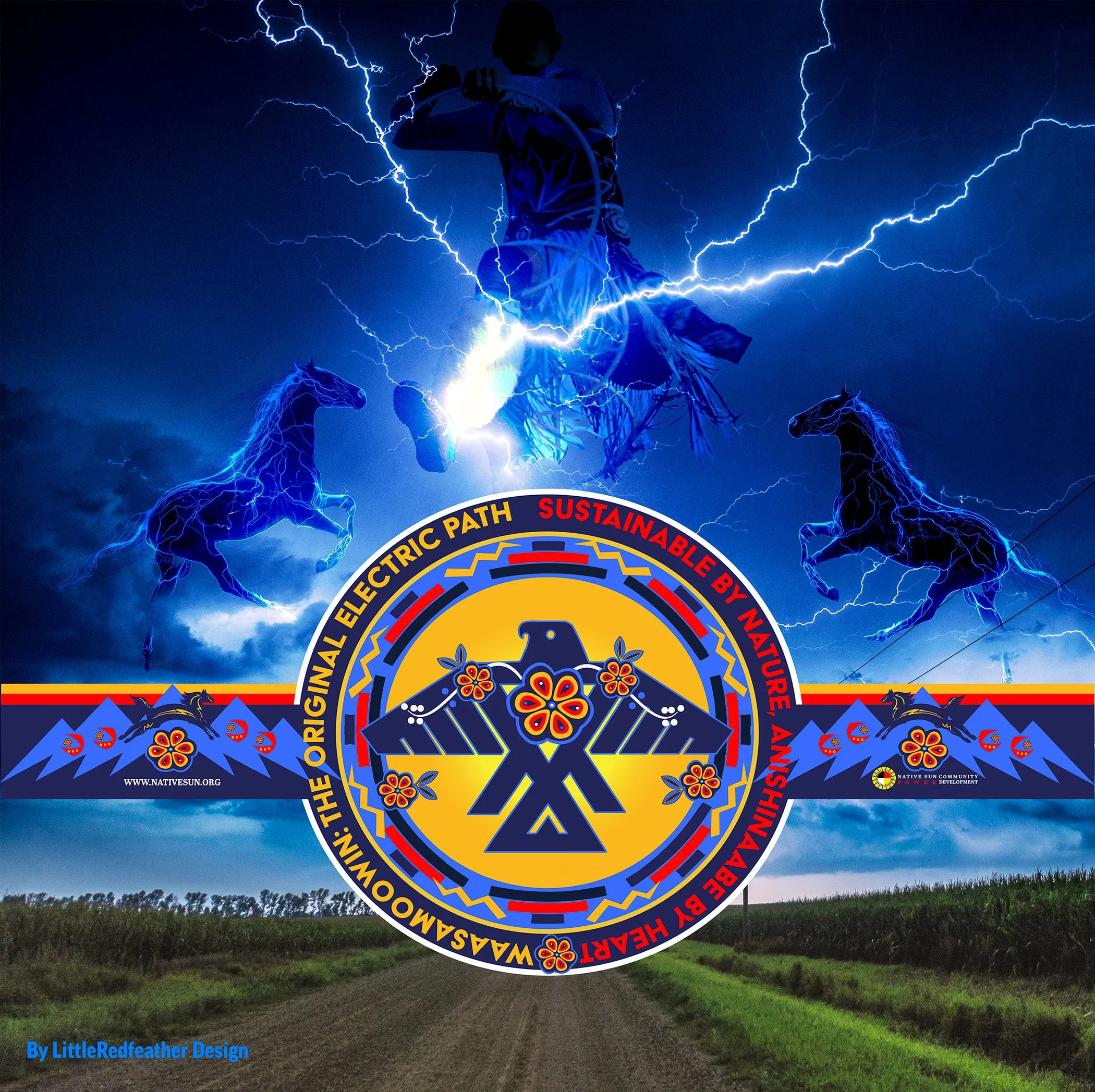
Freedom to Drive Logo, Branding, Merchandise and Marketing Templates, April 2026
"From Spirit Horse to Electric Force: Honoring the Seven Generations."
Details Coming Shortly
All my designs are crafted entirely by hand — no AI involved. Each piece is born from a focused creative process, blending photography, sketches, vector work, and illustration to achieve thoughtful, intentional results.
Website: www.nativesun.org | See the Press Release and Event Page.
About the Artwork Designed by Sarah LittleRedfeather
The design inspiration centers around Waasamoowin, the Thunderbird, symbolizing powerful transformation and energy. By embracing the idea of the "Original Electric Path," we seek to blend traditional Anishinaabe values with contemporary sustainable practices.
This design reflects the harmony between nature and technology, showcasing the Thunderbird as a guiding figure toward sustainable innovation. The phrase "Sustainable by Nature, Anishinaabe by Heart" highlights a deep respect for the environment while honoring the rich cultural heritage of the Anishinaabe people.
The guiding concept, "From Spirit Horse to Electric Force: Honoring the Seven Generations," emphasizes a commitment to sustainability and foresight. It illustrates a journey from the natural world, represented by the Spirit Horse, to a future powered by renewable energy, emphasizing the importance of making decisions today that benefit generations to come.
Ultimately, this design captures a fusion of cultural storytelling and environmental stewardship, creating a visual narrative that celebrates both tradition and innovation.


Client
Native Sun Community Power Development
MN Tribal Advocacy Council On Energy Logo, Branding, and Marketing Templates, April 2026
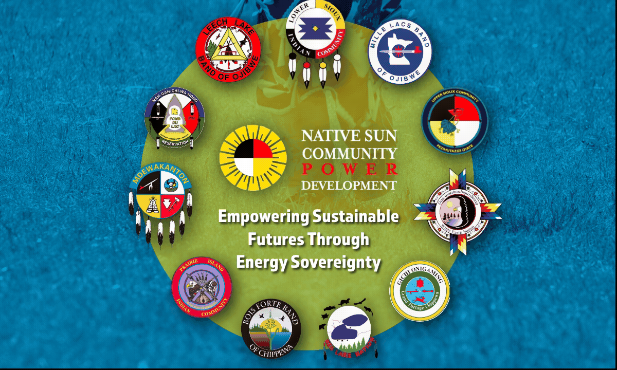
Empowering Sustainable Futures Through Energy Sovereignty
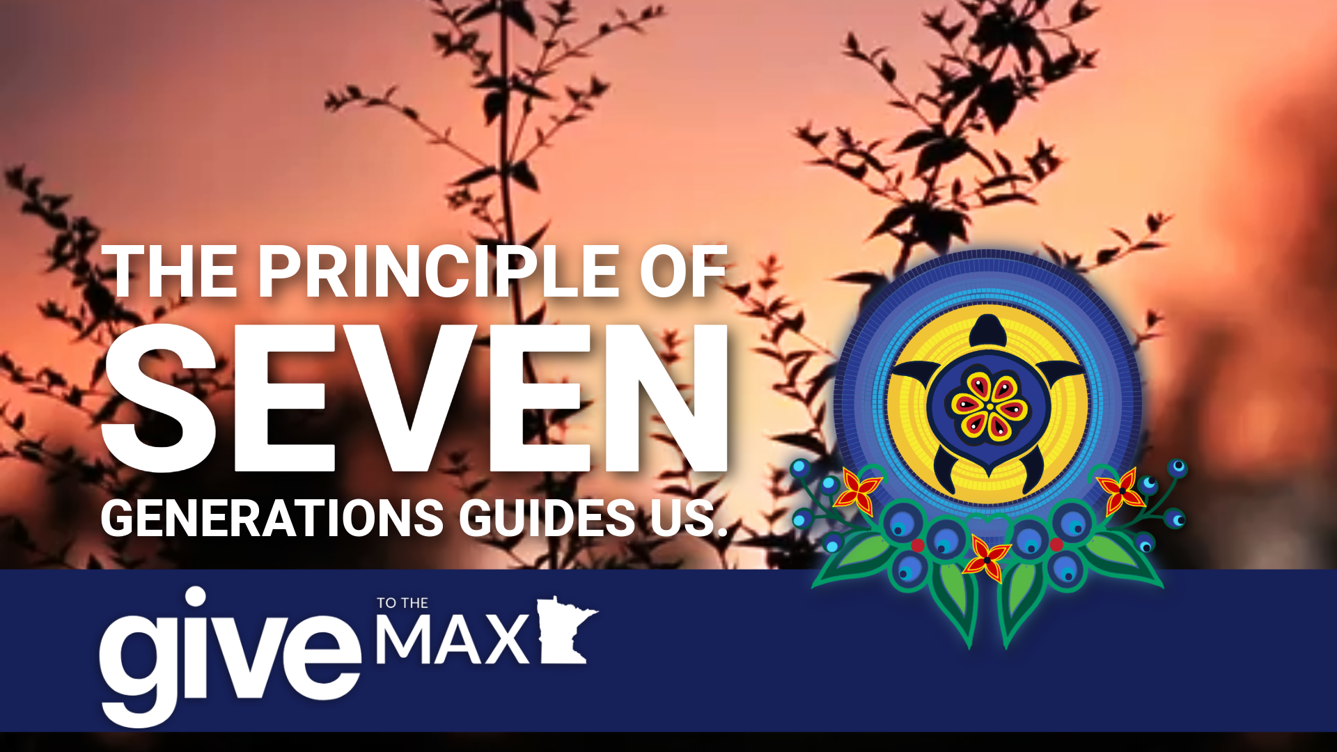
“Sovereign Energy for the Next Seven Generations.”
Details Coming Shortly
All my designs are crafted entirely by hand — no AI involved. Each piece is born from a focused creative process, blending photography, sketches, vector work, and illustration to achieve thoughtful, intentional results.
Website: www.nativesun.org

About the Artwork Designed by Sarah LittleRedfeather
This design inspiration draws deeply from Anishinaabeg and Dakhóta traditions, highlighting the power of unity, relationships, and our connection to land and community. Through a celebration of cultural heritage and strong community ties, we prioritize the well-being of all. By honoring local ecology and diverse teachings, we embody these identities with meaningful materials and practices. Ceremonies encourage community involvement and leadership, guiding our design journey. The hand drum serves as a powerful symbol of unity and the interconnectedness of nations. This vision was to enhance social, cultural, and ecological health, nurturing a legacy of shared responsibility.
This approach transforms design into a collaborative partnership, creating sustainable spaces and enriching experiences.


Client
Native Sun Community Power Development
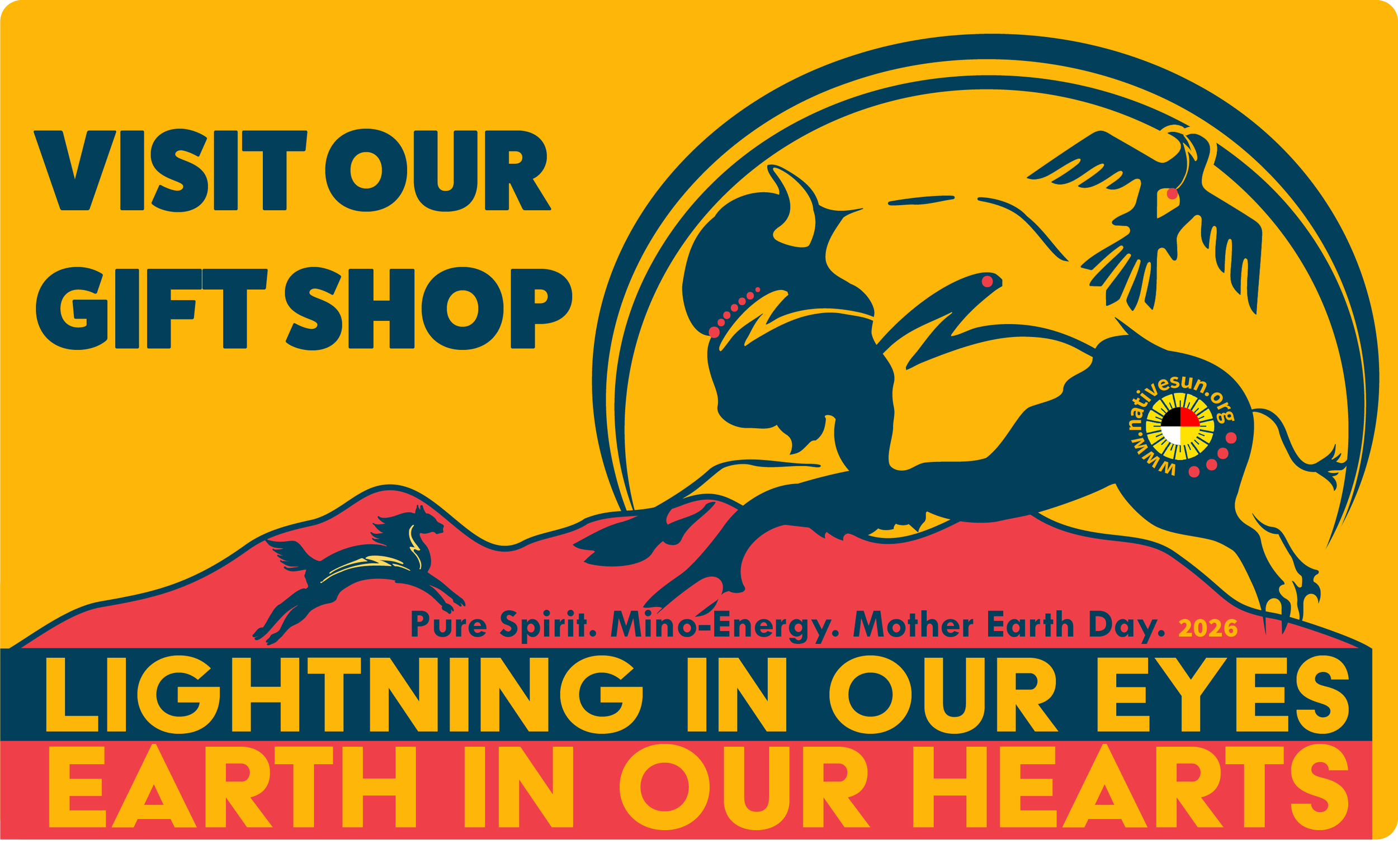
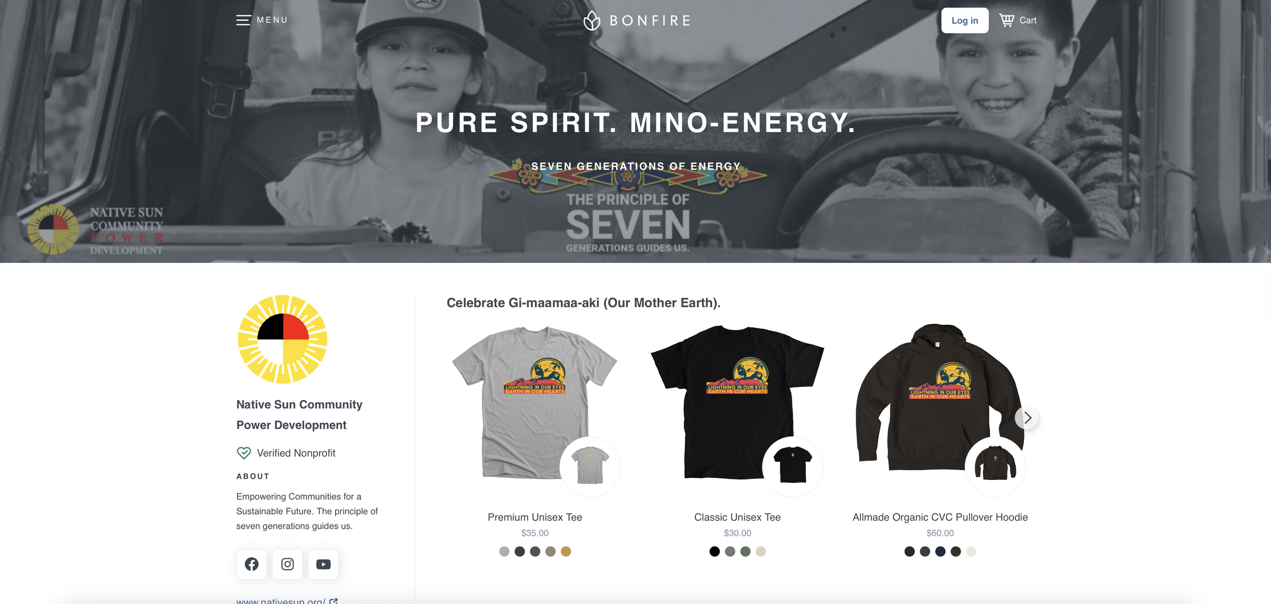
Mother Earth Day, Logo, Branding, Merchandise, Marketing Templates, and Website set up, April 2026
Details Coming Shortly
All my designs are crafted entirely by hand — no AI involved. Each piece is born from a focused creative process, blending photography, sketches, vector work, and illustration to achieve thoughtful, intentional results.
About the Artwork Designed by Sarah LittleRedfeather
Lightning in Our Eyes ... Earth in Our Hearts.
Native Sun Community Power Development is excited to introduce our "Honoring Gi-maamaa-aki (Our Mother Earth)" campaign, which is closely connected to our initiative.
This new collection celebrates our deep relationship with Mother Earth and all our relatives from the earth and sky, while also raising awareness about our commitment to sustainability and environmental responsibility.
Our merchandise will showcase vibrant designs inspired by the beauty of nature and our diverse ecosystems, capturing the spirit of mino-energy (good). Each item will remind us of our moral and cultural responsibility to protect our Mother Earth. From reusable bags to eco-friendly apparel, we make it easy for individuals and communities to adopt sustainable practices in everyday life.
As part of this campaign, we'll reinvest a portion of the proceeds into our community environmental programs, showing our commitment to preserving our world. We invite everyone to wear, share, and promote these designs as symbols of our collective responsibility towards Mother Earth.
With the theme "Lightning in Our Eyes ... Earth in Our Hearts," we embody the essence of pure energy and our connection to the planet. Join us in this important effort! Together, we can spread the message of love and respect for our earth, paving the way for a bright and green future for generations to come. Keep an eye out for the launch of our merchandise, and let’s make a positive impact together!
About the Artwork Designed by Sarah LittleRedfeather
"The artwork beautifully conveys the strong connections between the Horse and Mashkode-bizhiki (buffalo) nations. At its heart lies a sacred buffalo, depicted in rich Earth blue tones, symbolizing strength and resilience.
Surrounding this central figure, horses gallop with flowing manes, accompanied by the crackling of lightning, reflecting the deep bond between our communities and Mother Earth. Above, Migiziwag (eagles) soar against a vibrant backdrop, signifying protection and our spiritual ties.
The Giizis (moon) and the sun shine in warm hues, representing the balance and cycles of life. The dynamic energy of lightning, a symbol of the Animikii (Thunderbirds), highlights the profound connection to the sky world. Mother Earth is illustrated as a thriving ecosystem, igniting hope and reminding us of our responsibility to care for the environment.
This artwork celebrates our culture's vital role in honoring Mother Earth and emphasizes the importance of sustainable practices and community efforts, ensuring that our legacy endures for future generations." - Sarah LittleRedfeather
Client
White Earth Tribal Community College
Graphic Design and Anishinaabeg Cultural Illustration.
Website: www.wetcc.edu
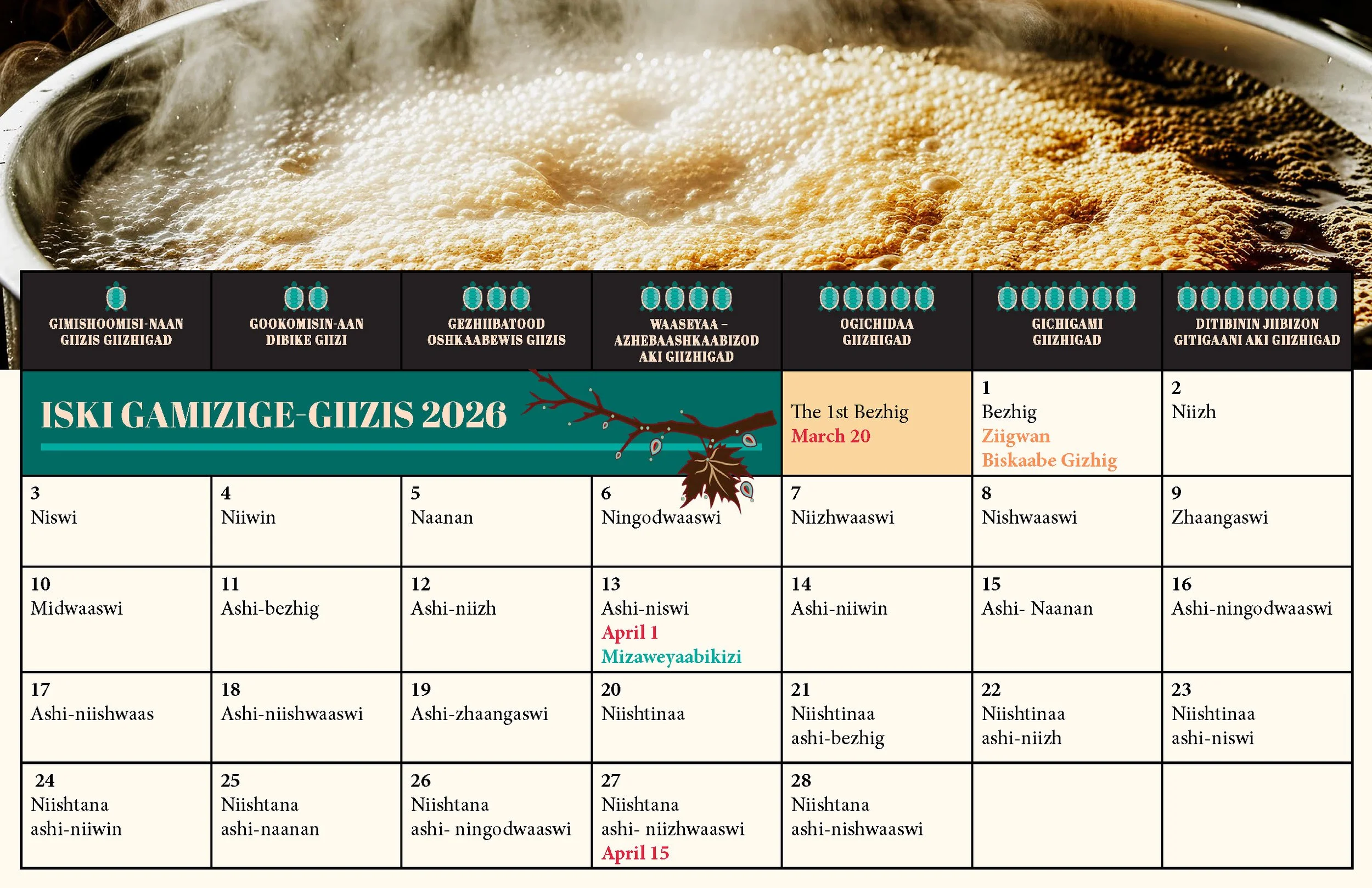
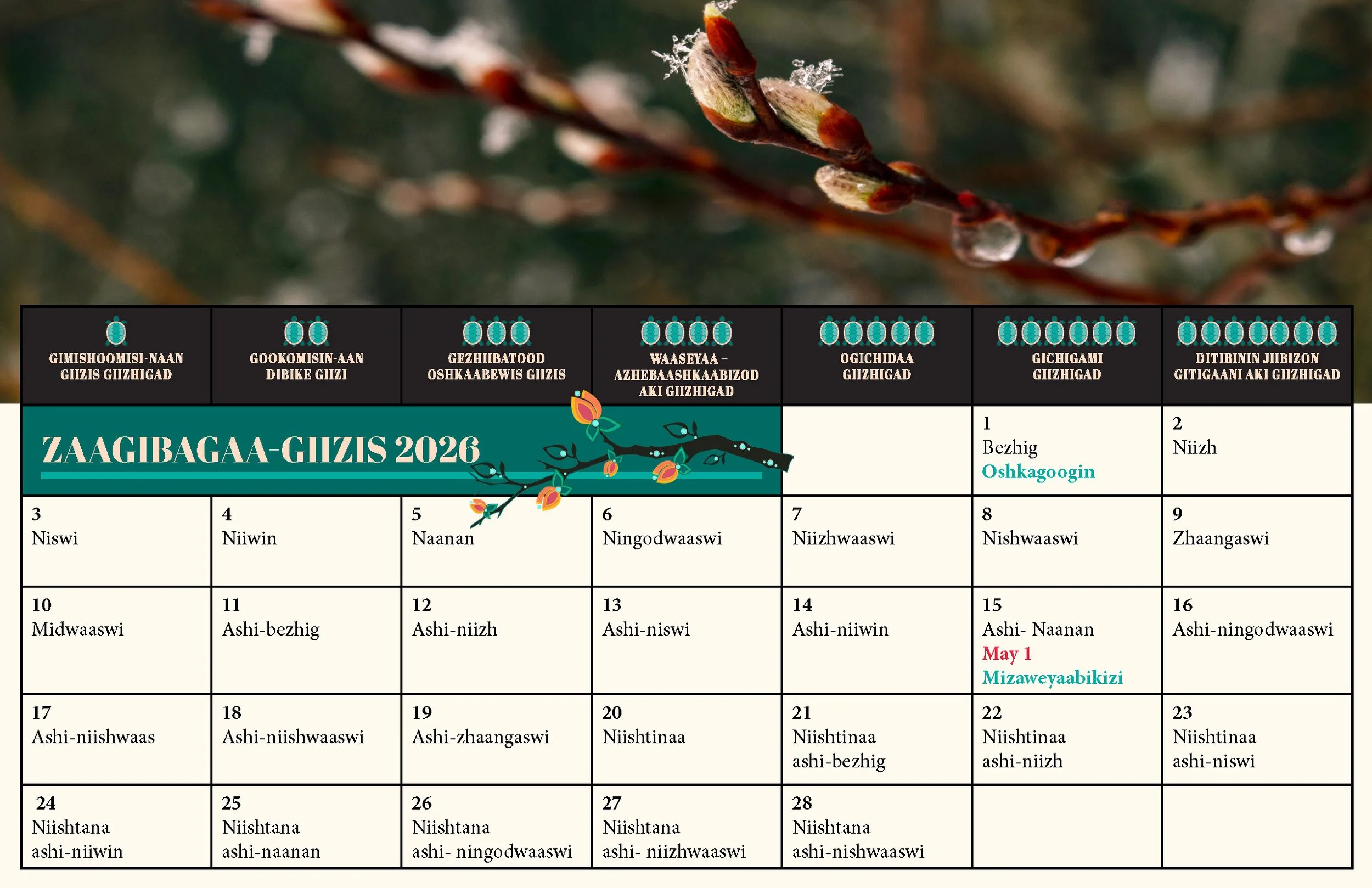
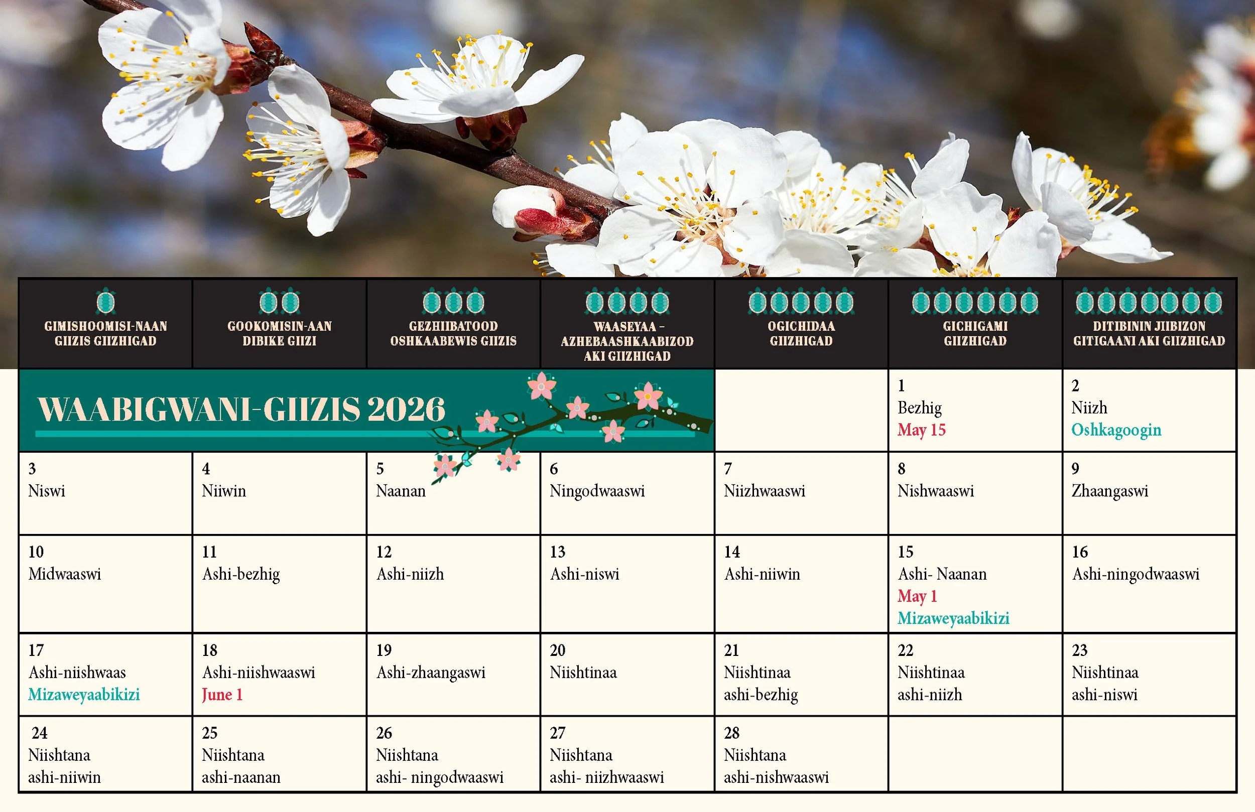
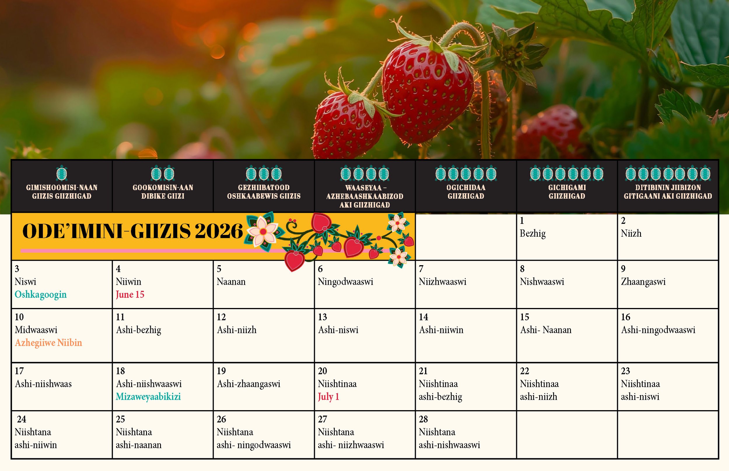
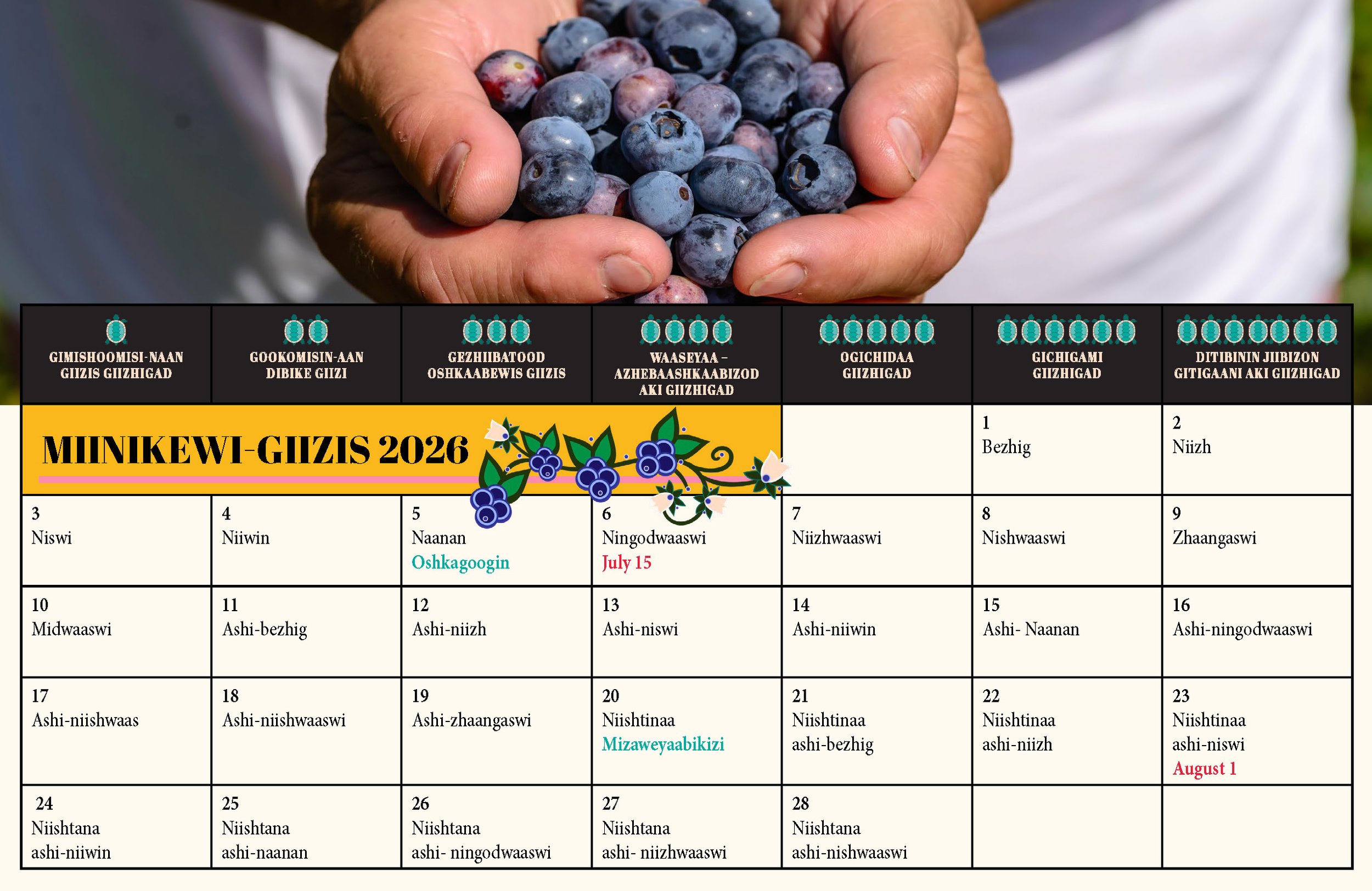
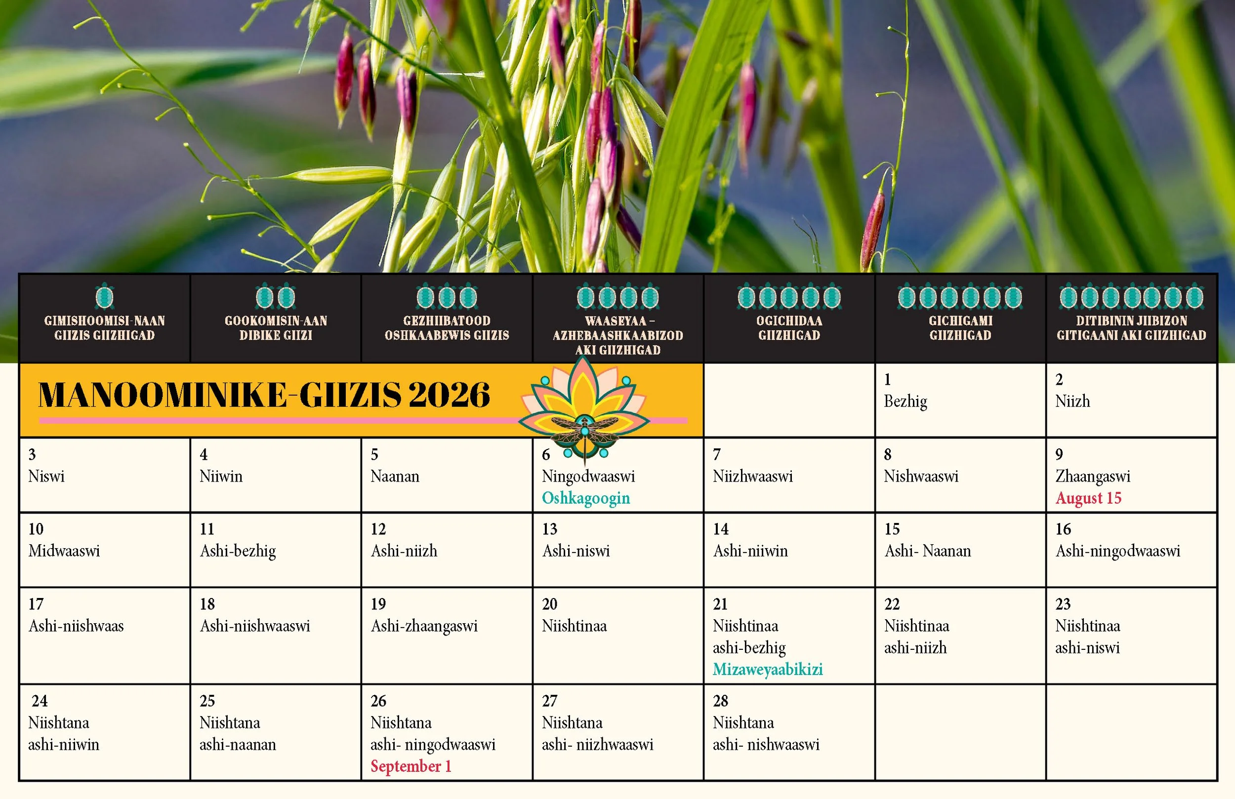
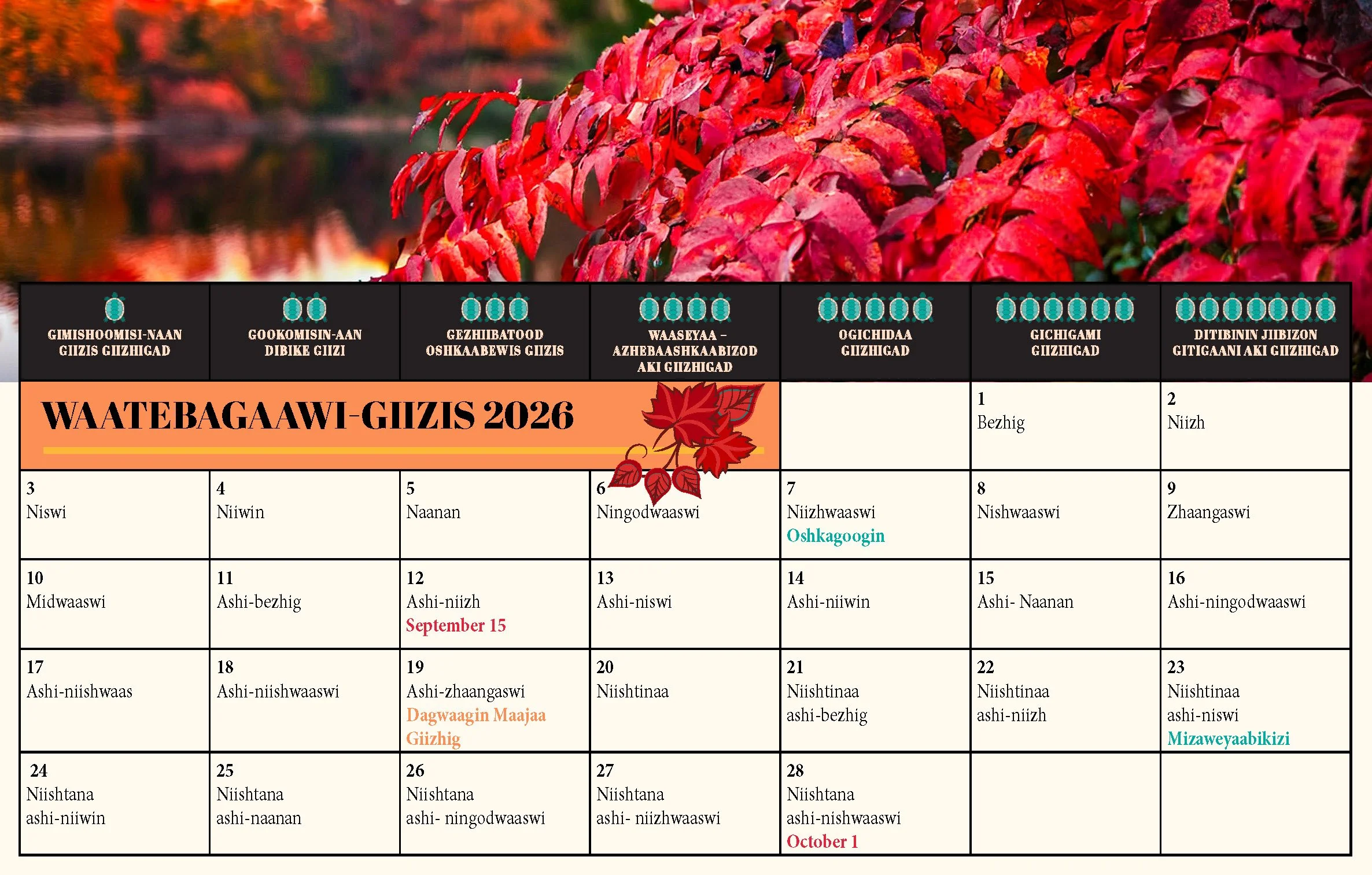
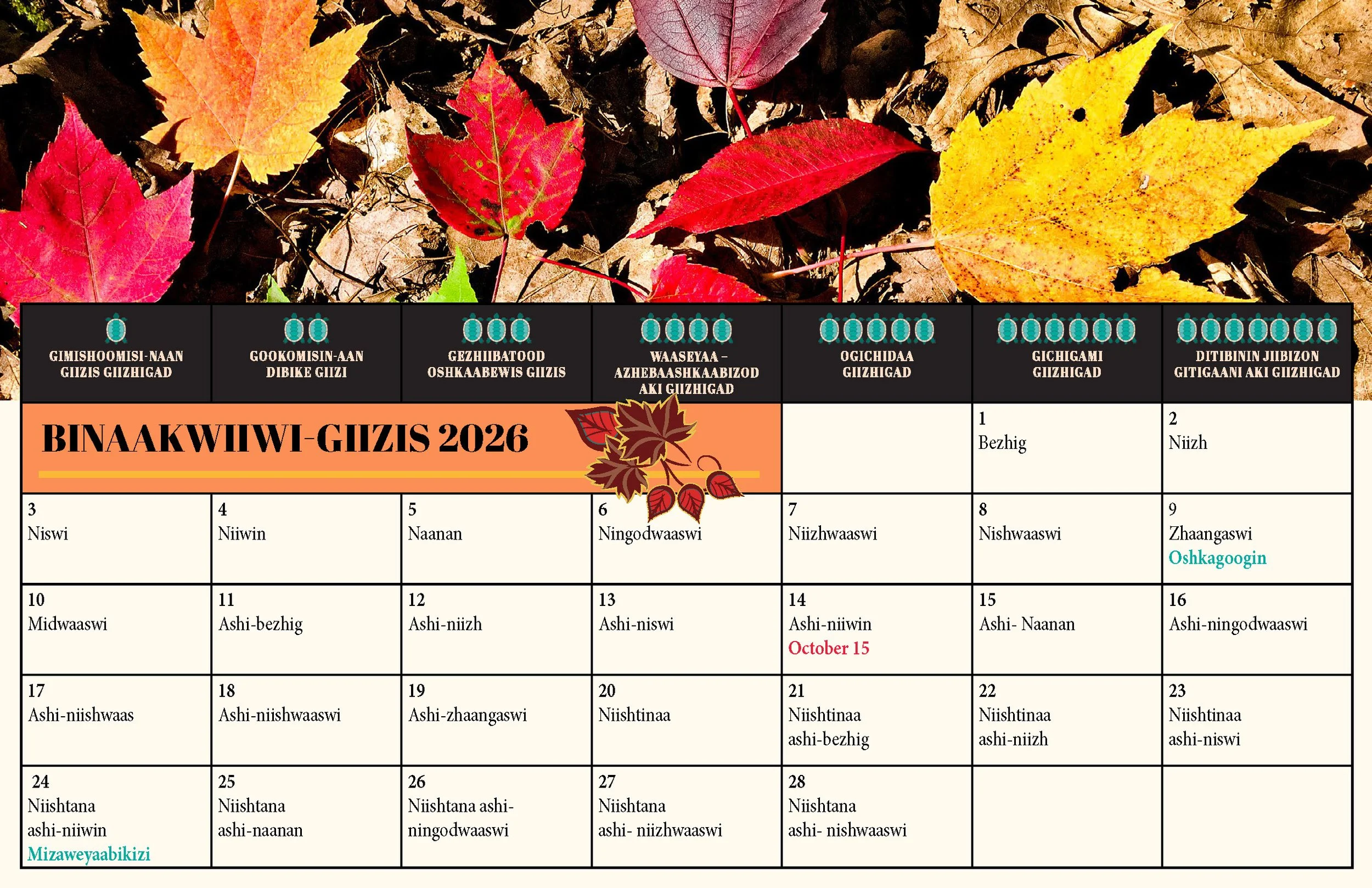
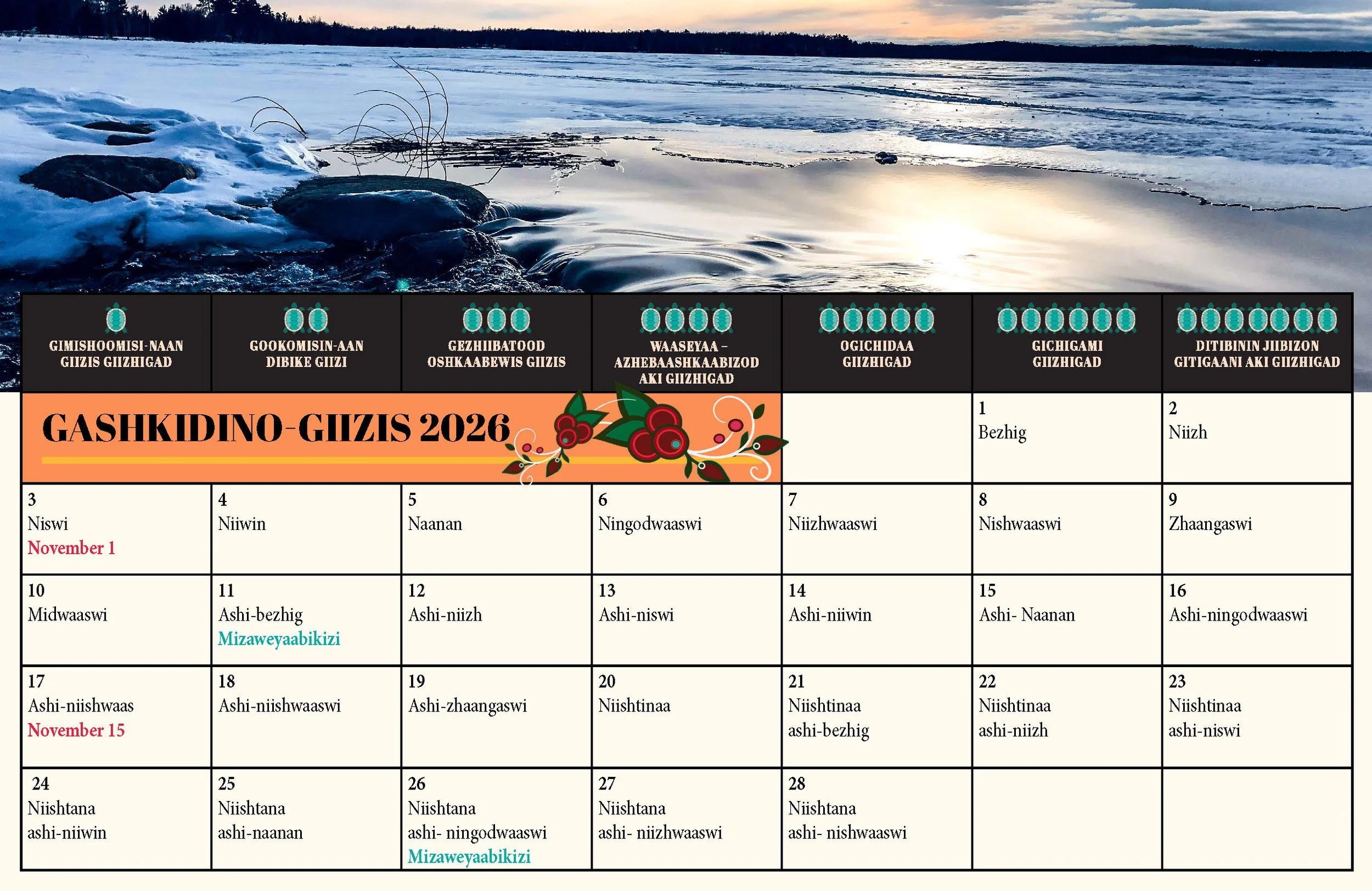
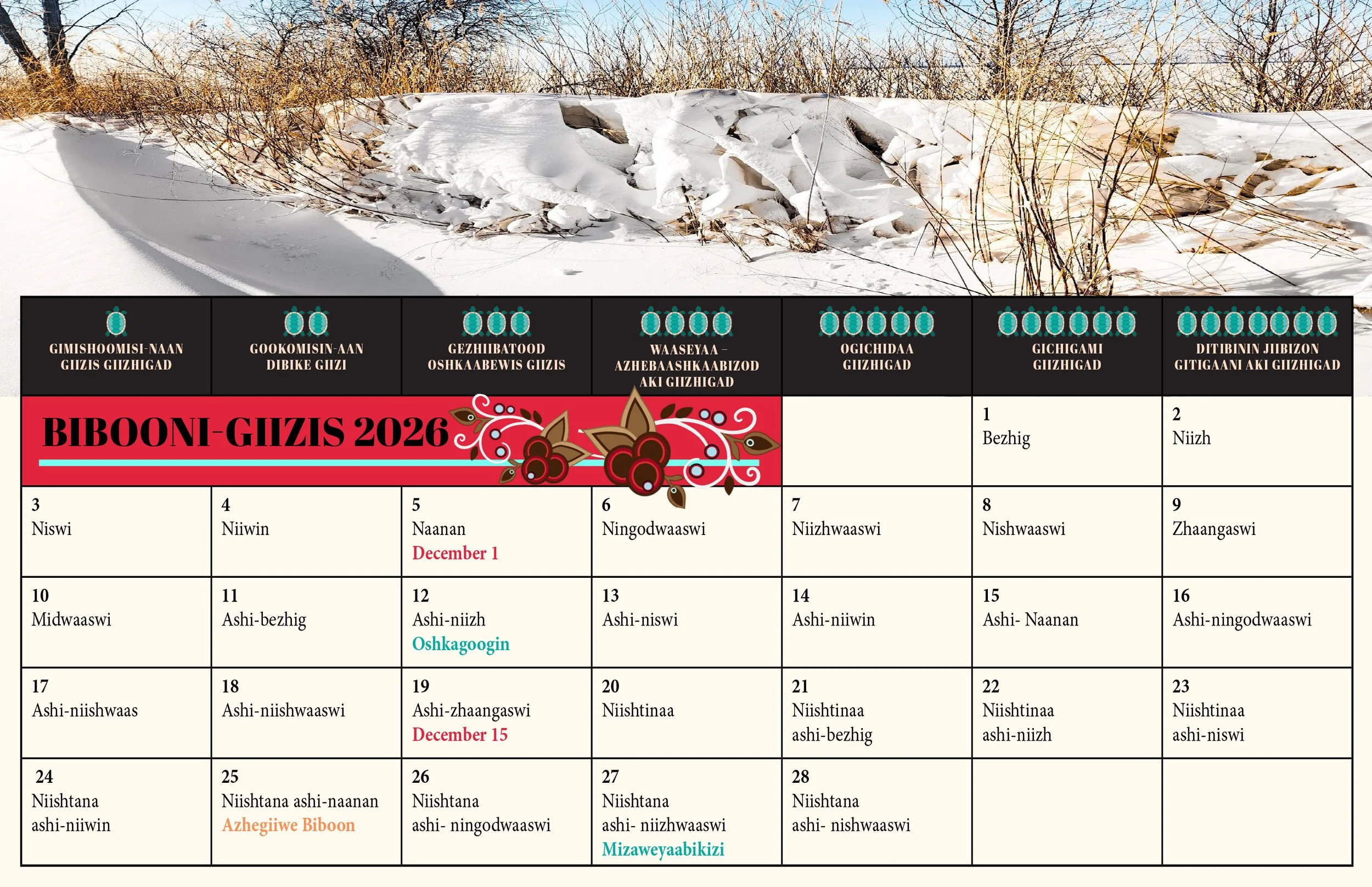
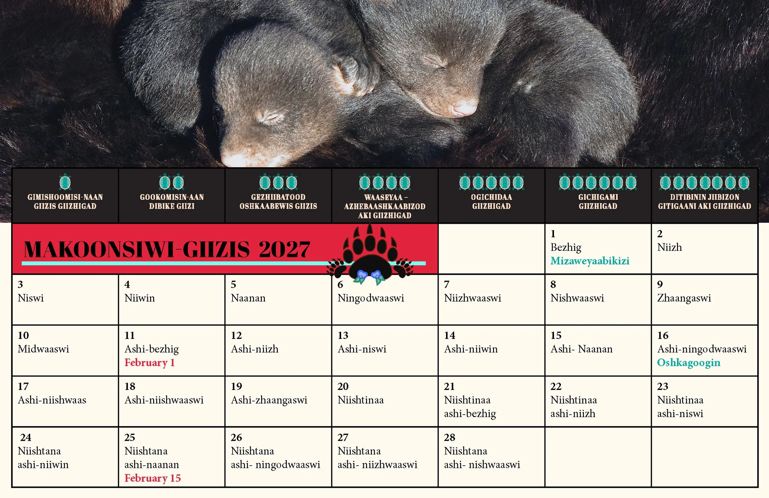
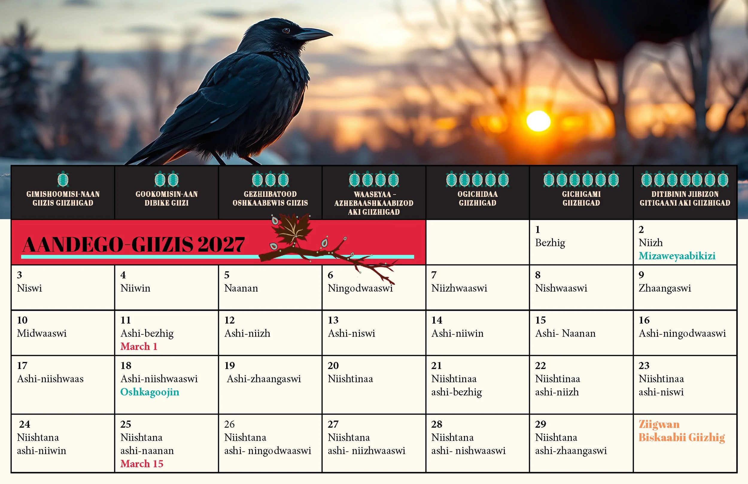
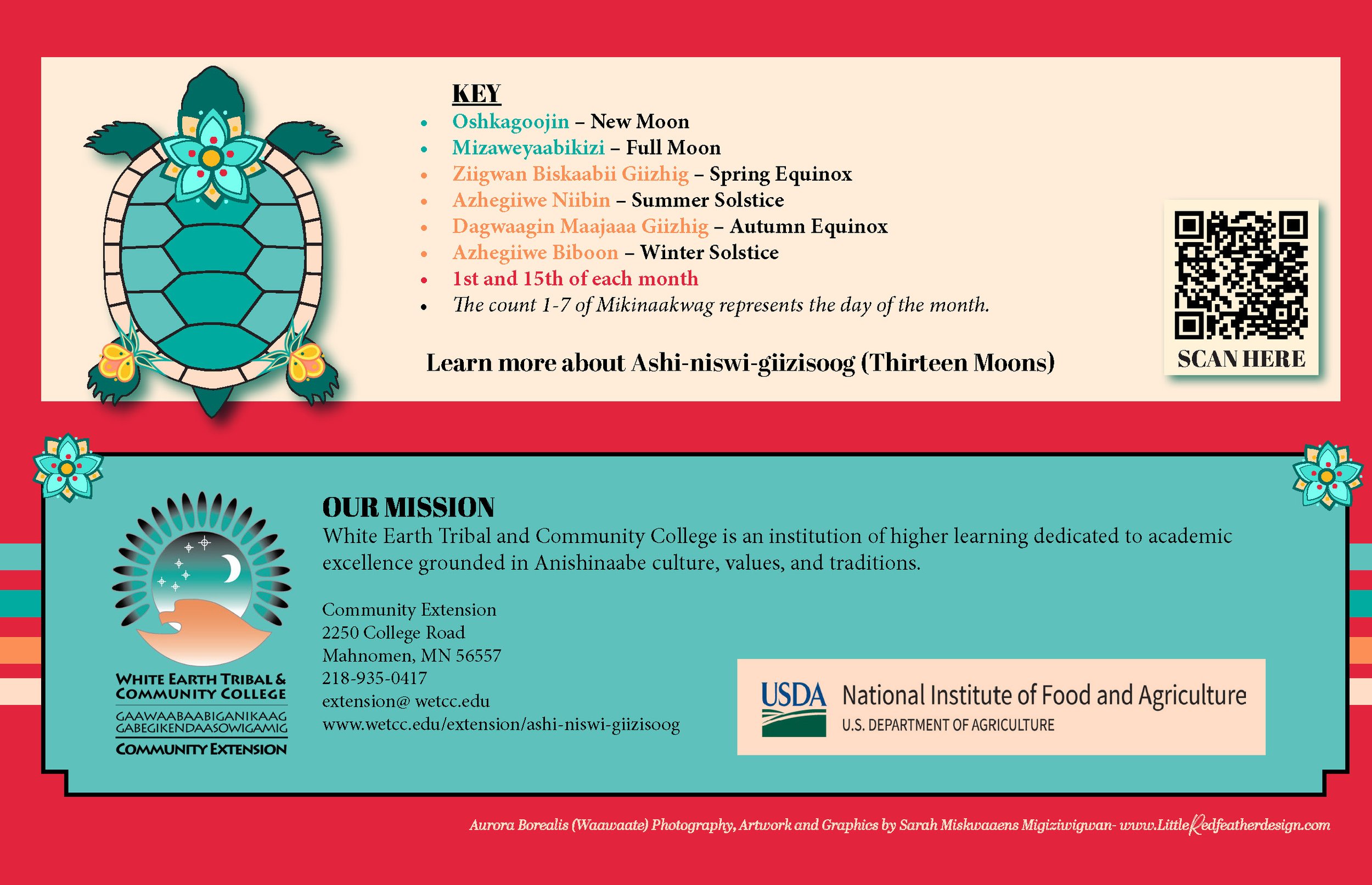
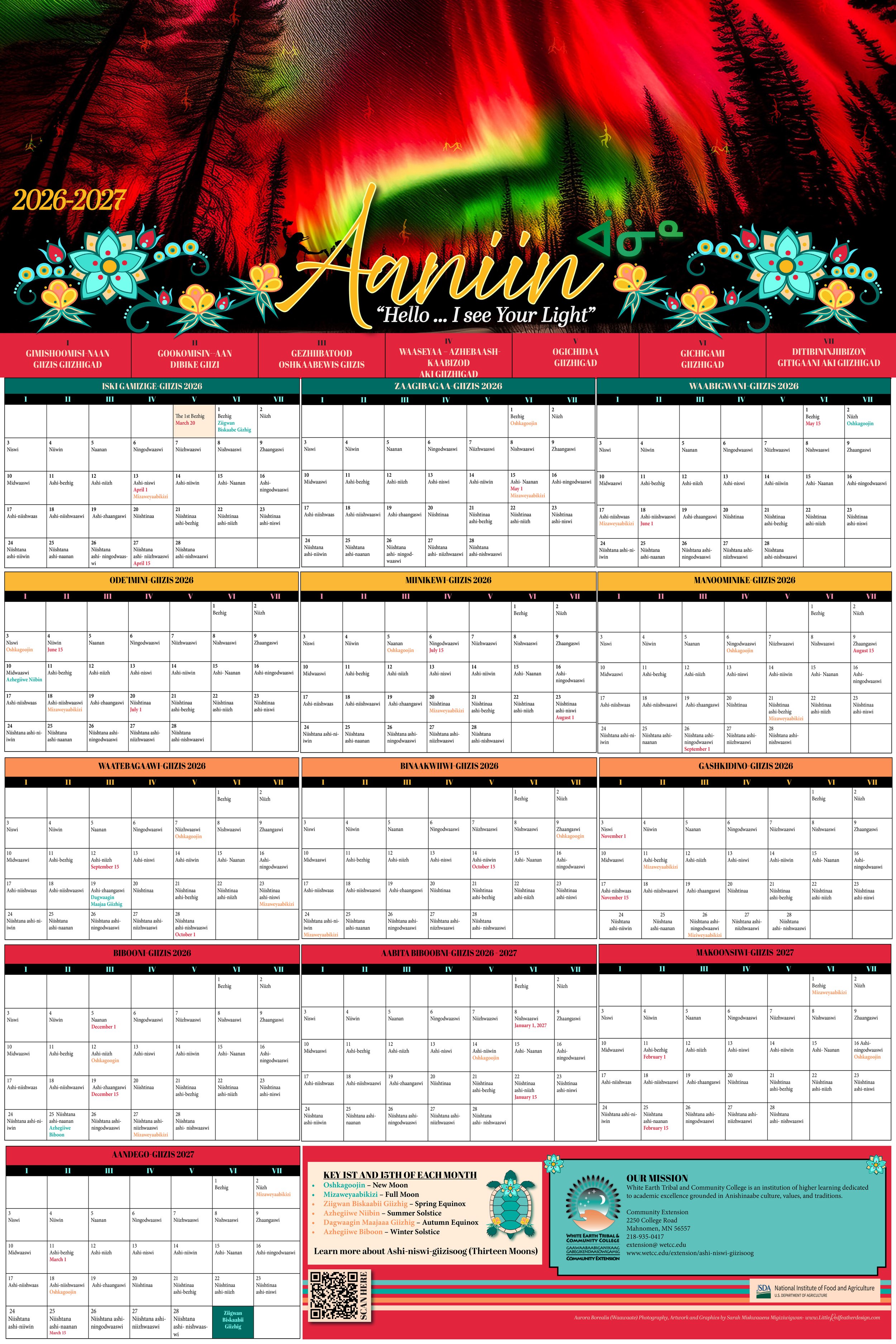
Cultural 2026/2027 13-Giizis (Moon) Calendar 02/01/2026 and current.
All my designs are crafted entirely by hand — no AI involved. Each piece is born from a focused creative process, blending photography, sketches, vector work, and illustration to achieve thoughtful, intentional results.

Below are other graphics projects. Photography by Nedahness Rose Greene.


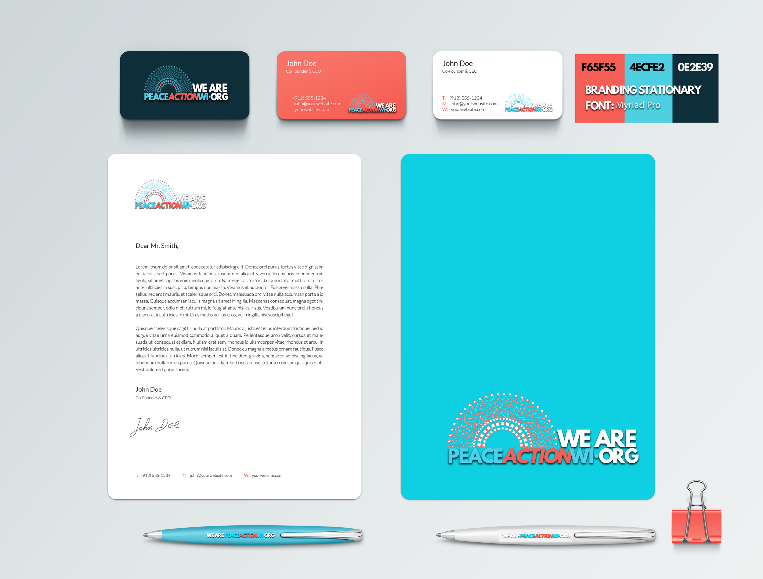
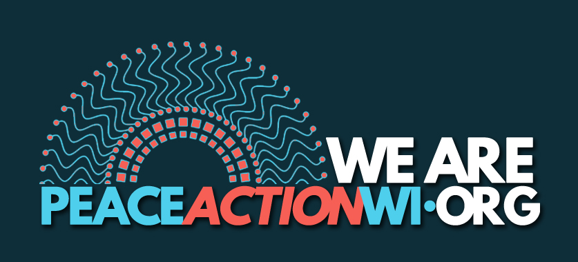
Client
Native Sun Community Power Development
Website Development, Branding, and Design.
Website: www.nativesun.org
Platform: Wix
Live in 6-weeks including the branding.
09/01/2025 and current
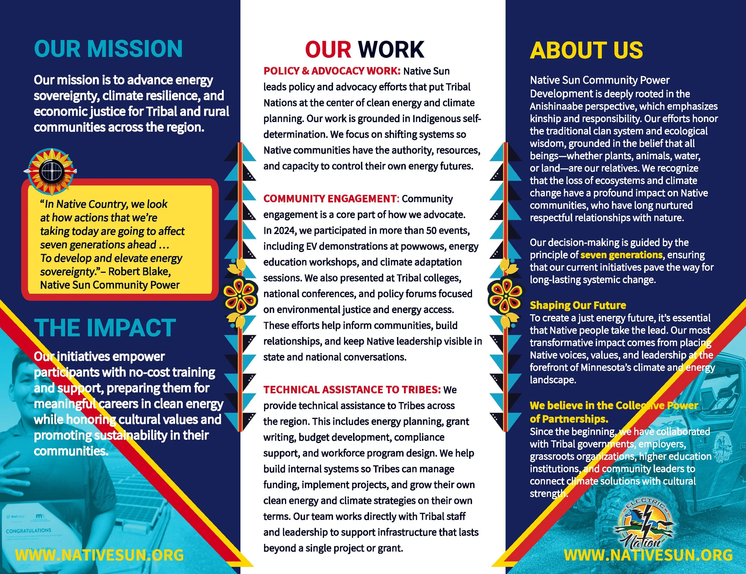
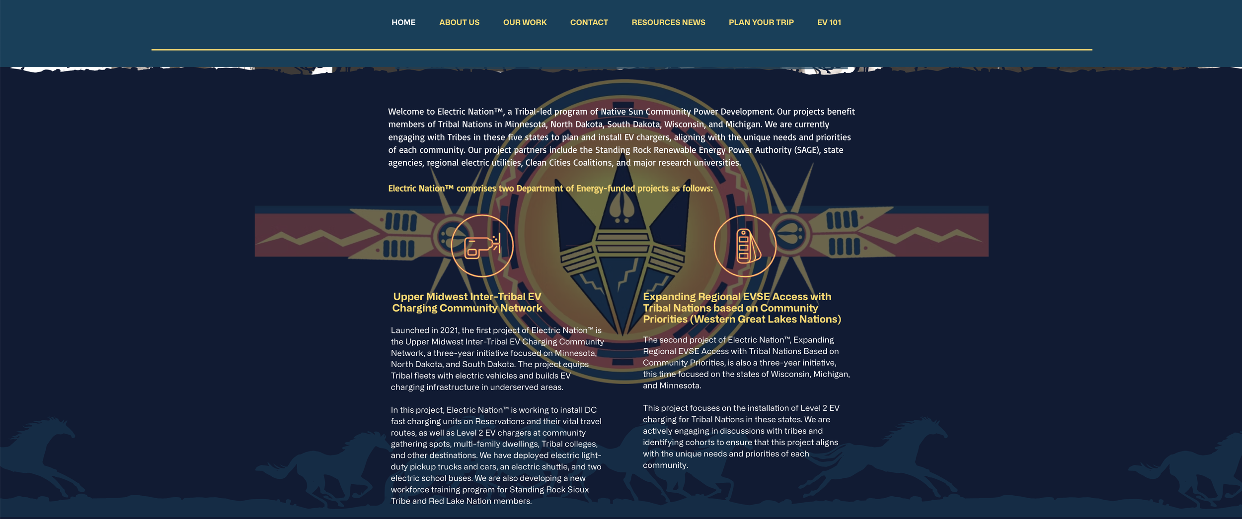
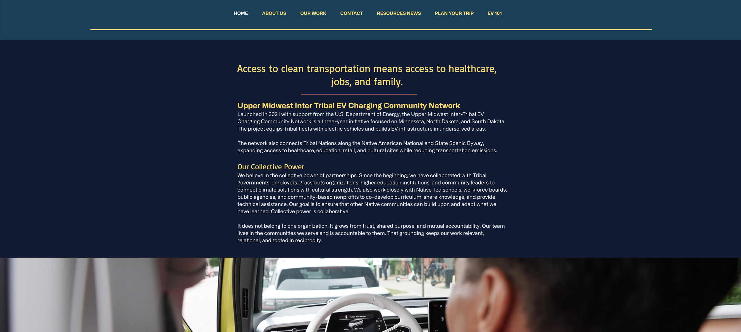
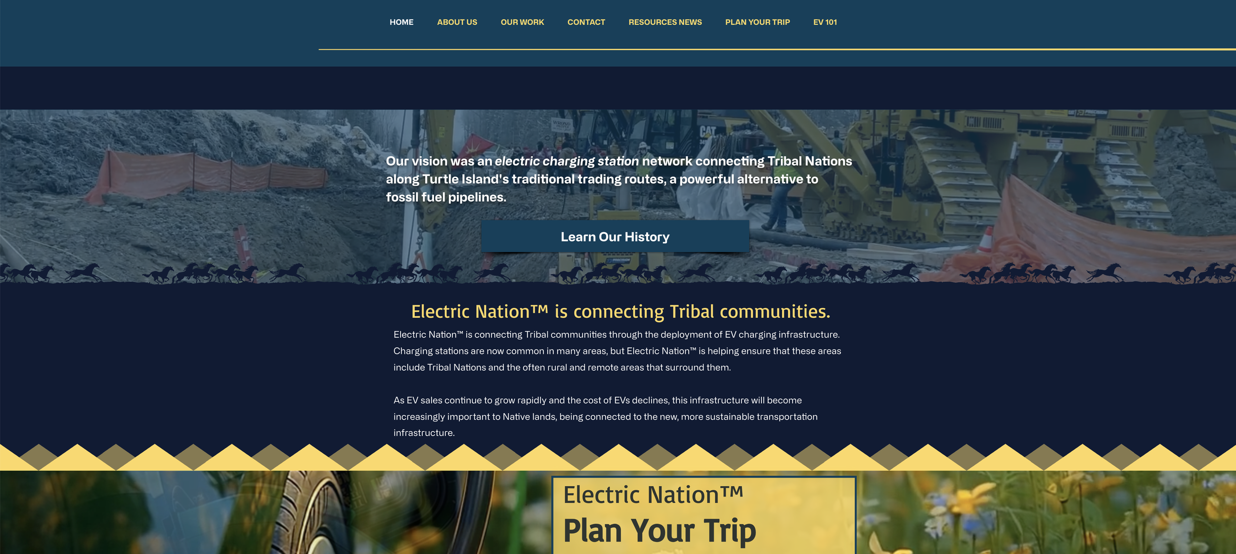
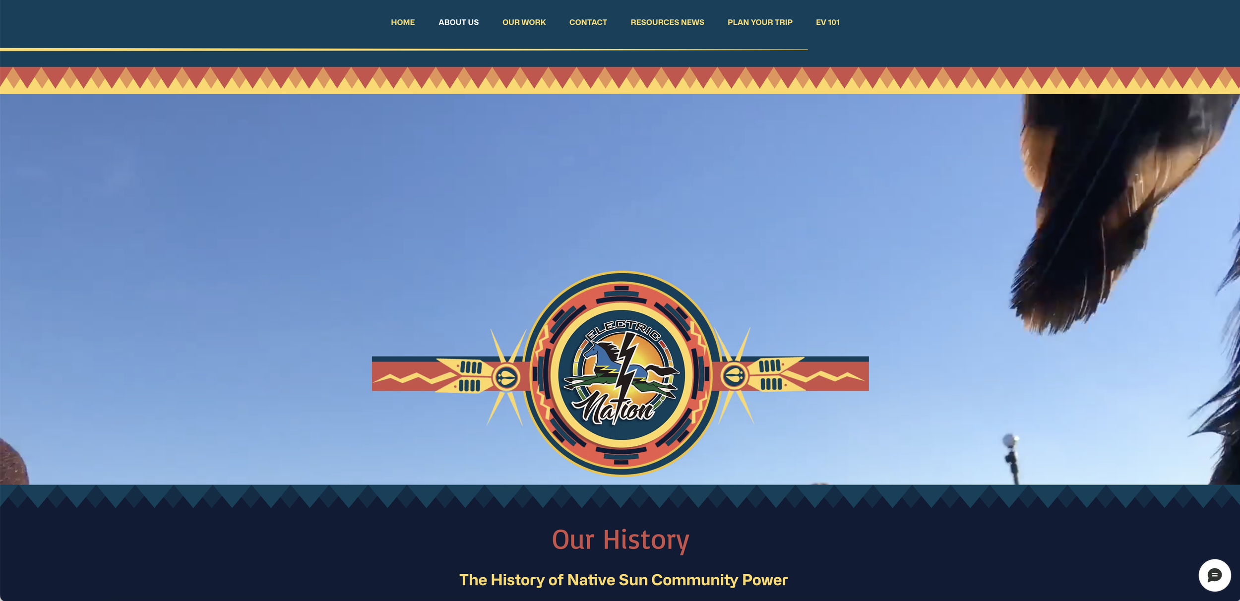
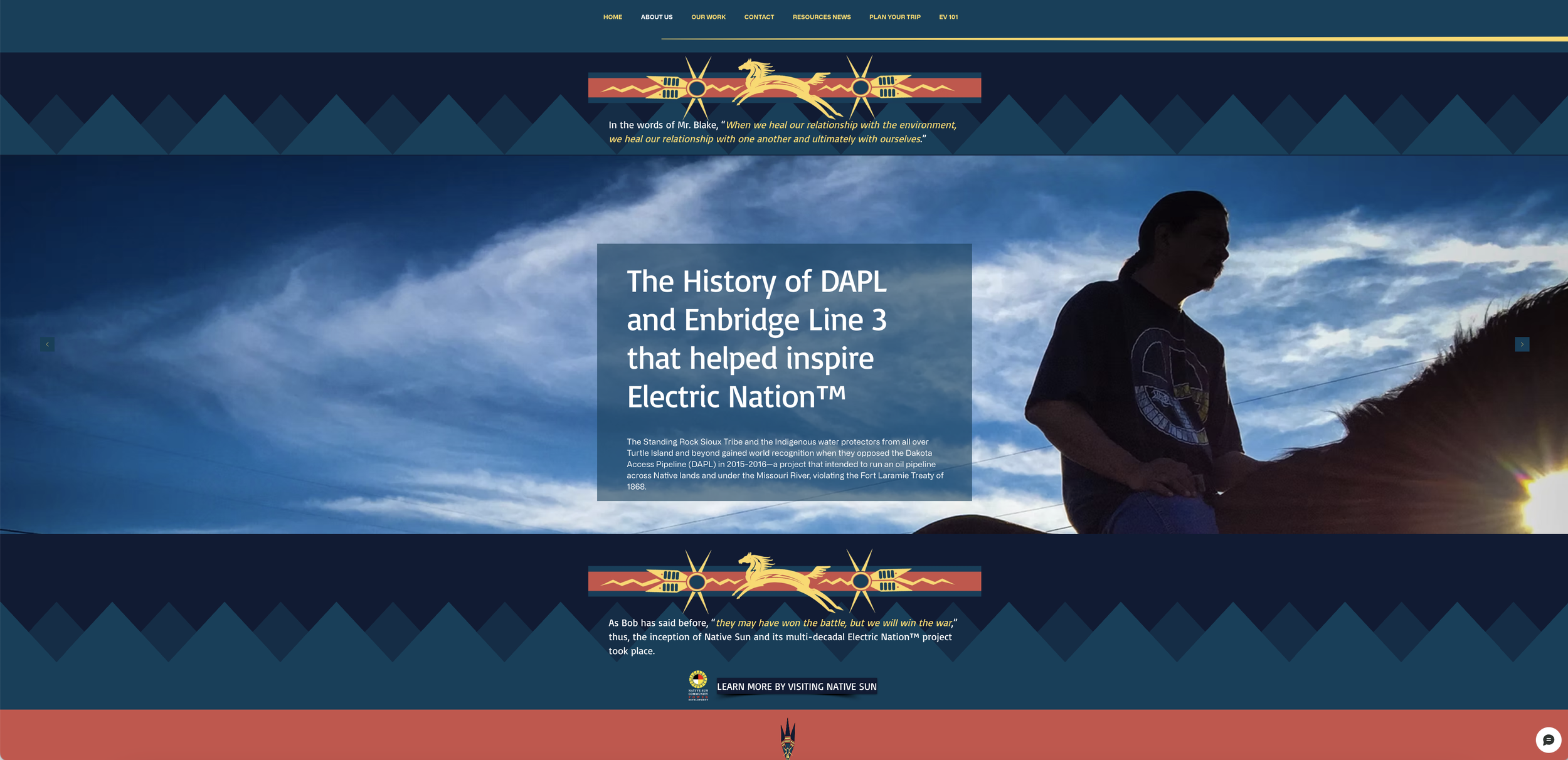
In 2025, I led and delivered a complete website and branding program for Native Sun Community Power Development, designed to strengthen the organization’s digital presence and reflect its mission, values, and cultural identity.
Project scope and objectives
Define and communicate Native Sun’s mission and core values online.
Create a cohesive visual identity that respects cultural context and resonates with community members.
Build a scalable, easy-to-manage website that supports ongoing outreach, storytelling, and program promotion.
Implement marketing and communications features to grow engagement and maintain continuous community dialogue.
Branding and design
Developed a brand system: logo refinements, color palette, typographic hierarchy, and iconography informed by consultations with Native Sun stakeholders to ensure cultural appropriateness and authenticity.
Produced a graphic-design suite: templates for reports, presentations, social graphics, and print collateral so visual communications remain consistent across channels.
Curated imagery and media guidelines: selected and placed photographs and media that reflect community life and project work, applying cropping, color treatment, and accessibility-conscious image ALT text to maintain visual impact and inclusivity.
Content strategy and copyediting
Audited existing content to align messaging with organizational priorities and audience needs.
Wrote and copyedited web content to improve clarity, tone, and persuasiveness while preserving culturally relevant language and nuances.
Structured content for discoverability: clear service pages, program descriptions, impact stories, and calls to action to guide visitors toward engagement and support.
Marketing and engagement tools
Launched strategic marketing initiatives to expand online reach: email templates, editorial calendar for blog and social posts, and guidance on audience segmentation for outreach.
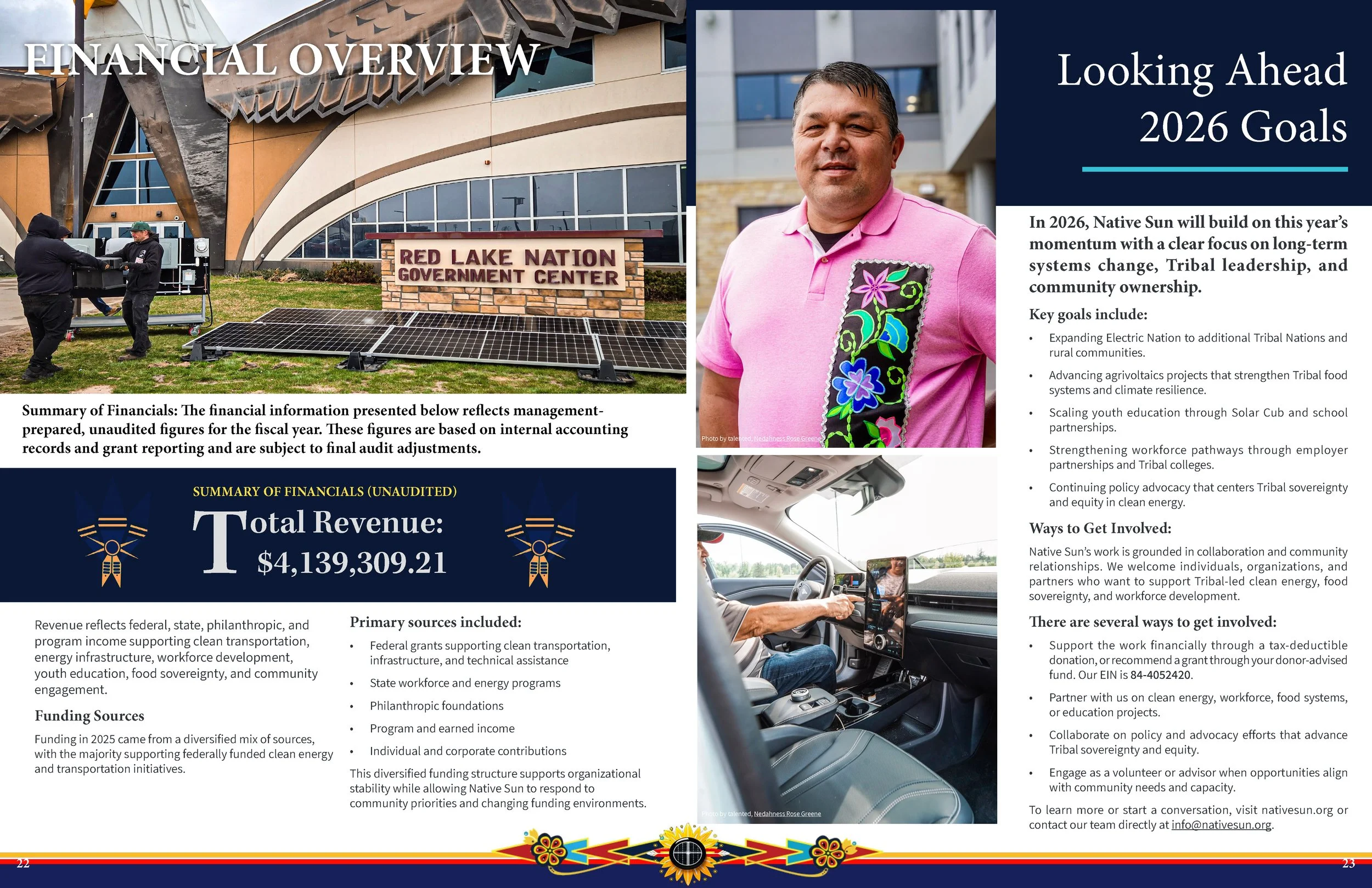
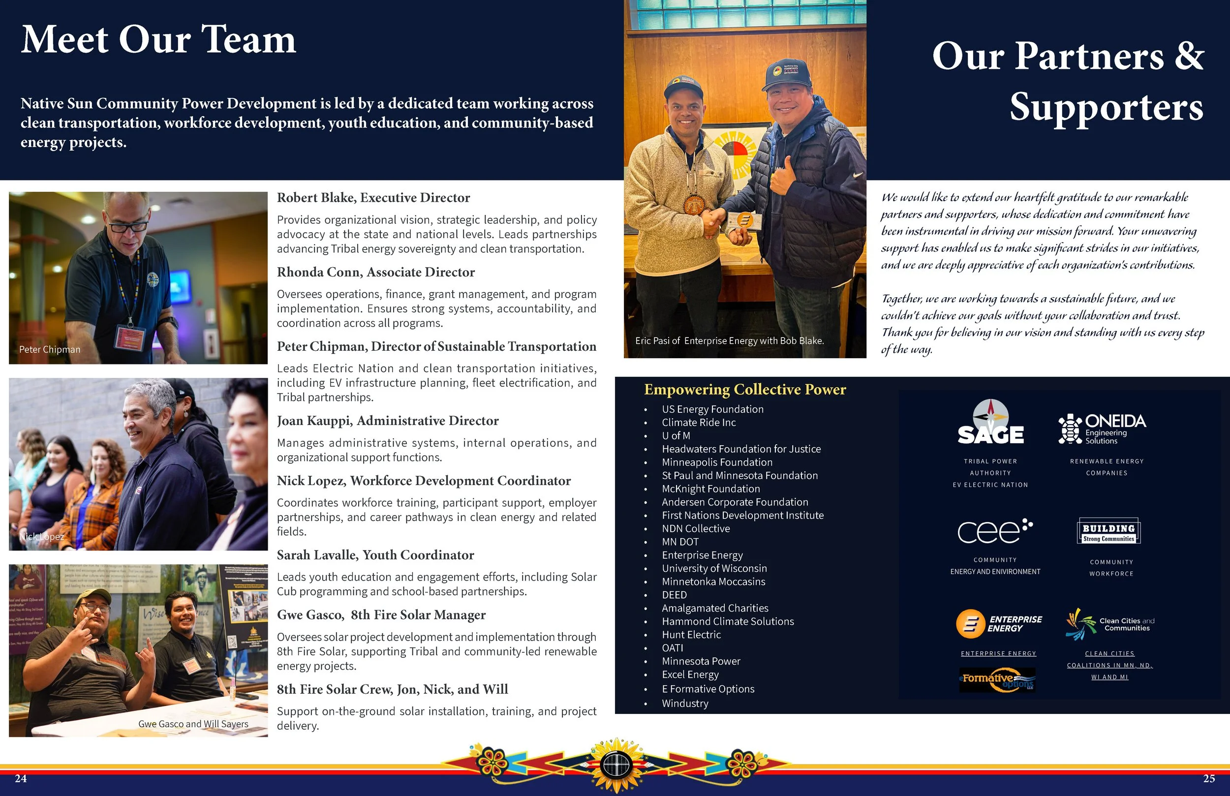
Outcomes and impact
A polished, culturally reflective website and brand identity that clearly communicates Native Sun’s work and values.
Improved tools for ongoing community engagement: an active blog, regular newsletters, and a consistent visual voice across communications.
Empowered staff with the skills and systems needed to maintain the site and execute outreach independently.
Stronger online visibility and a platform better suited to promote programs, partnerships, and funding opportunities.
This integrated effort combined creative direction, content polish, and technical implementation to support Native Sun Community Power Development’s mission and enhance its ability to connect with community members, partners, and stakeholders.
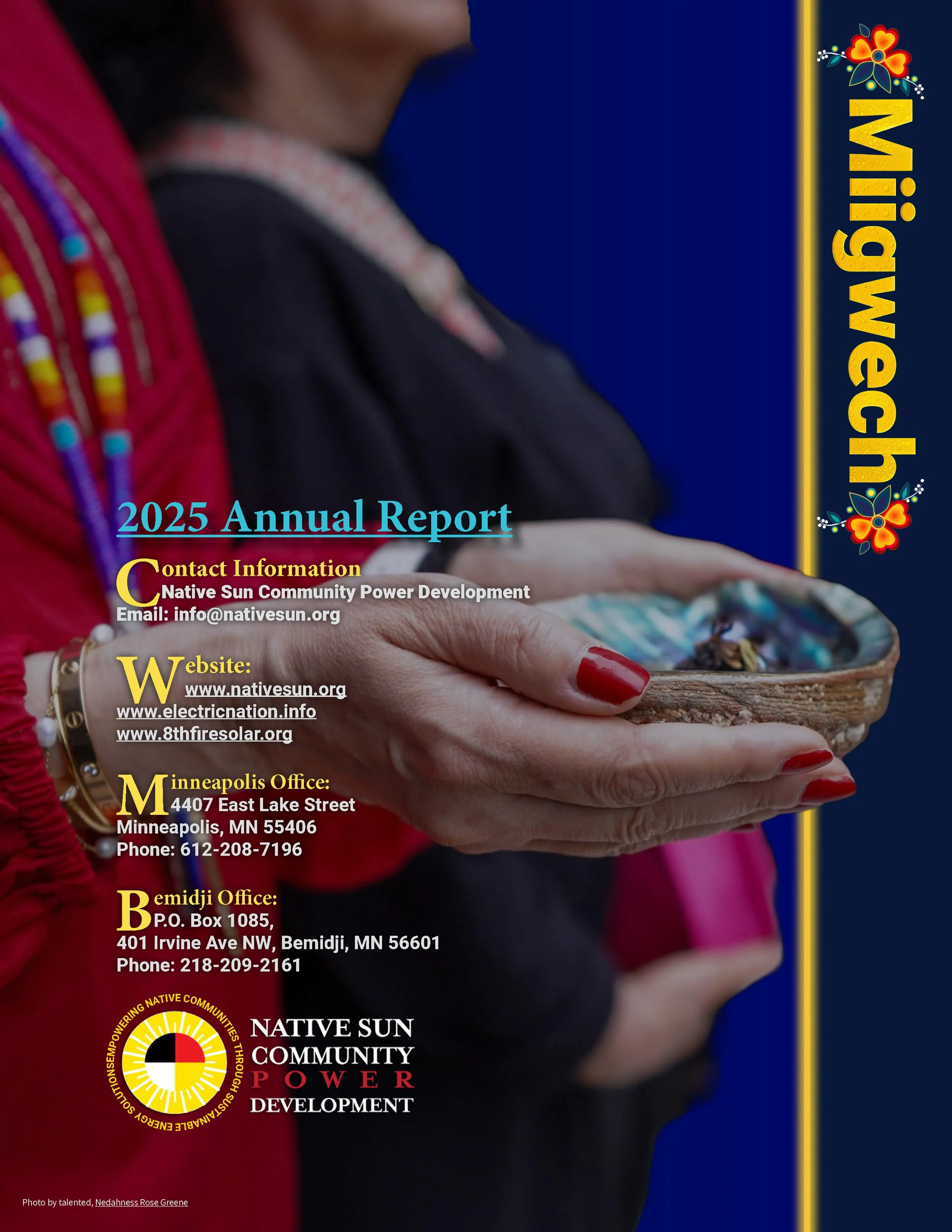
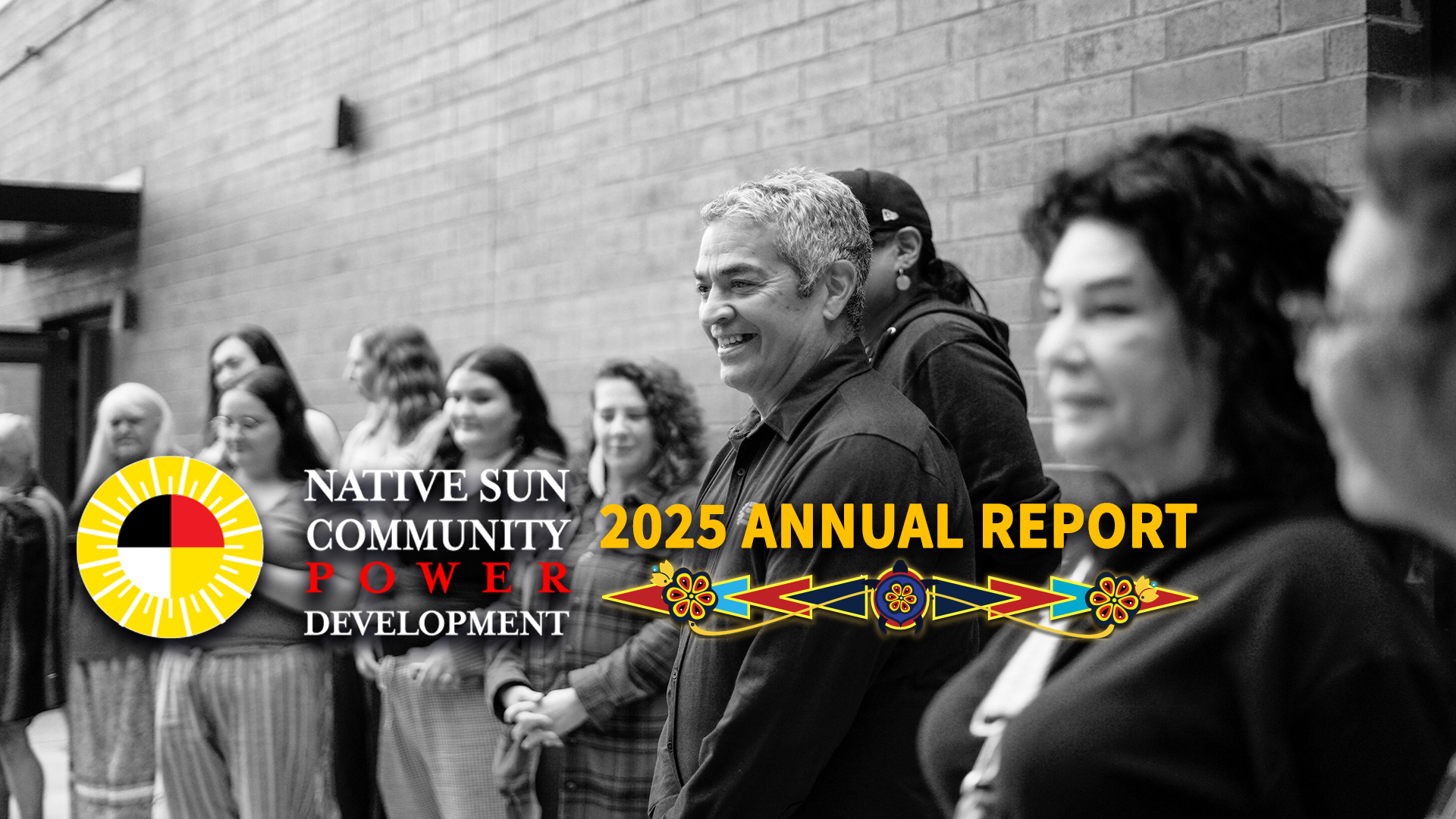
Here displayed is the 2024 Annual Report I designed.
Client
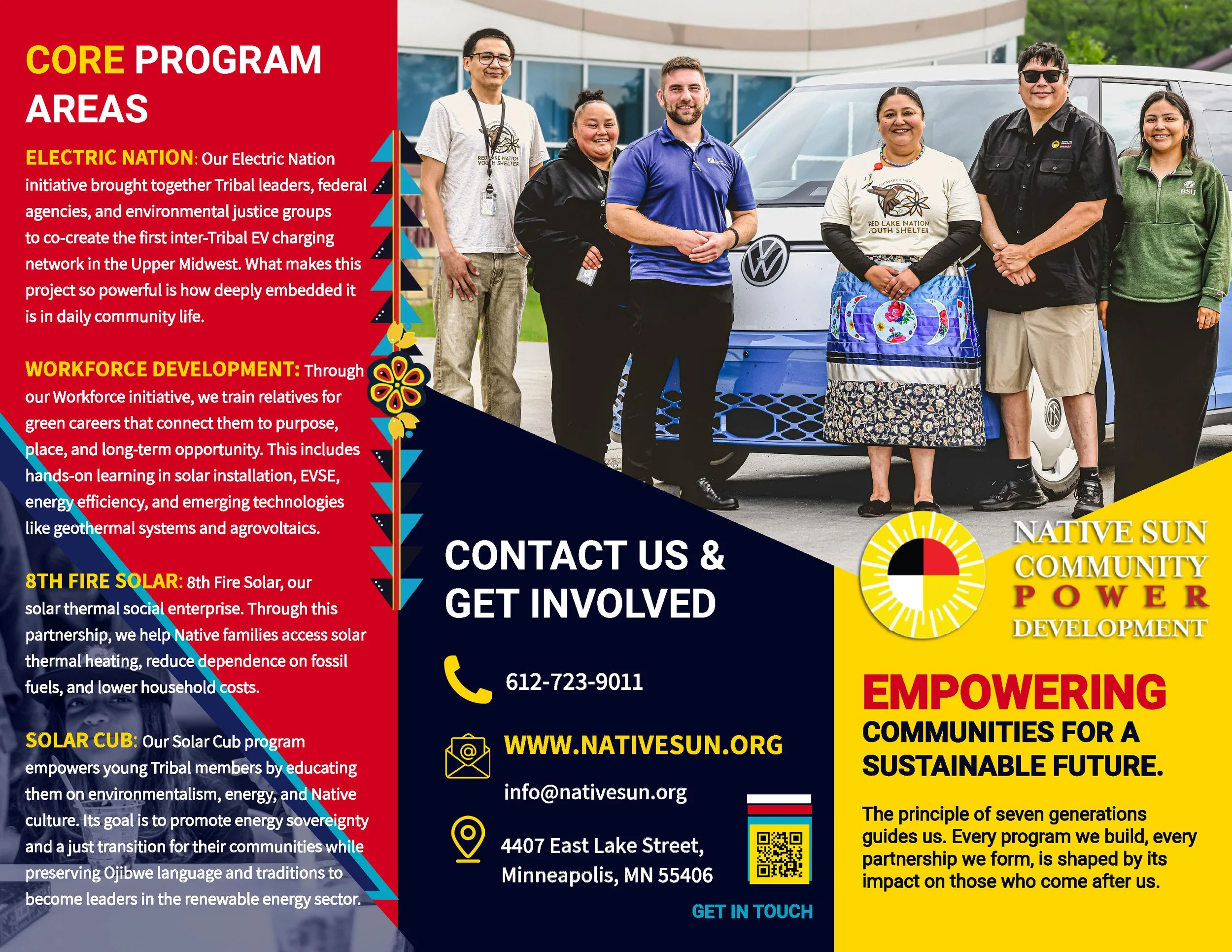
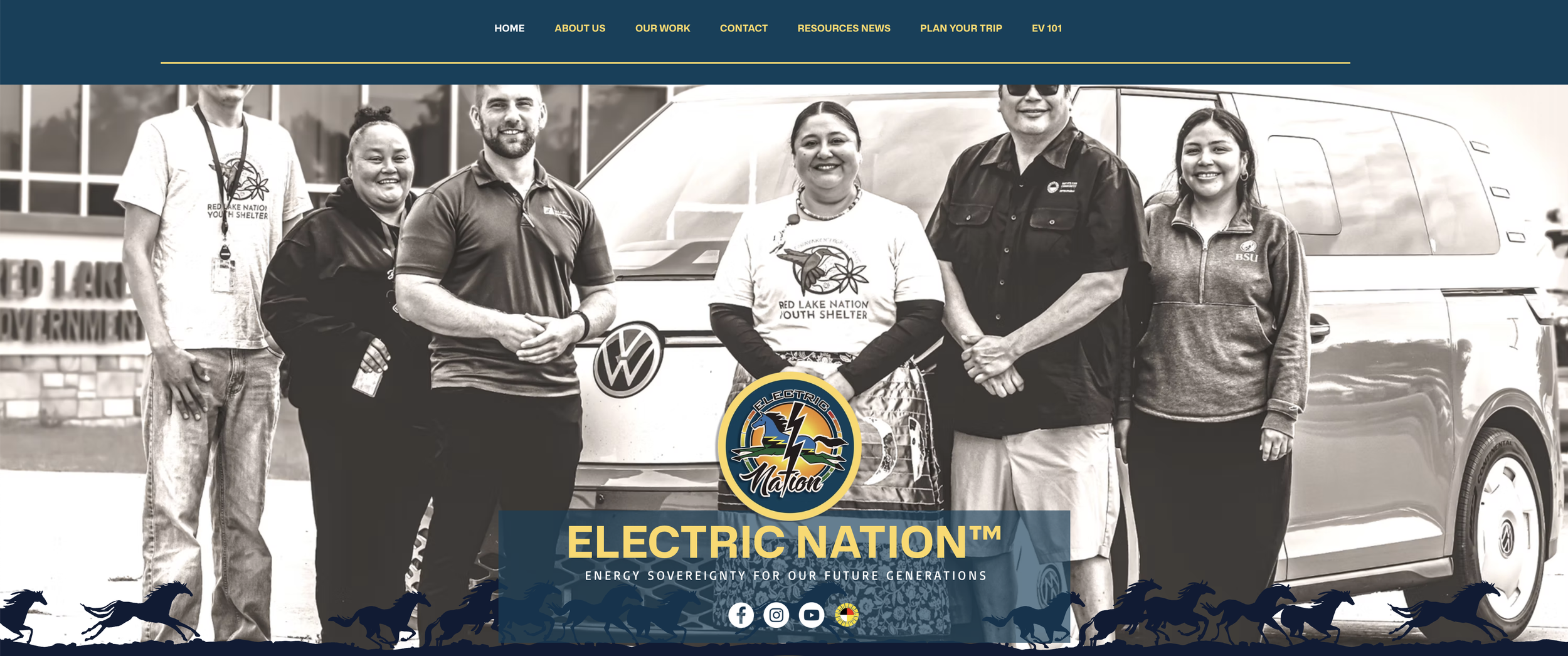
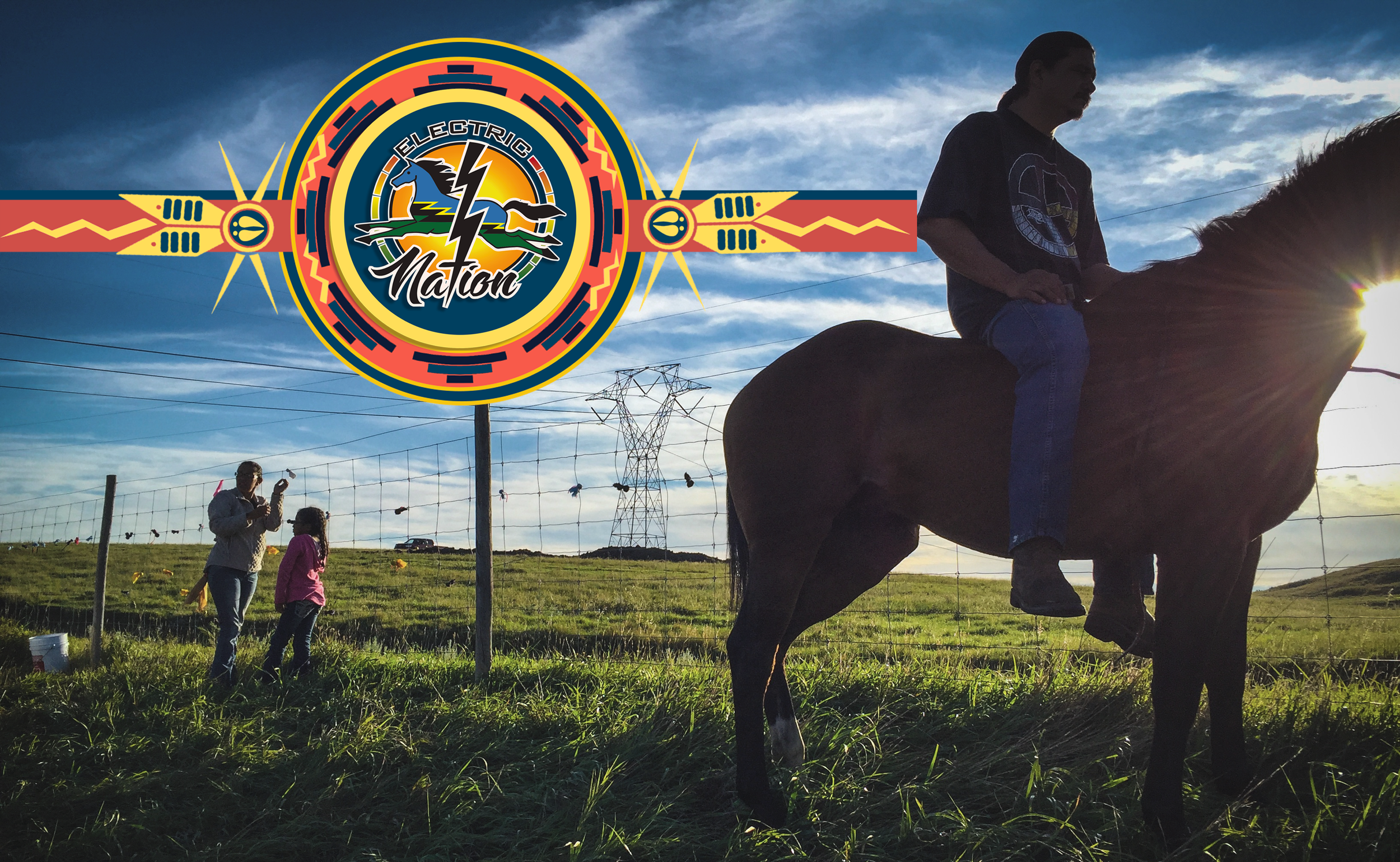
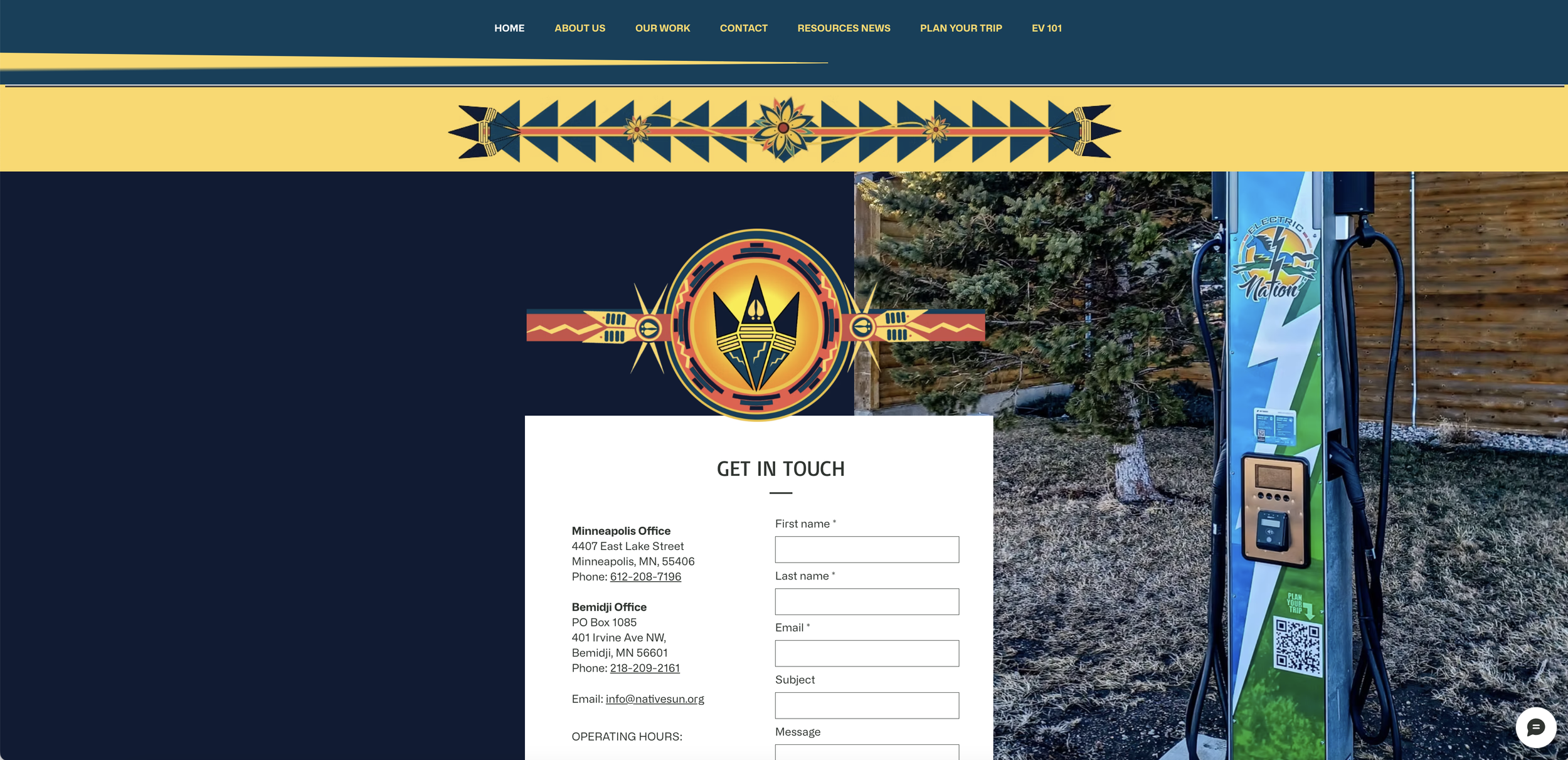
Native Sun Community Power Development, Electric Nation™
Website Development, Branding, and Design.
Website www.electricnation.info
Platform: Wix
Live in 6-weeks including the branding.
09/01/2025 and current
In 2025, I led the end-to-end website and brand design for Native Sun Community Power Development, creating a cohesive digital platform and visual identity aligned with the organization’s mission, values, and cultural roots. Services delivered included website development and programming, graphic design, branding elements, and strategic marketing to strengthen online visibility and audience engagement.
Key contributions:
Developed a culturally reflective website with thoughtful media placement and visual design to support community storytelling.
Implemented content management features—blog to sustain ongoing community dialogue and outreach.
Produced brand assets and graphic systems that reinforce Native Sun’s identity across digital touchpoints.
Performed comprehensive copyediting to ensure clear, polished, and impactful messaging.
Launched targeted marketing initiatives to grow engagement and amplify program initiatives.
Branding and design
Developed a brand system: logo refinements, color palette, typographic hierarchy, and iconography informed by consultations with Native Sun stakeholders to ensure cultural appropriateness and authenticity.
Produced a graphic-design suite: templates for reports, presentations, social graphics, and print collateral so visual communications remain consistent across channels.
Curated imagery and media guidelines: selected and placed photographs and media that reflect community life and project work, applying cropping, color treatment, and accessibility-conscious image ALT text to maintain visual impact and inclusivity.
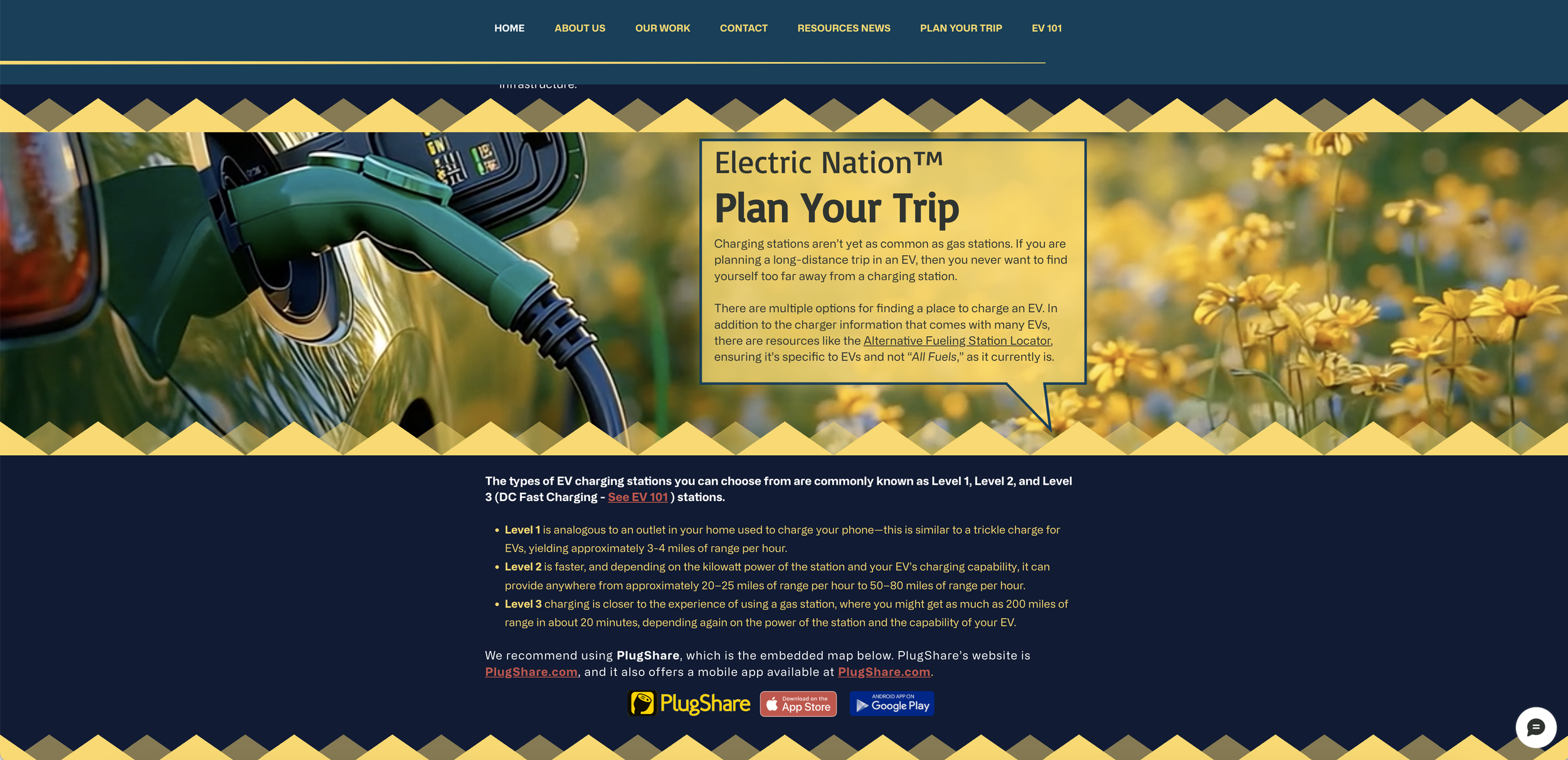
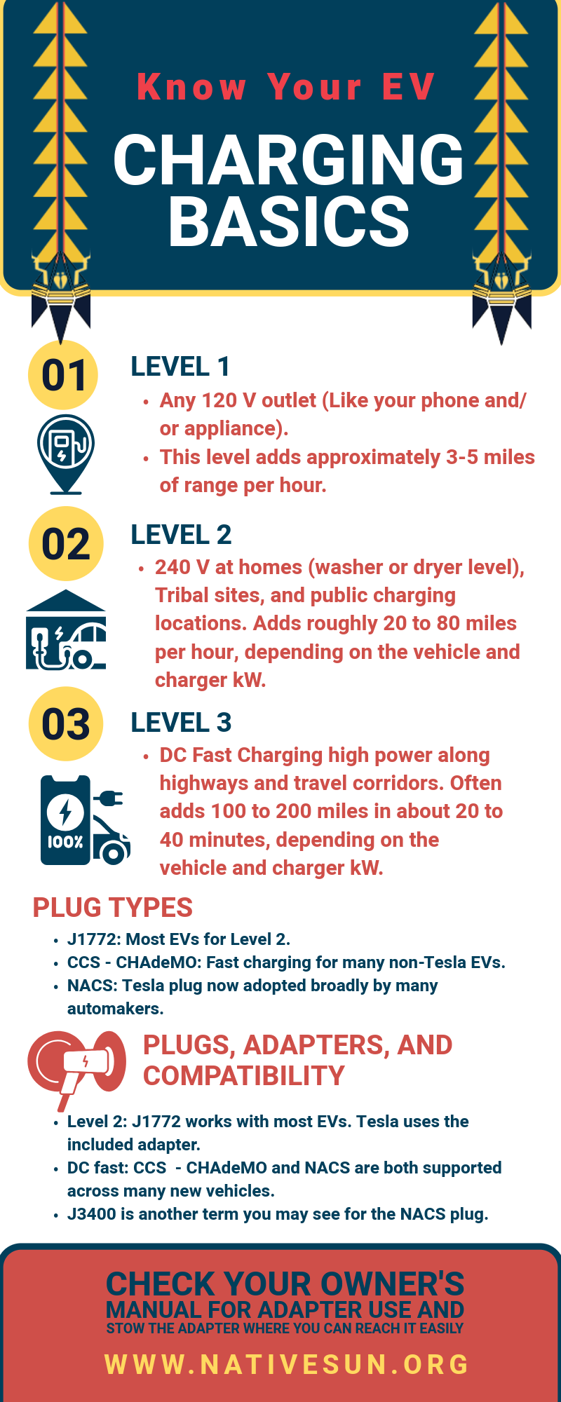
Get to know your EV and why electric vehicles matter for community and energy sovereignty — a special feature on of knowledge page for viewers to explore, learn, and engage with the graphic visuals.
The integrated approach combined creative design and technical execution to enhance Native Sun’s online presence and advance its work within the Electric Nation initiative.
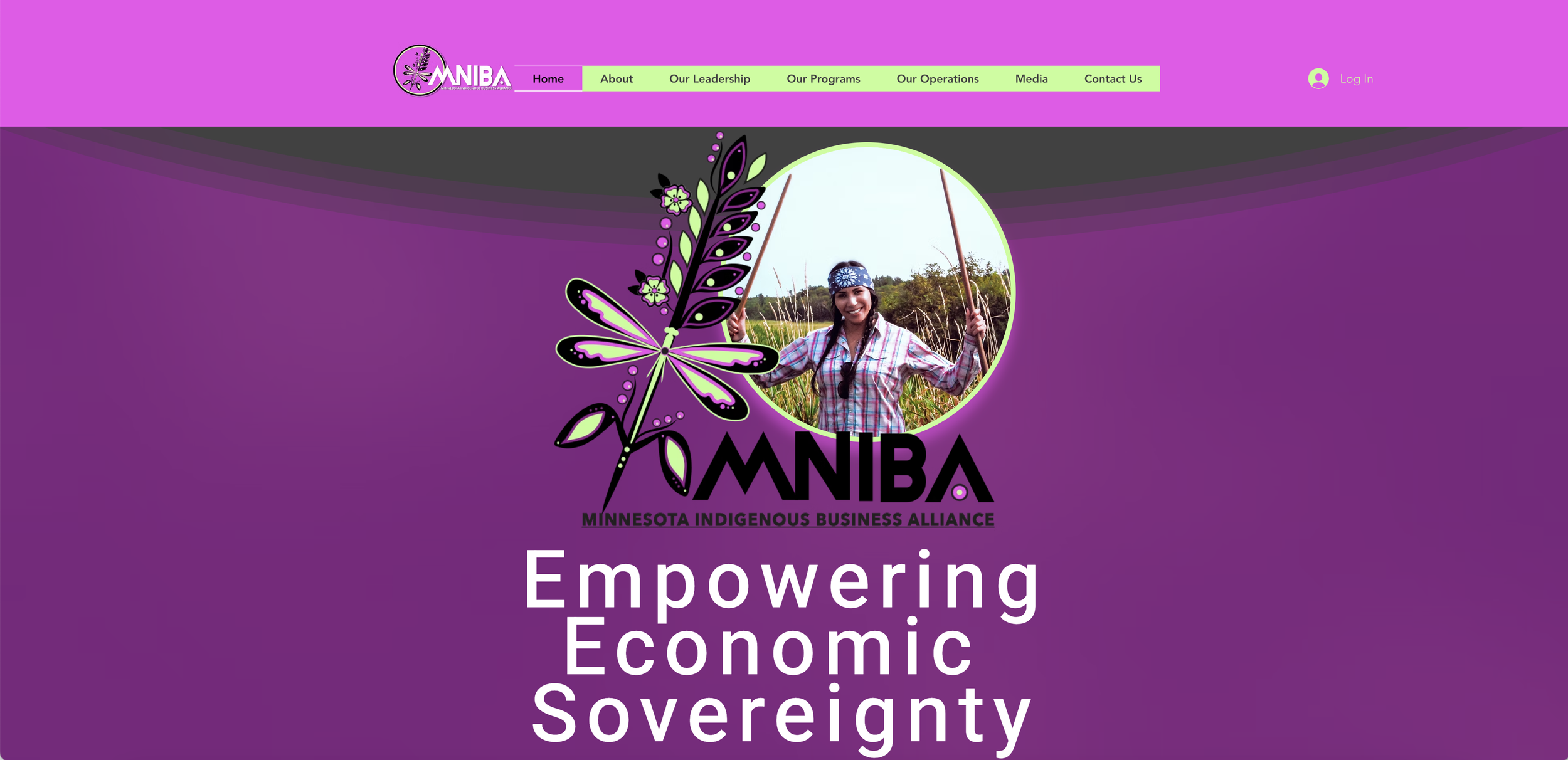
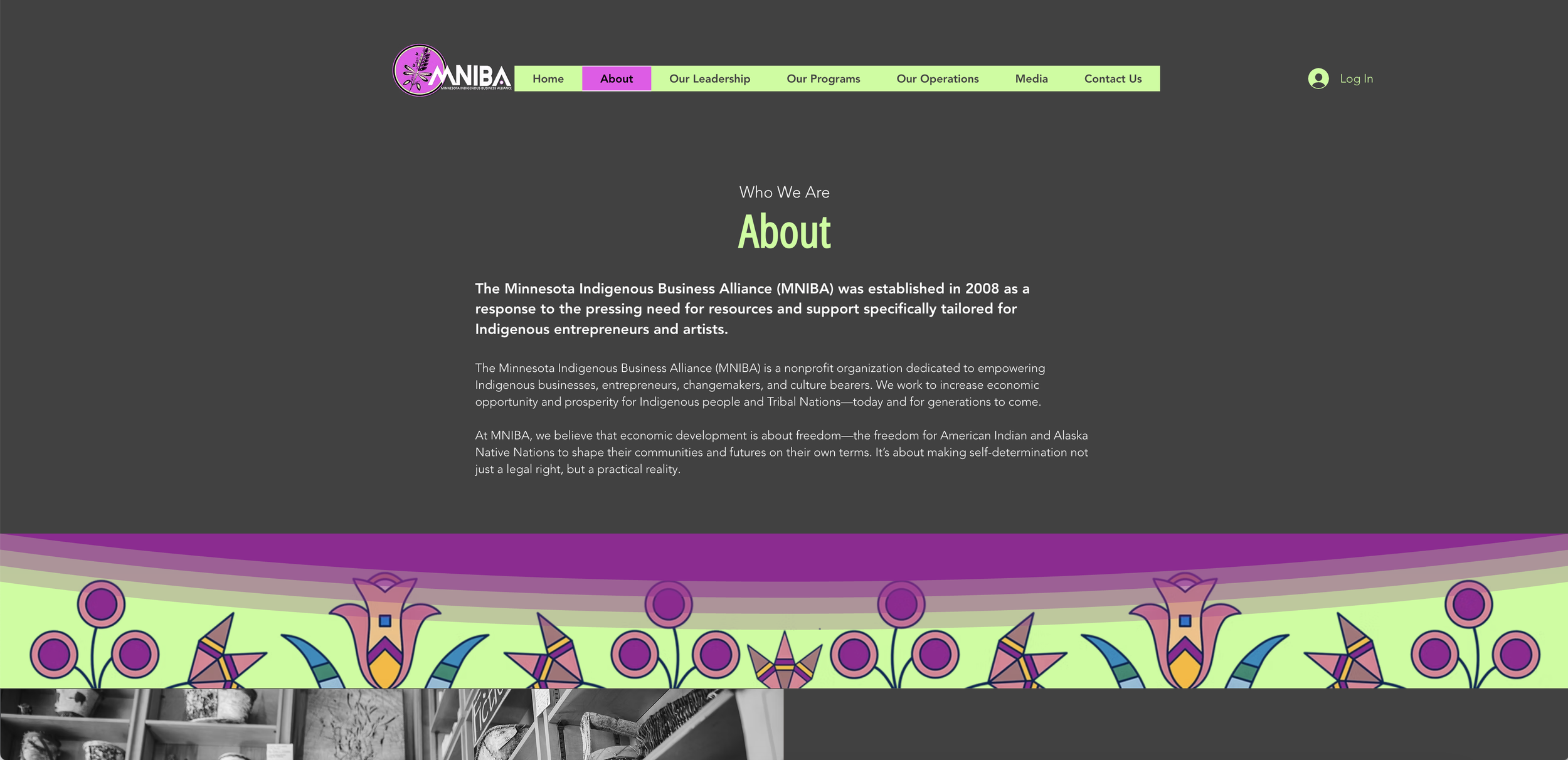
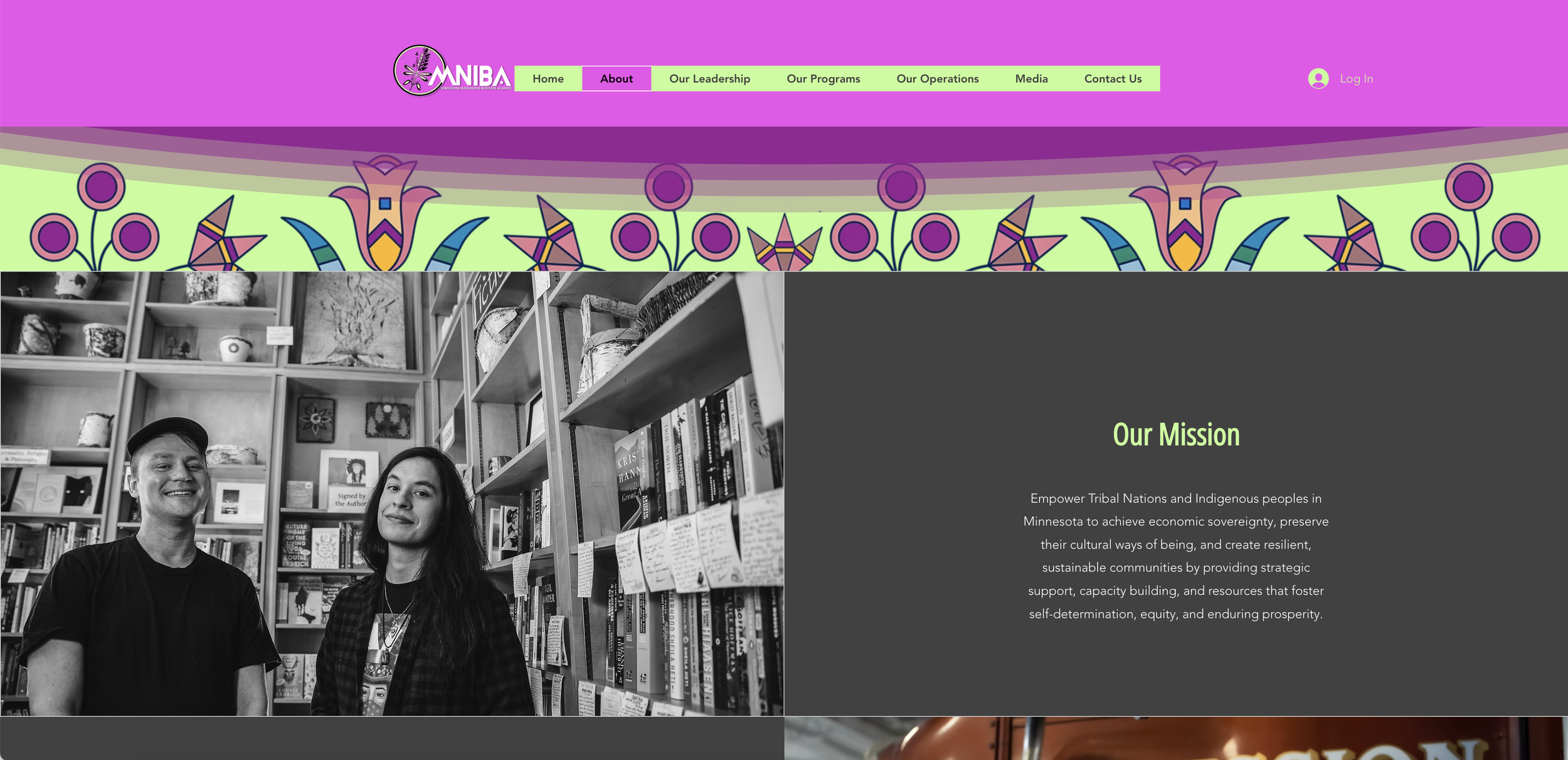
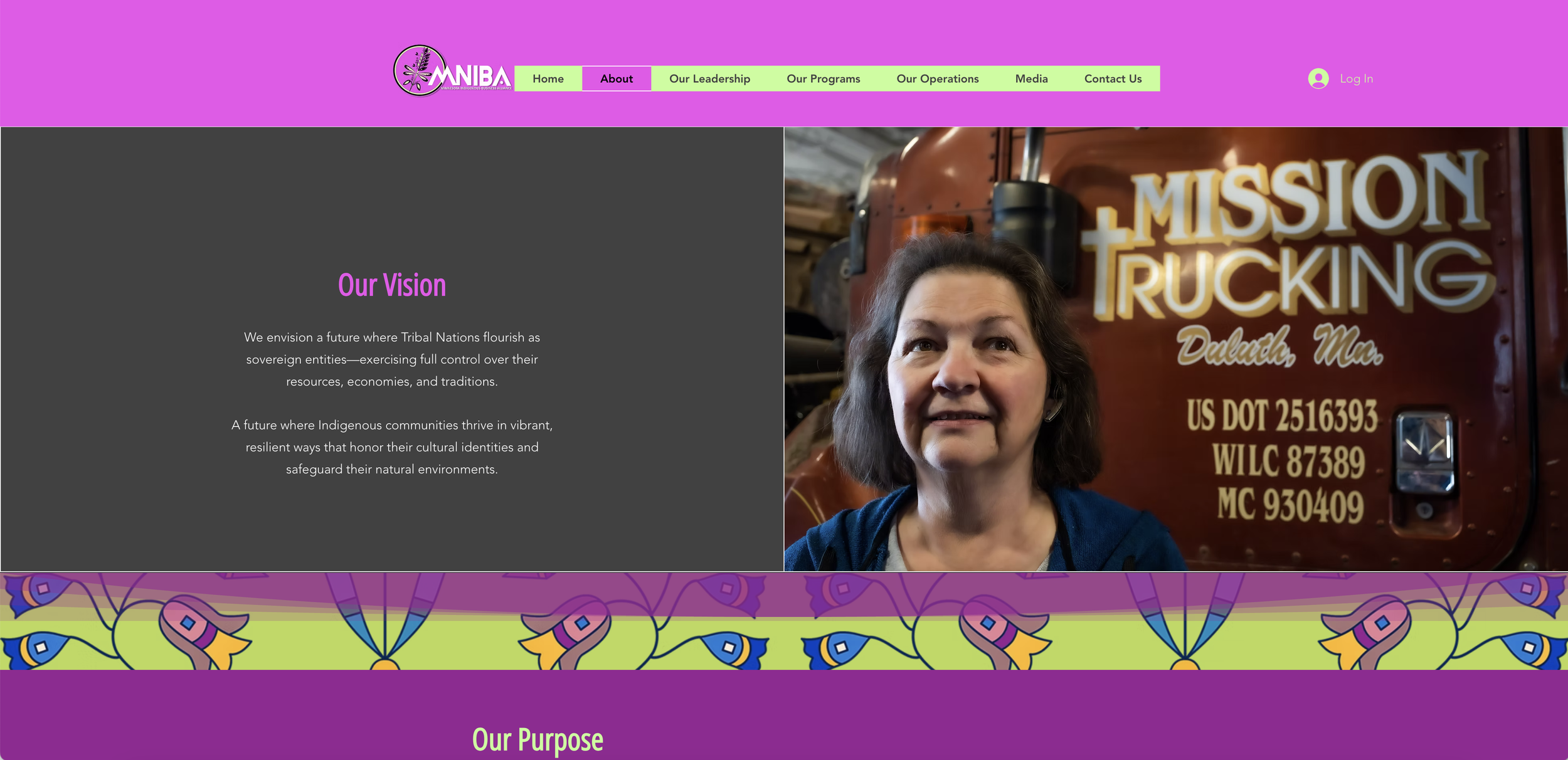
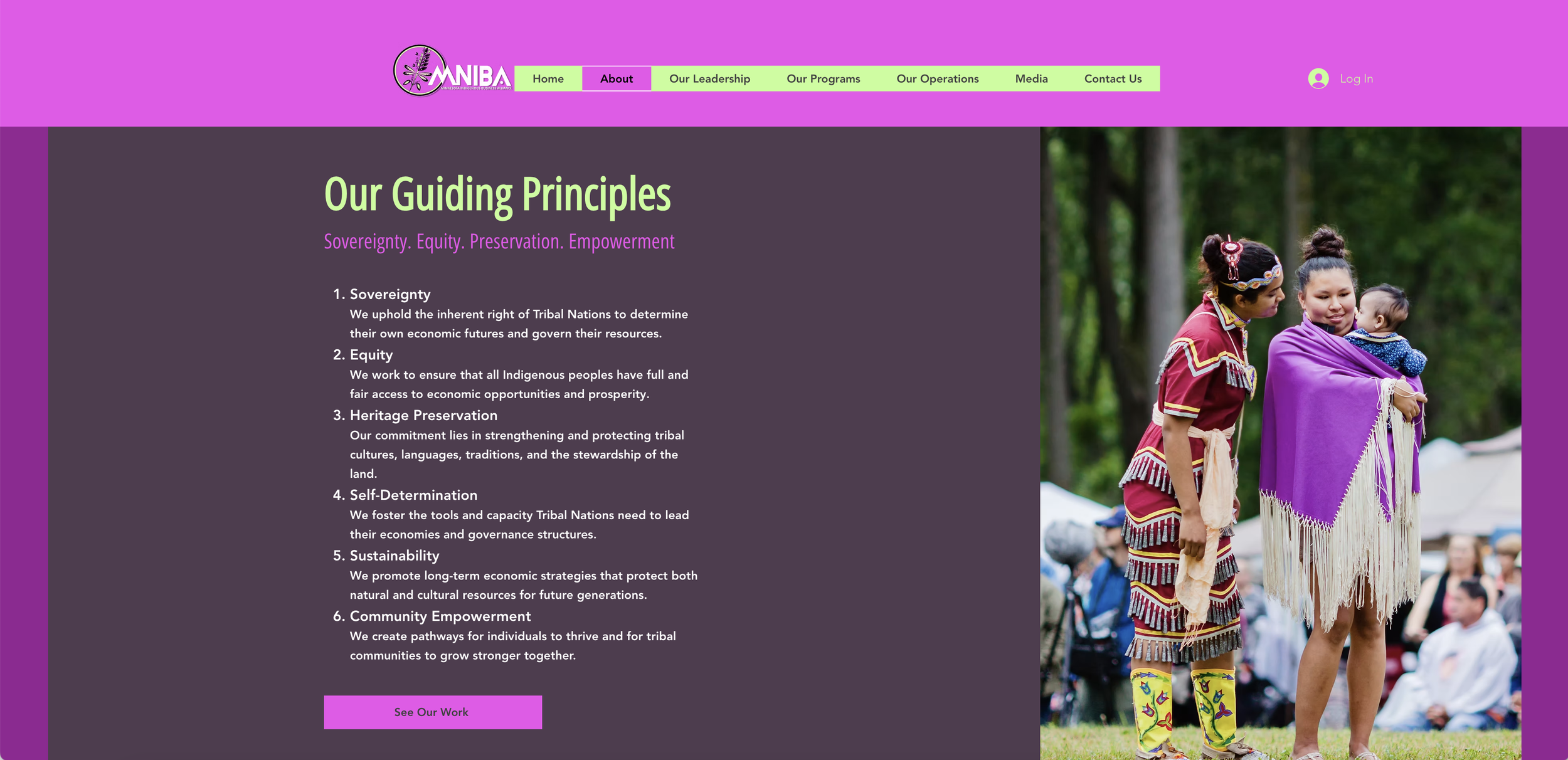
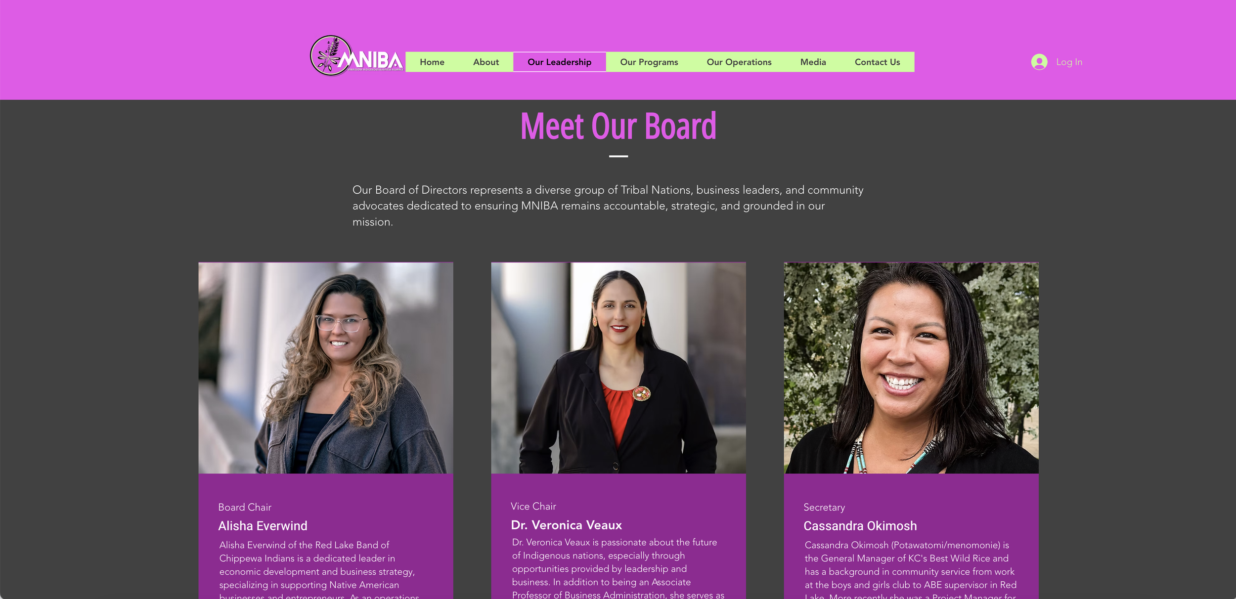
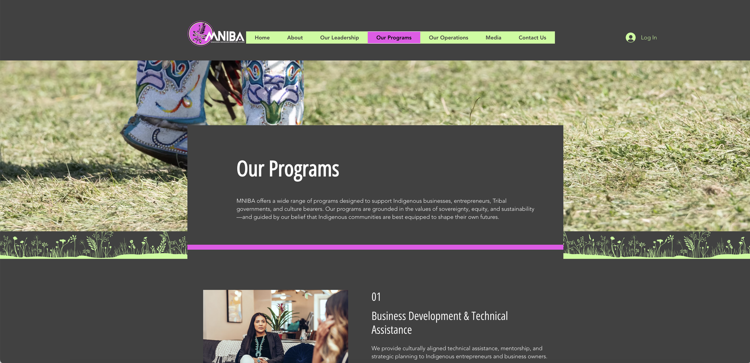
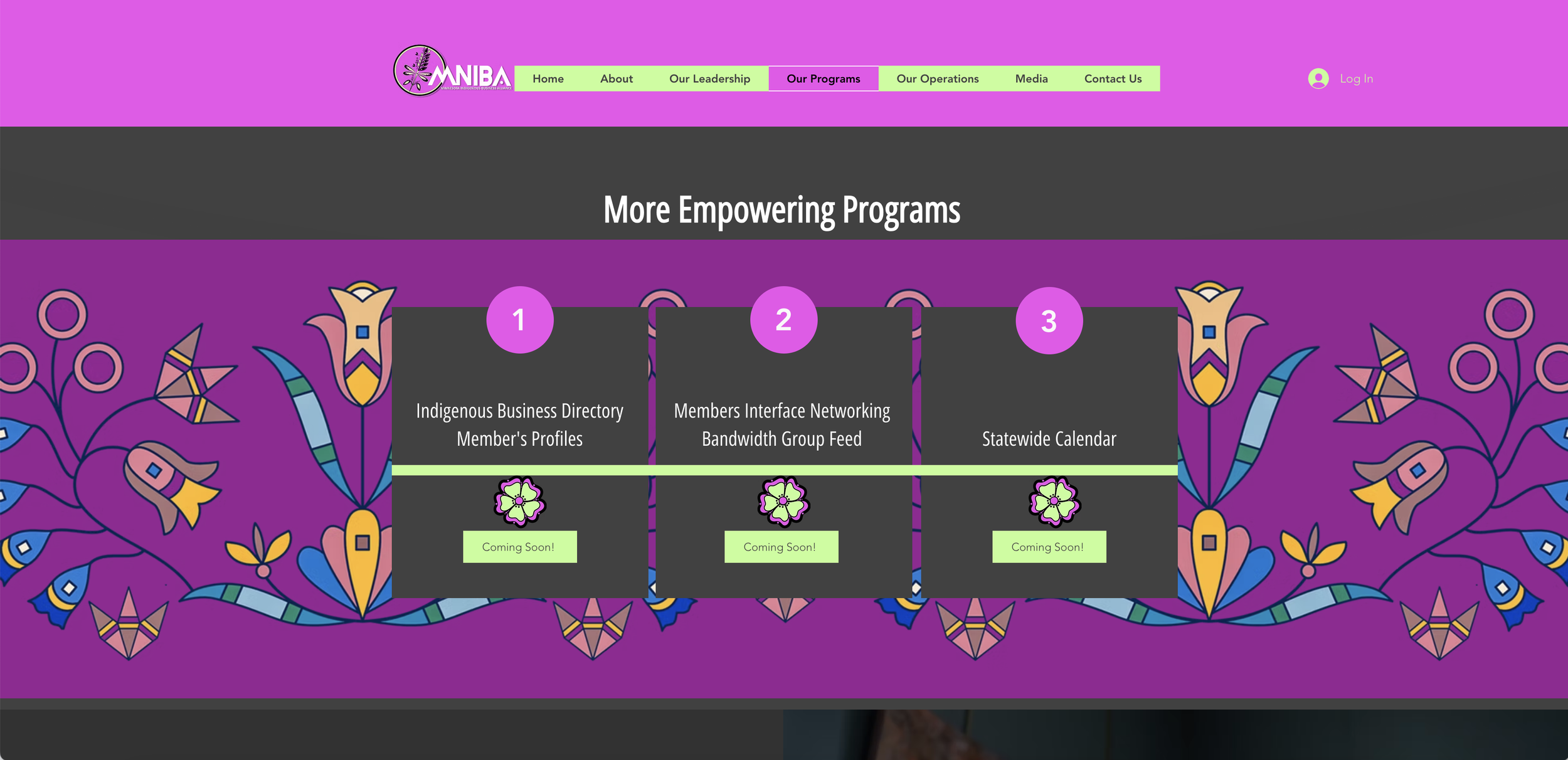
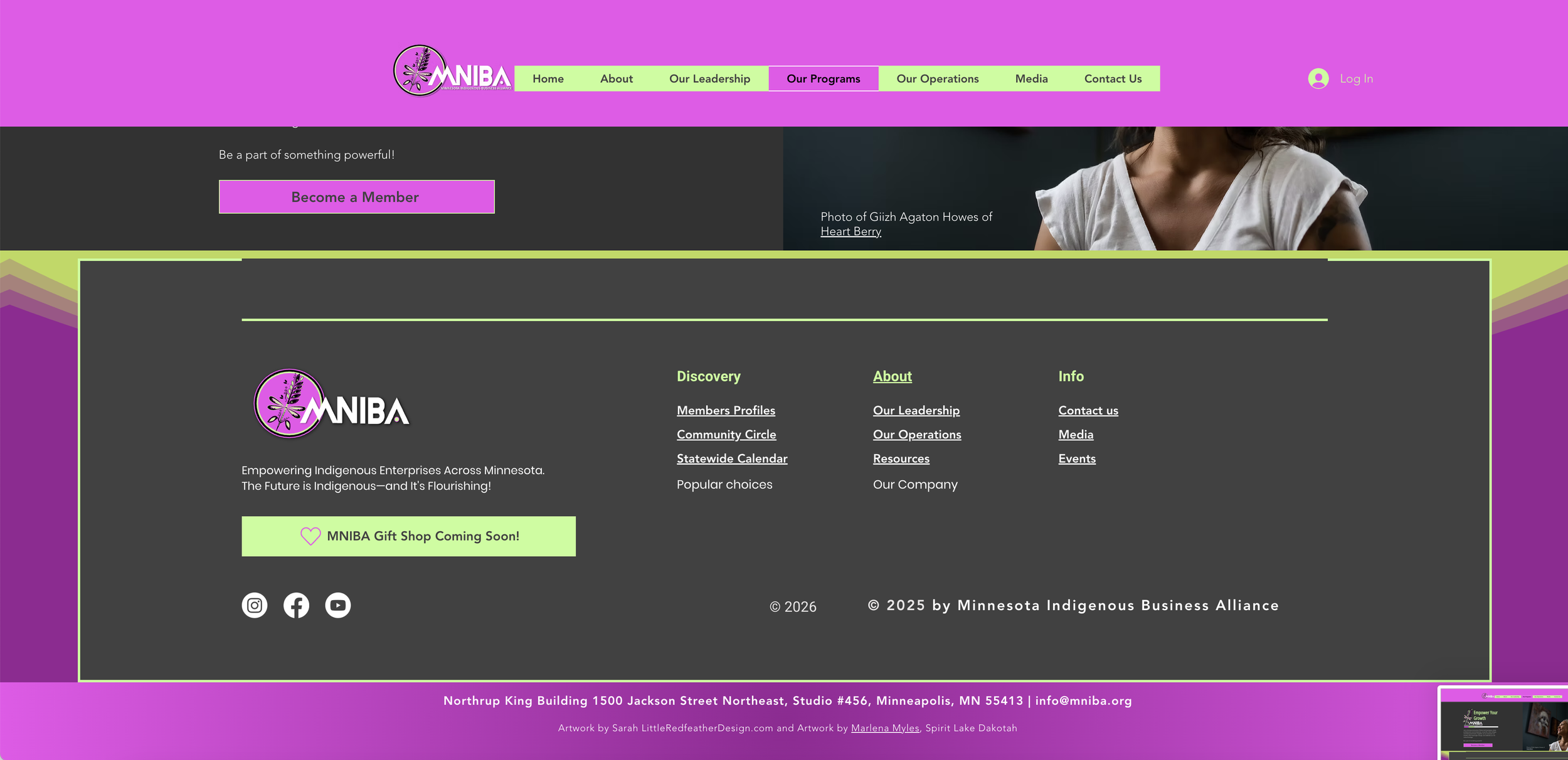


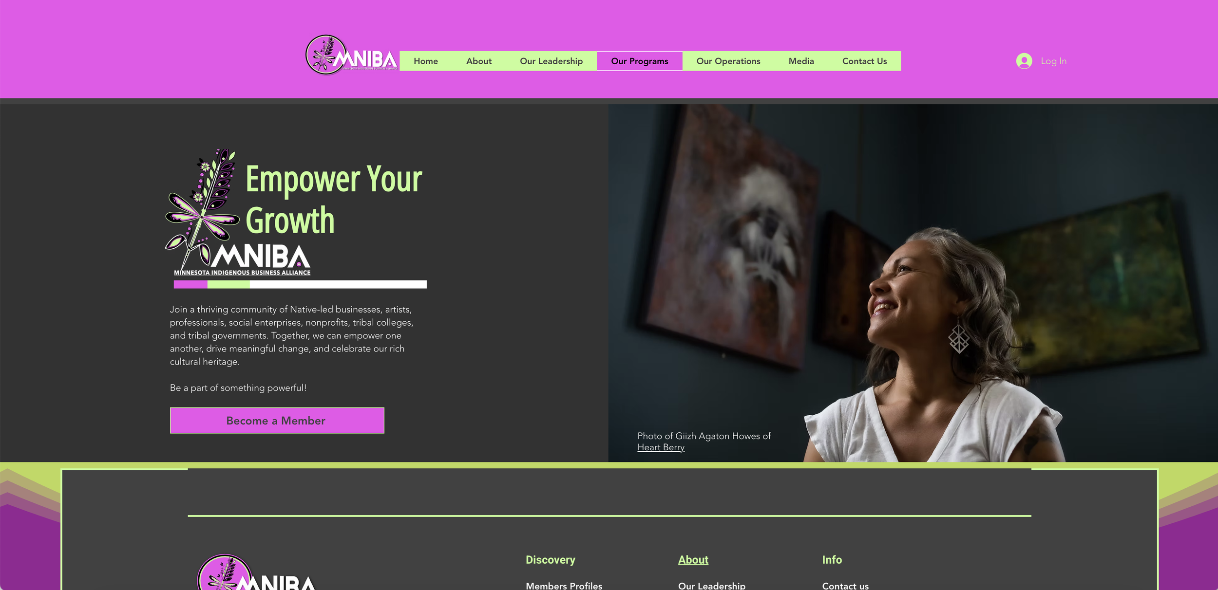
Client
Minnesota Indigenous Business Alliance
Website Development, Logo, Branding, and Design.
Website: www.mniba.org
Platform: Wix
Live in 6-weeks including the branding.
Year 05/01/2025
In 2025, I led the end-to-end website and brand design for Minnesota Indigenous Business Alliance, creating a cohesive digital platform and visual identity aligned with the organization’s mission, values, and cultural roots. Services delivered included website development and programming, graphic design, branding elements, and strategic marketing to strengthen online visibility and audience engagement.
Key contributions:
Developed a culturally reflective website with thoughtful media placement and visual design to support community storytelling.
Implemented content management features—blog to sustain ongoing community dialogue and outreach.
Produced brand assets and graphic systems that reinforce Minnesota Indigenous Business Alliance’s identity across digital touchpoints.
Performed comprehensive copyediting to ensure clear, polished, and impactful messaging.
Launched targeted marketing initiatives to grow engagement and amplify program initiatives.
The integrated approach combined creative design and technical execution to enhance the online presence of the Minnesota Indigenous Business Alliance.
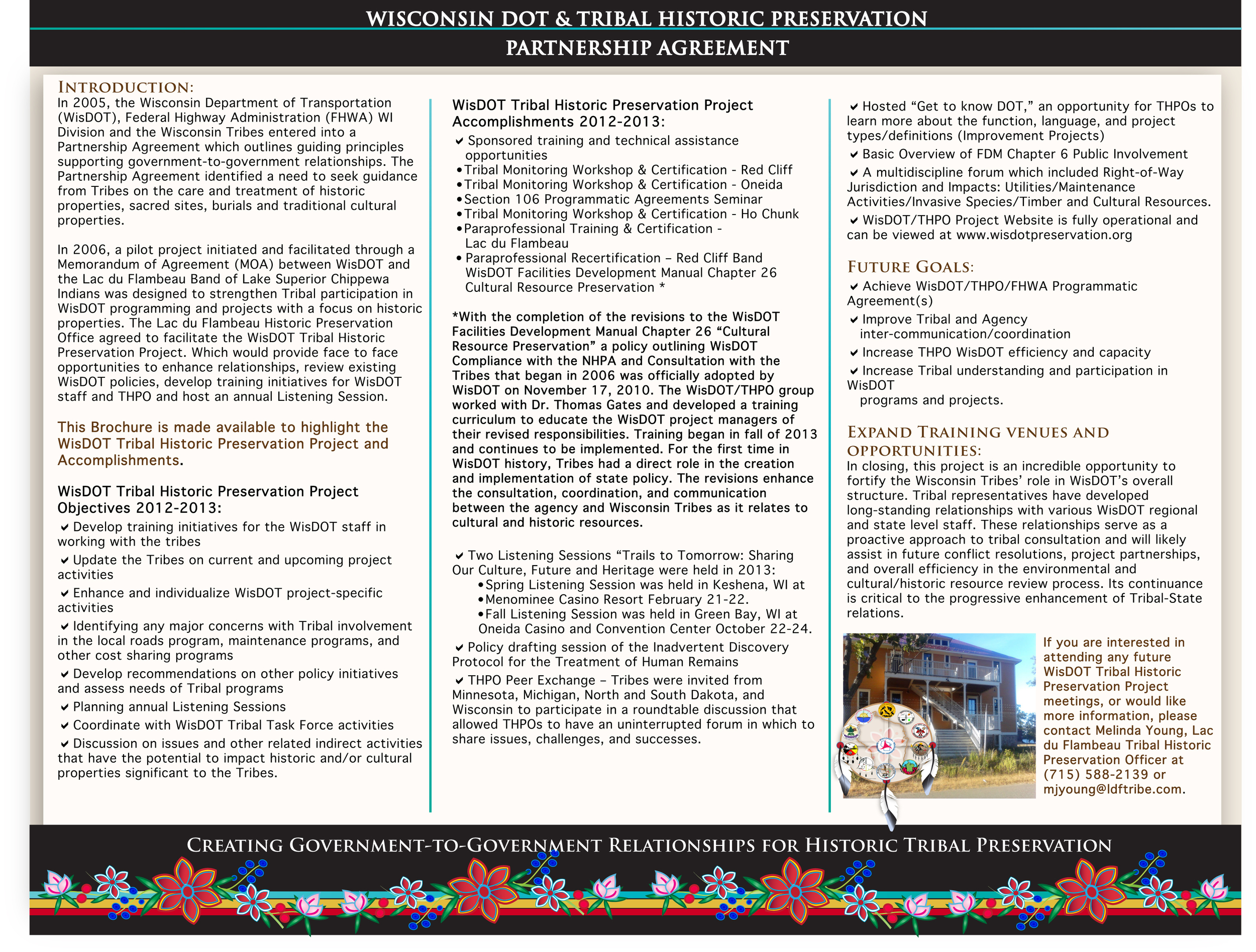
Projects 2012 / 2024
2018 to 2024 Projects


The projects were meticulously crafted with a significant emphasis on branding, ensuring a cohesive and recognizable identity across all platforms. This process involved the development of a comprehensive logo package, which included various logo variations, color palettes, and typography guidelines to establish a strong visual presence. In addition, we produced high-quality videography and photography that captured the essence of the brand, complementing various marketing materials, presentations, and reports to create a polished and professional look.
To further enhance our online presence, a user-friendly website was designed with a responsive layout and intuitive navigation, ensuring an optimal user experience across all devices. This website was supplemented by a dedicated blogging platform, providing a space for sharing insightful content and engaging with the audience. Continuous support and maintenance were established to keep both the website and the blog up to date, ensuring that the brand remains relevant and accessible to its audience.
Anishinaabe Agriculture Institute
Website maintenance, marketing materials, and development for online commerce related to webinars.
Videography and photography.
Logo, graphics, and branding, including marketing materials and reports.
Videography and photography.
Indigenous Hemp and Cannabis Farmers Cooperative
Logo, graphics, branding, and web development, including marketing materials and reports.
Giiwedinong Treaty Rights & Culture Museum
Cultivated and designed the museum’s gallery space.
Created a commerce website and overall branding graphics, logo, and branding, including marketing materials and reports.
Videography and photography.
Billboard design.
Created commerce website and overall branding graphics, logo, and branding.
Videography and photography.
Logo and branding.
Videography and photography.
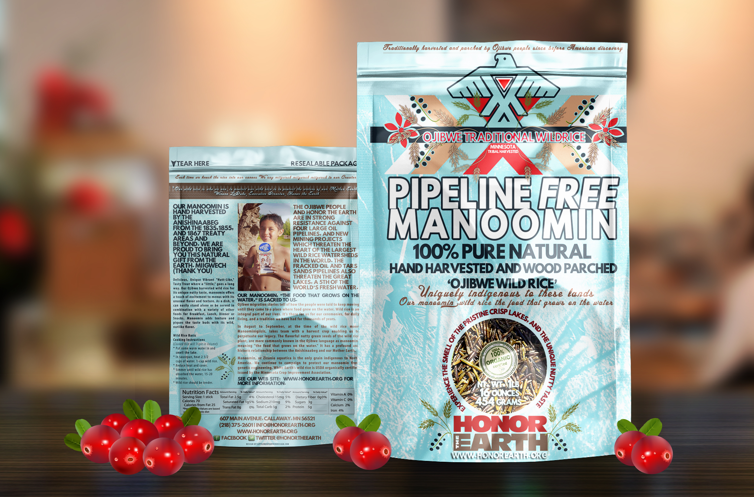
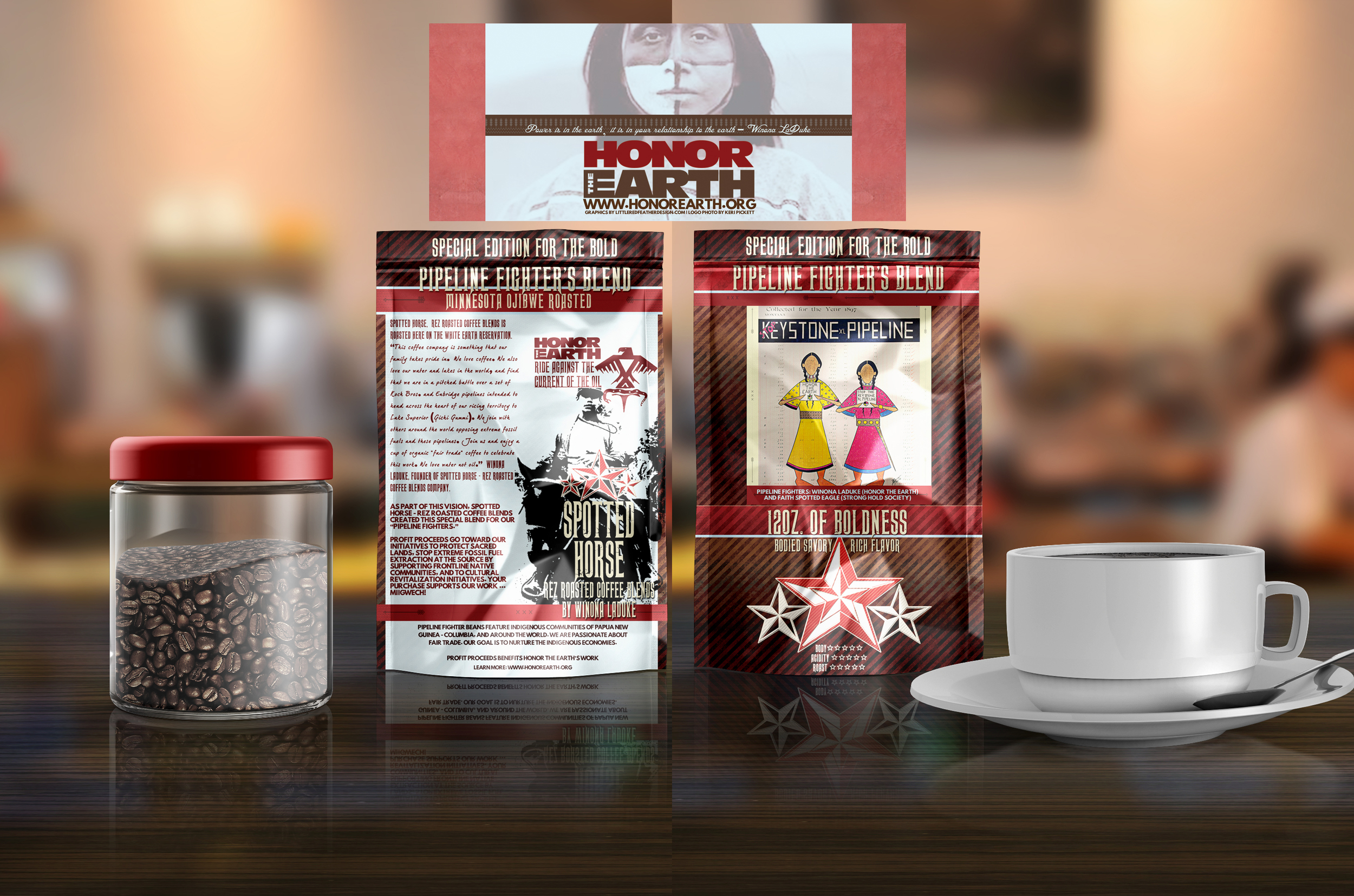
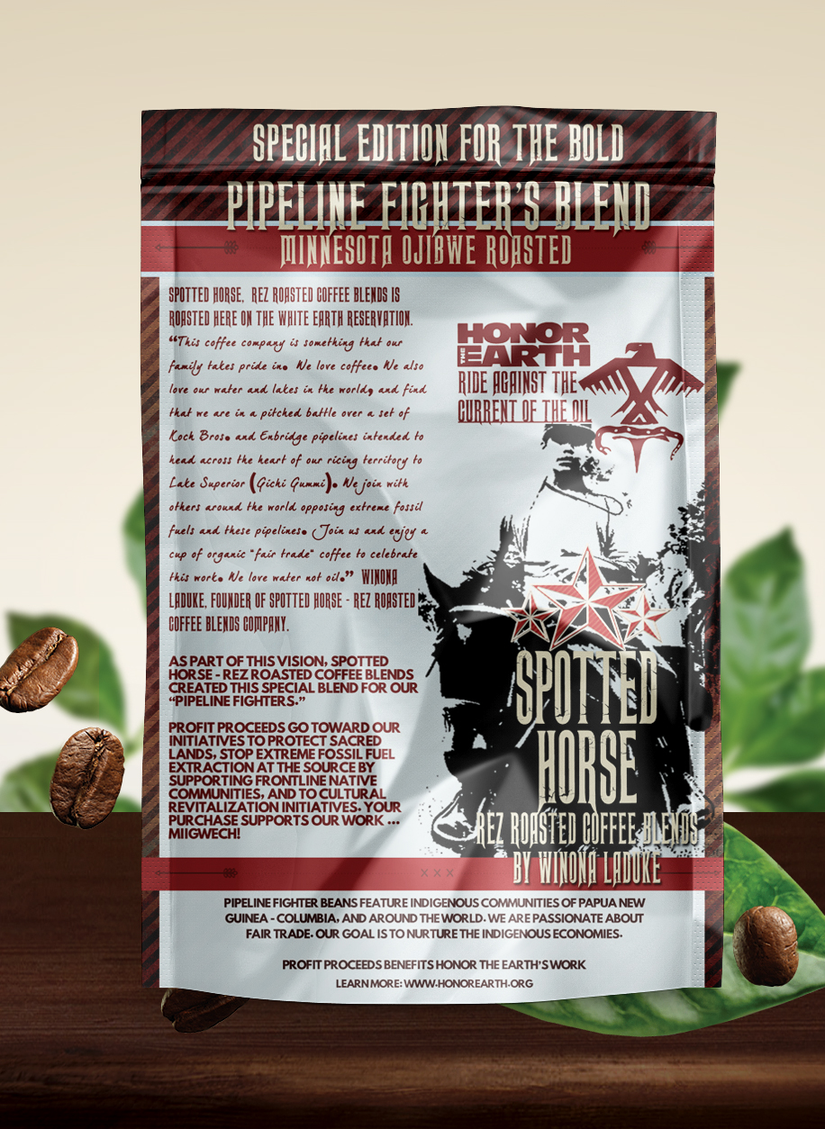
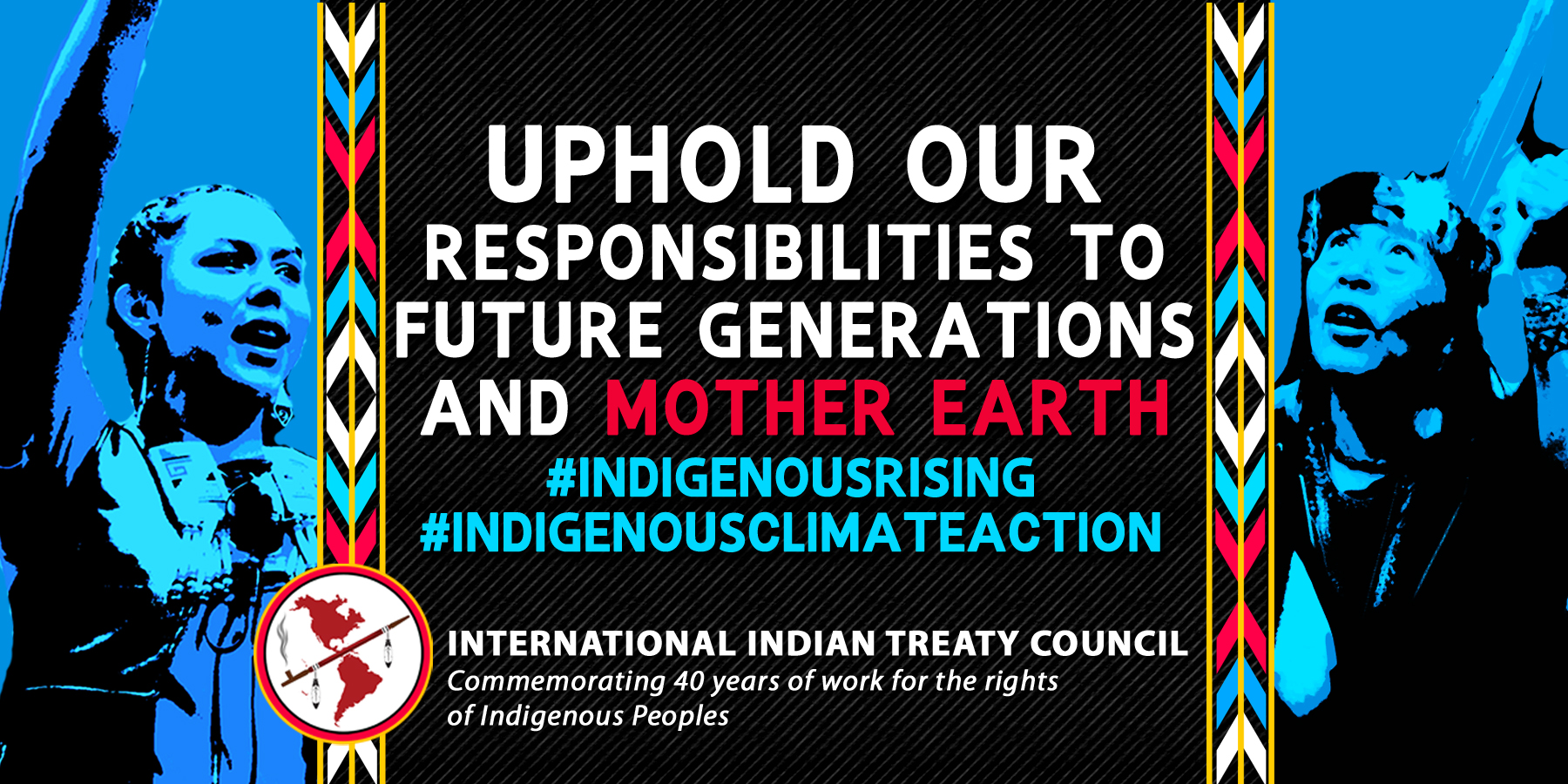
Honor the Earth branding from 2015 to 2023 includes videography, photography, merchandise design, marketing materials, reports, and the maintenance of the website, building their social media platforms from minimal followers to over 200k on Facebook and 65k on Instagram and Twitter.
Comprehensive campaign design materials and donor appeals.
The creation of a robust e-commerce website, Honor the Earth Merchandise, boosted annual sales volumes to over $200,000, alongside merchandise designs.
Multiple Billboard designs.
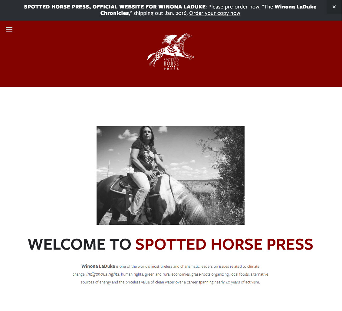
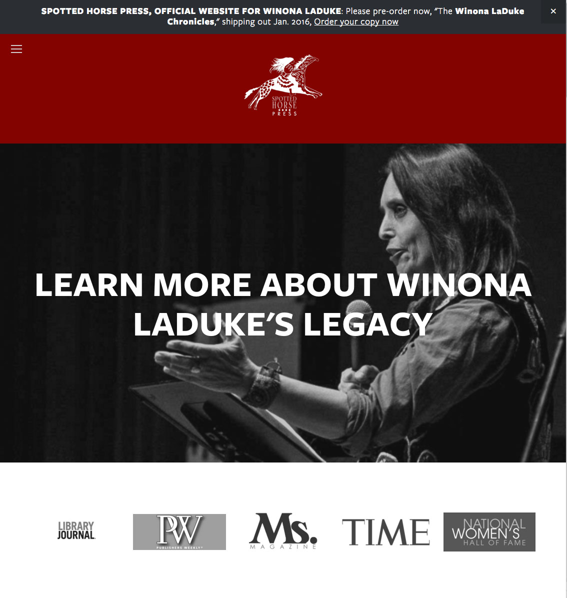
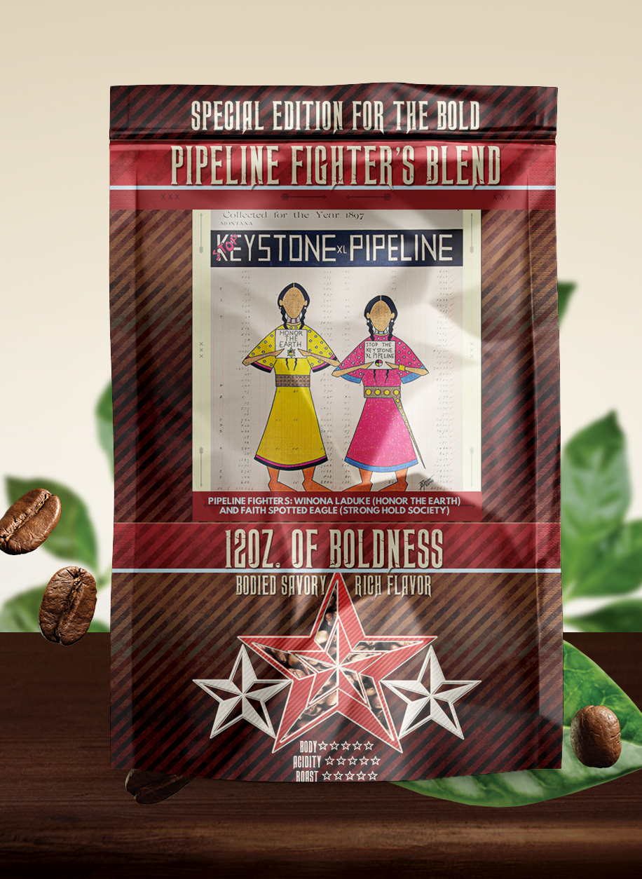
Project for Winona LaDuke's Spotted Horse Press & Coffee Company.
November 29, 2015 / Sarah Kalmanson / Source
Branded, designed, and developed the website winonaladuke.com, while also contributing to the creation and execution of her e-blast campaigns. Additionally, I took part in blogging for the website to enhance engagement and provide valuable content to the audience.


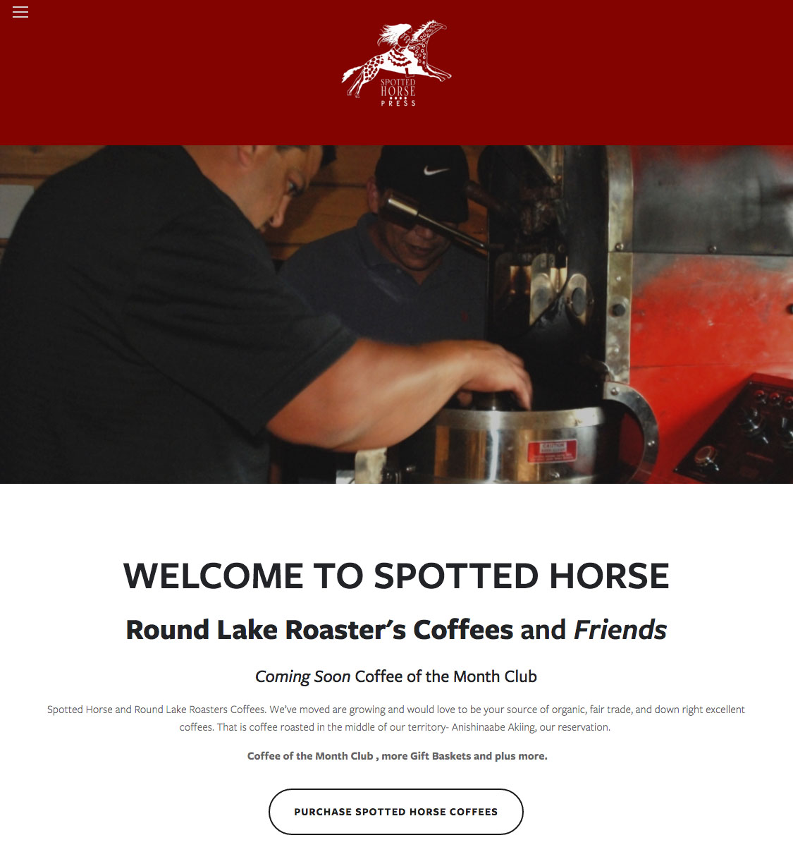


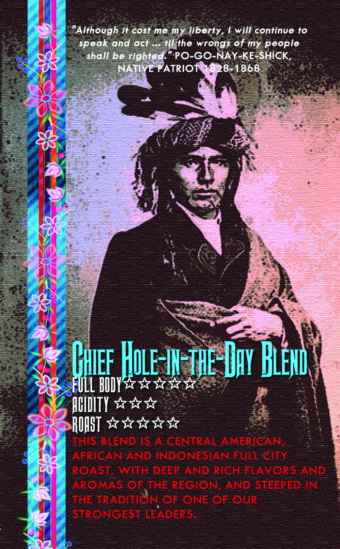
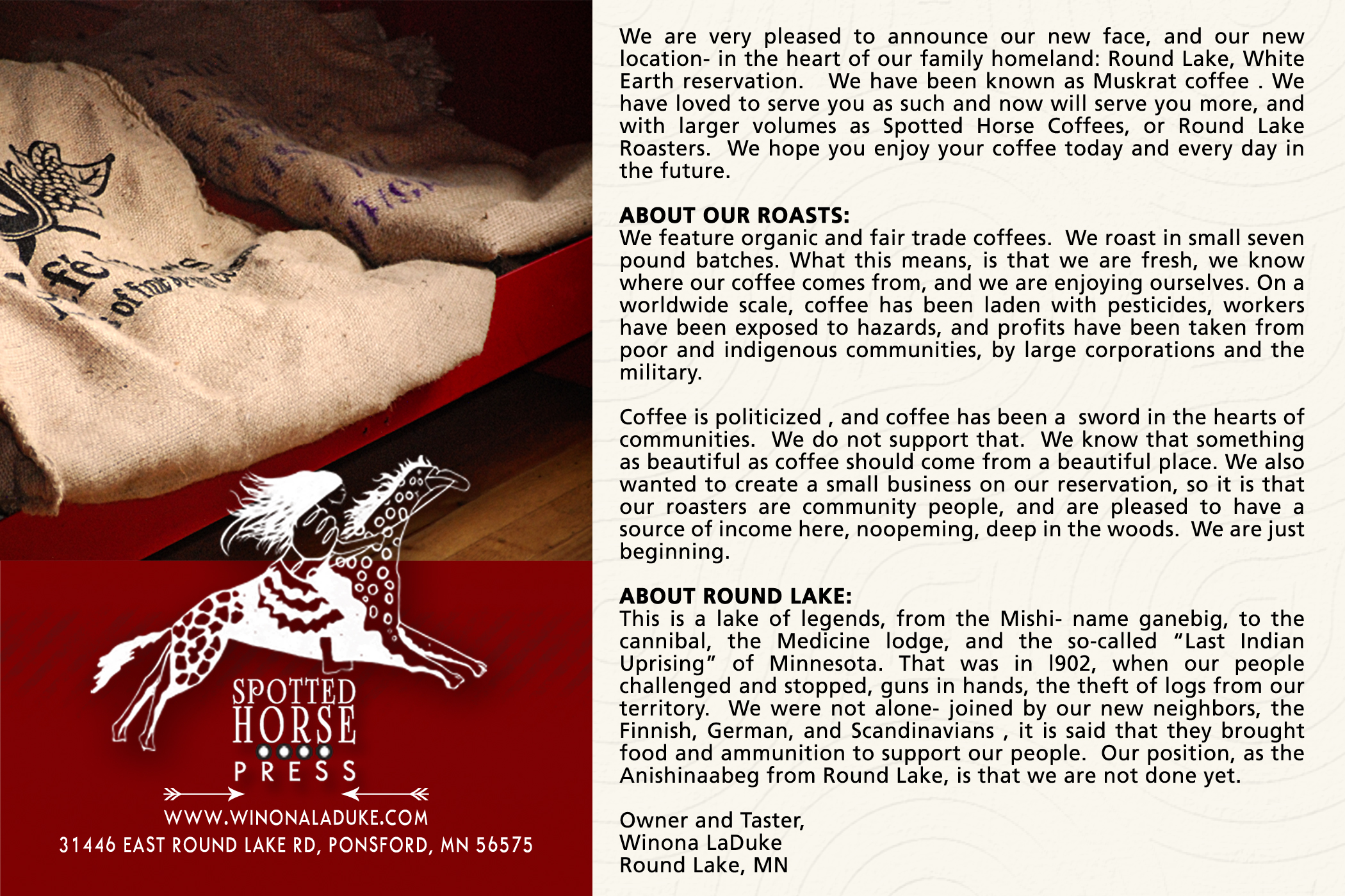
Coffee Packaging Design for Spotted Horse Coffees


Previous Projects Prior to 2015
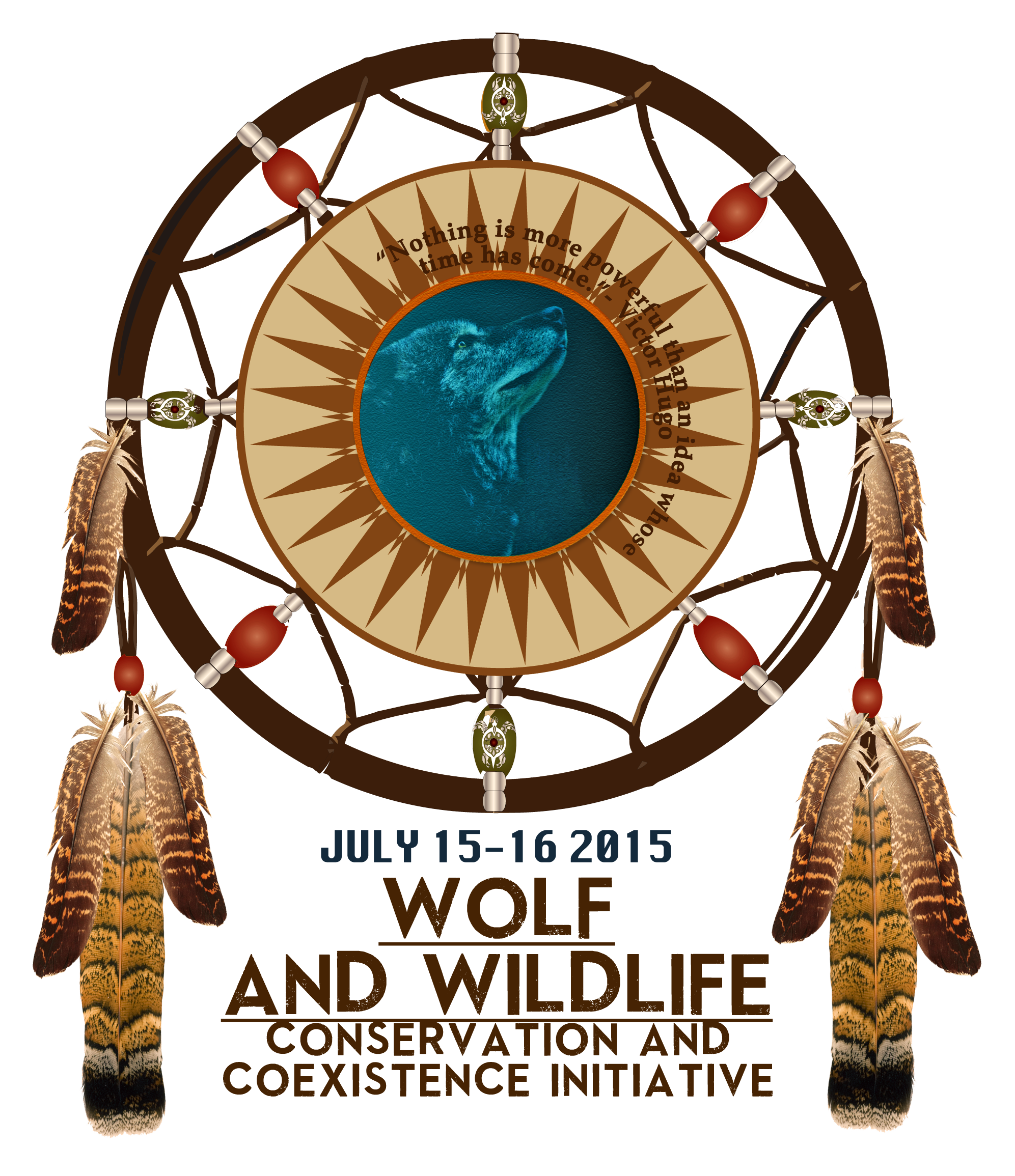


BRANDING, AND LOGO DESIGN


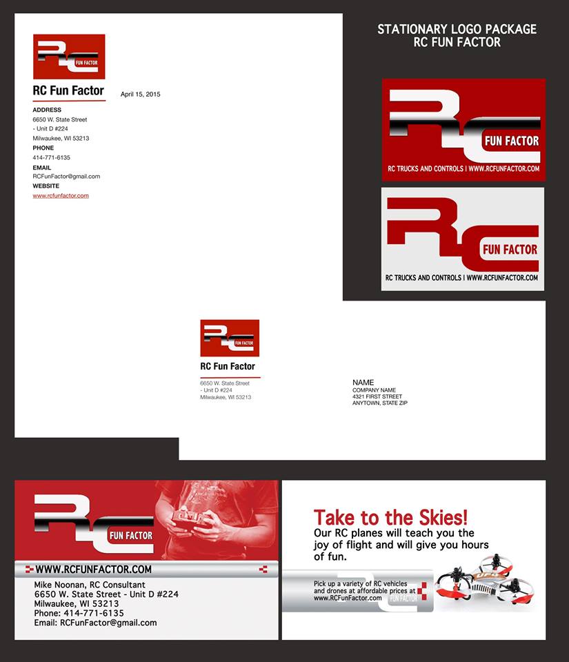


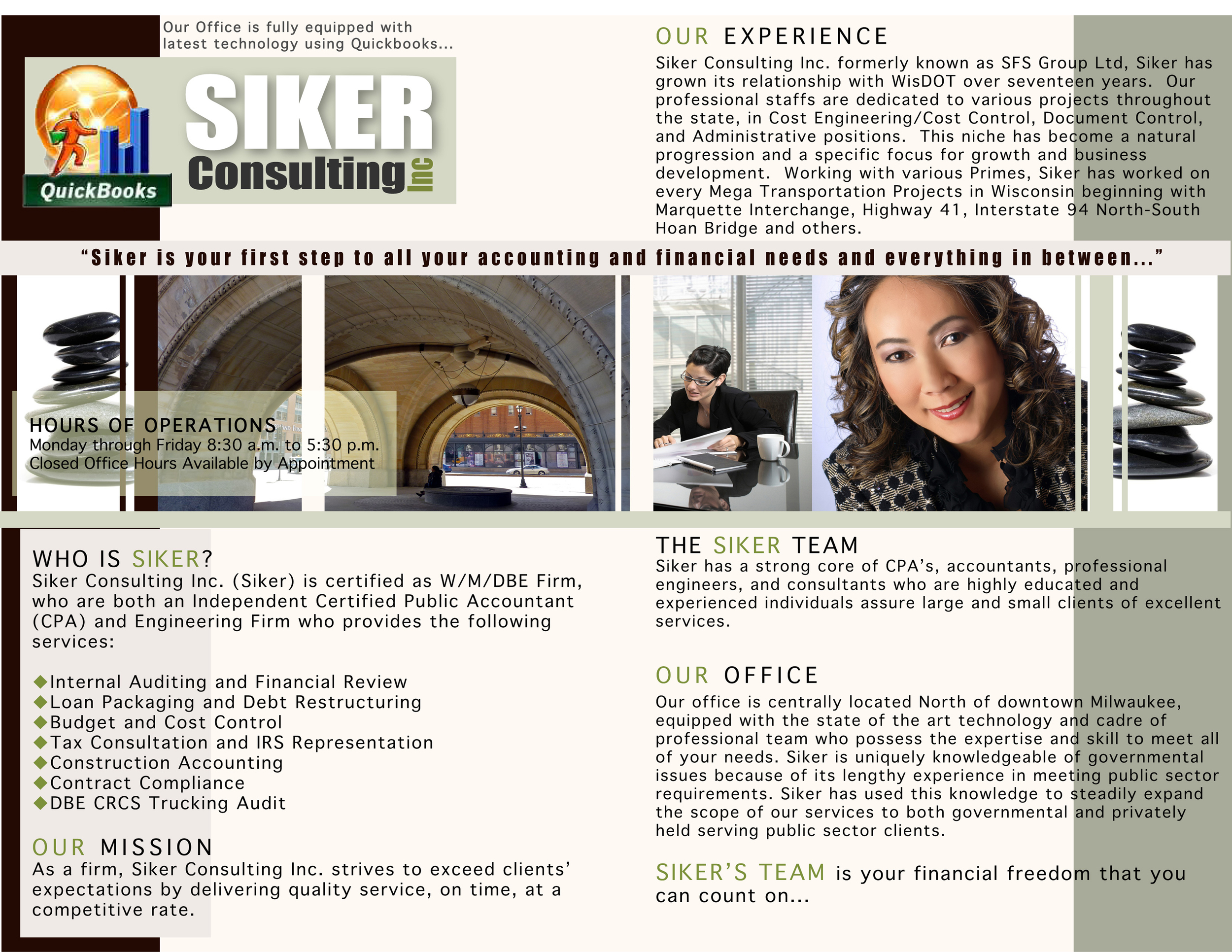
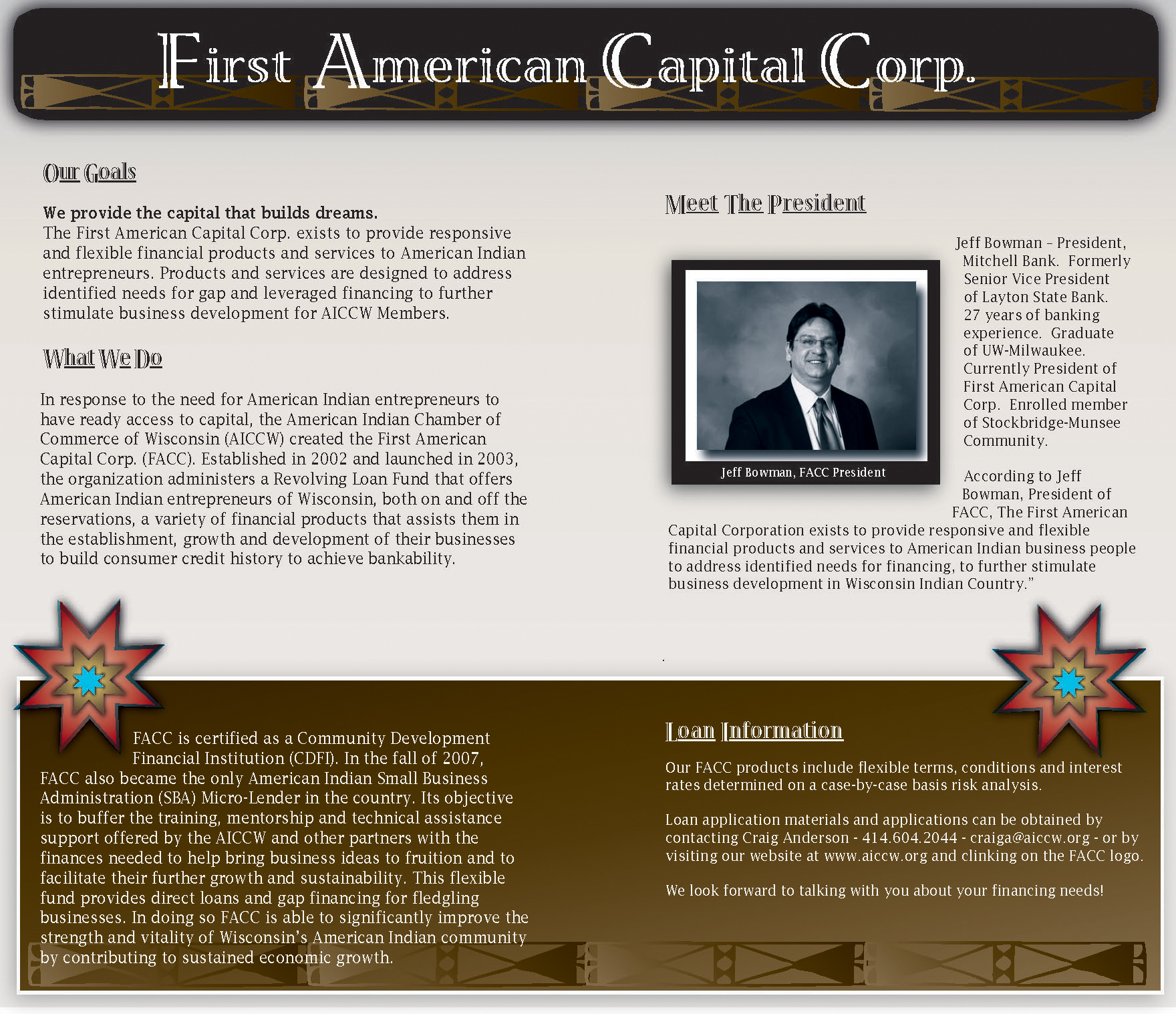


MARKETING MATERIALS - Brochures and Business Cards
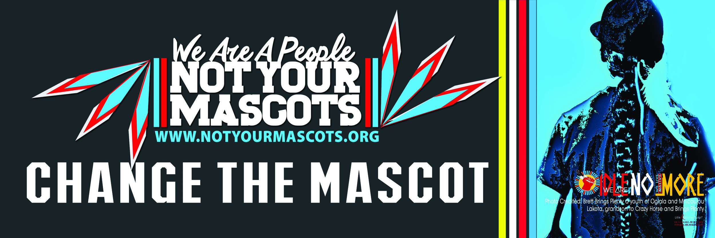
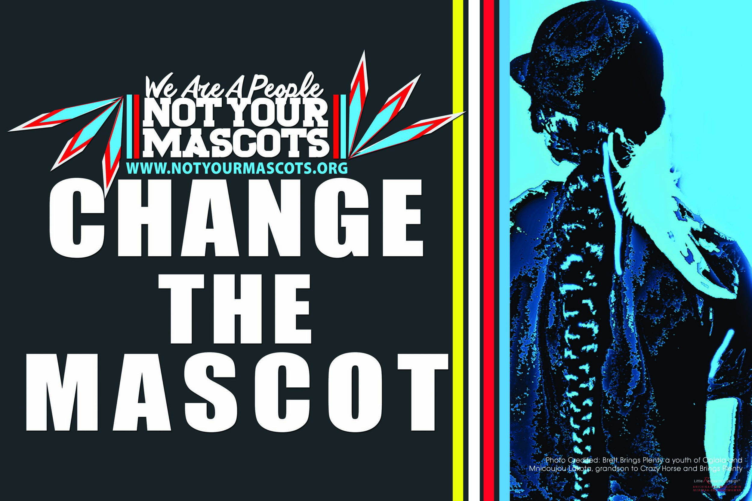

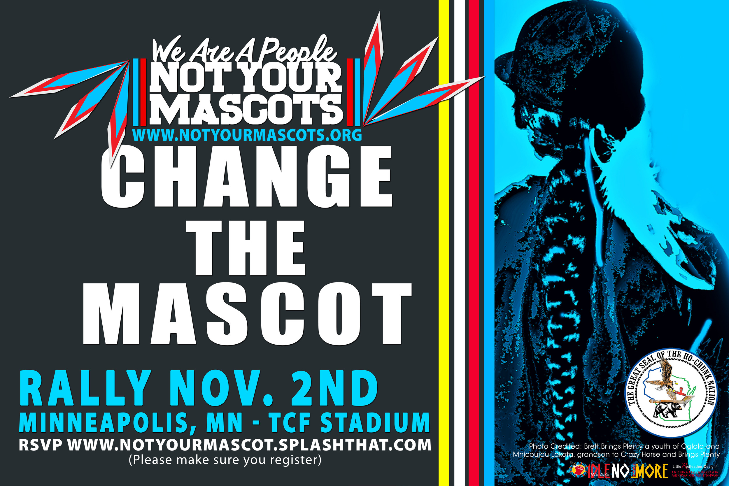
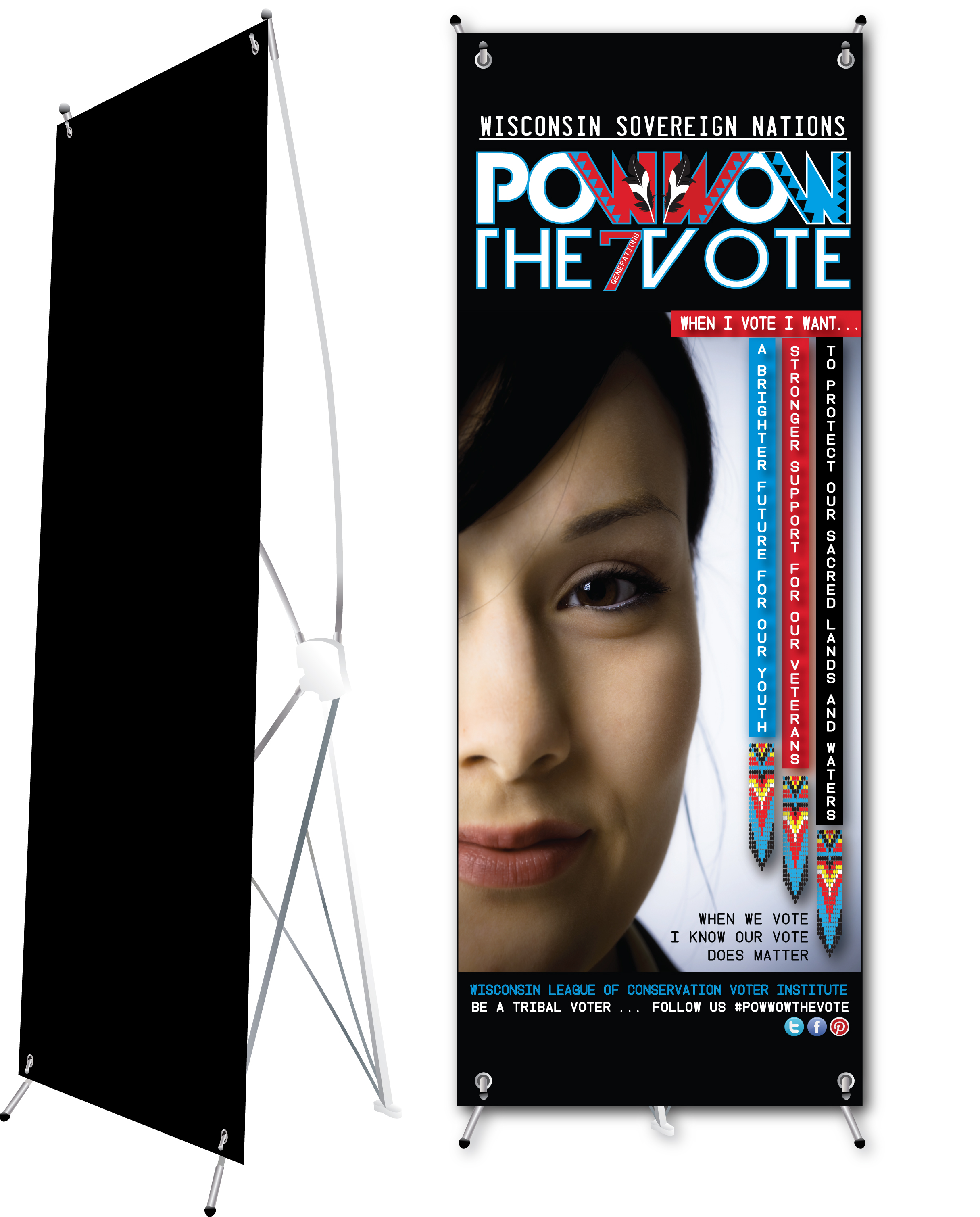
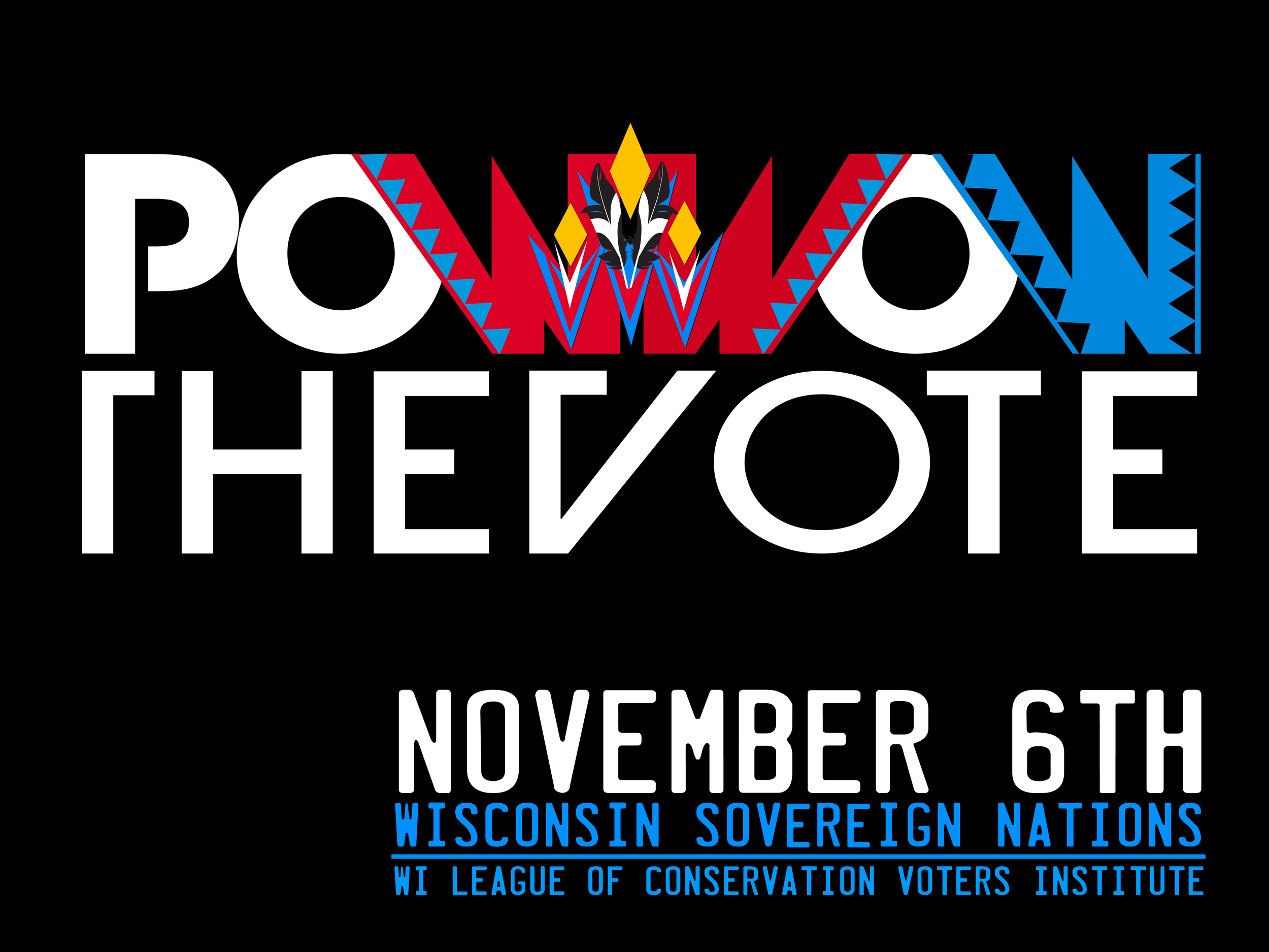
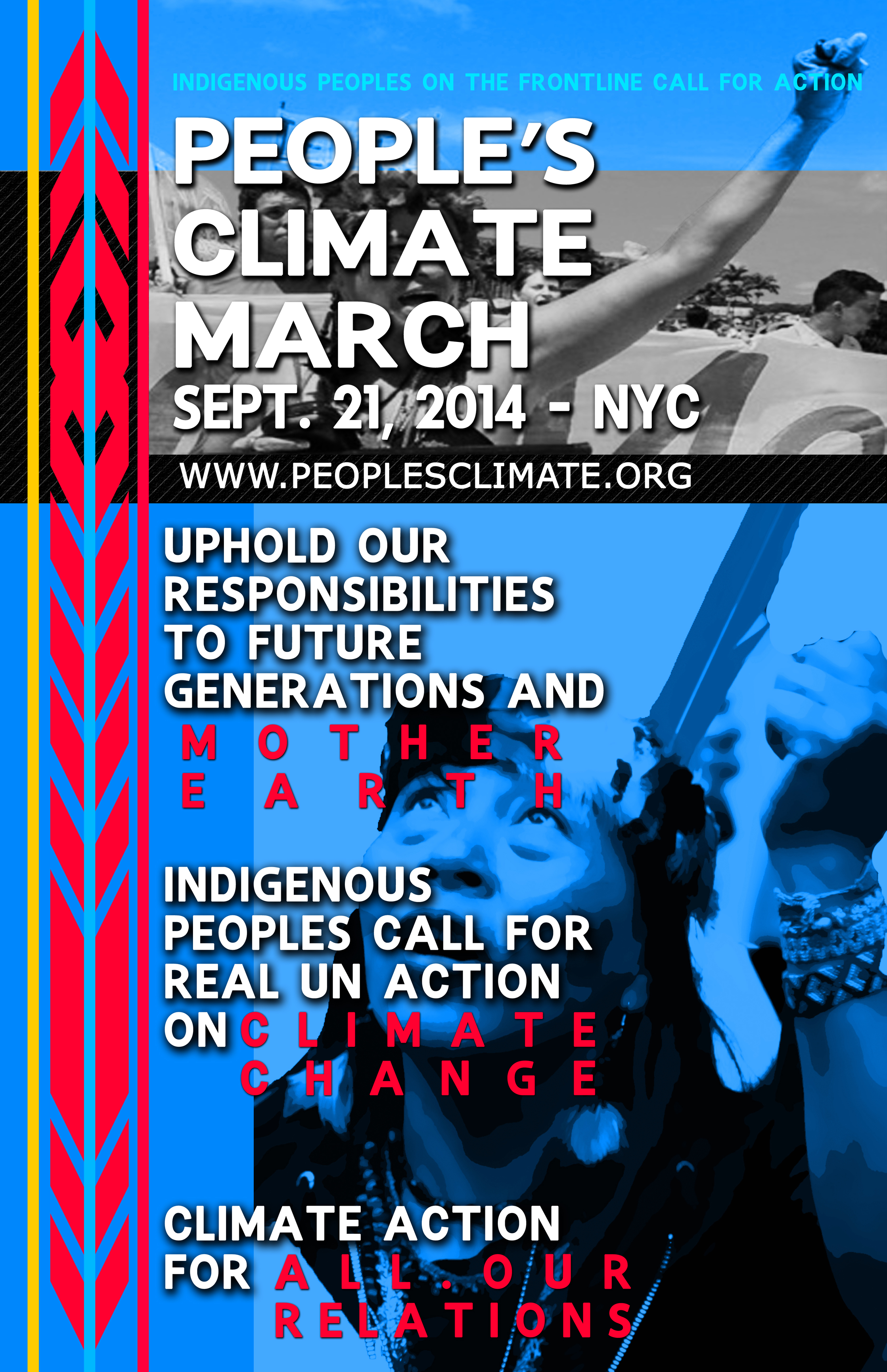


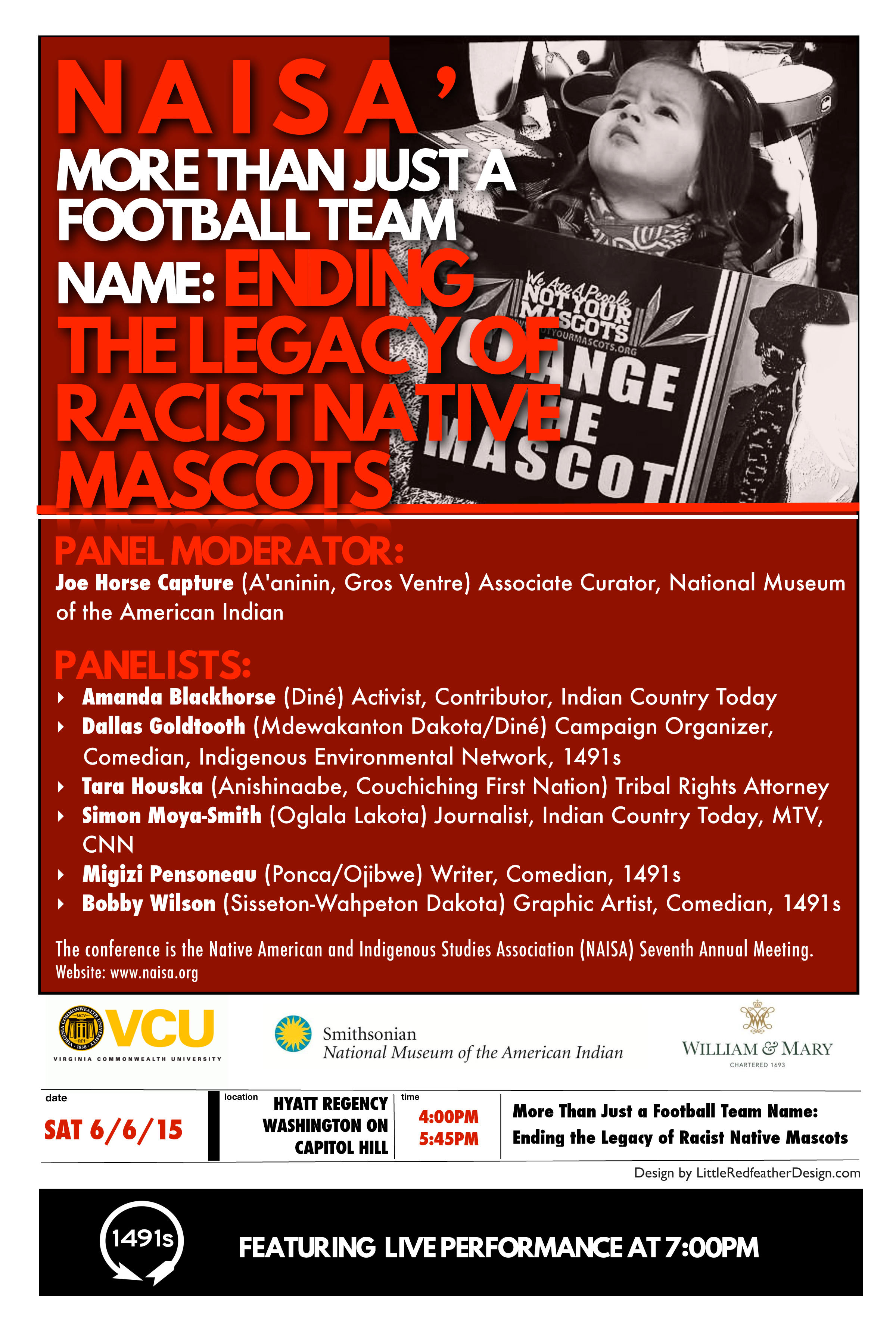

SIGNS, BANNERS and POSTERS DESIGNS


Advertisements, Event Posters and Social Media Memes
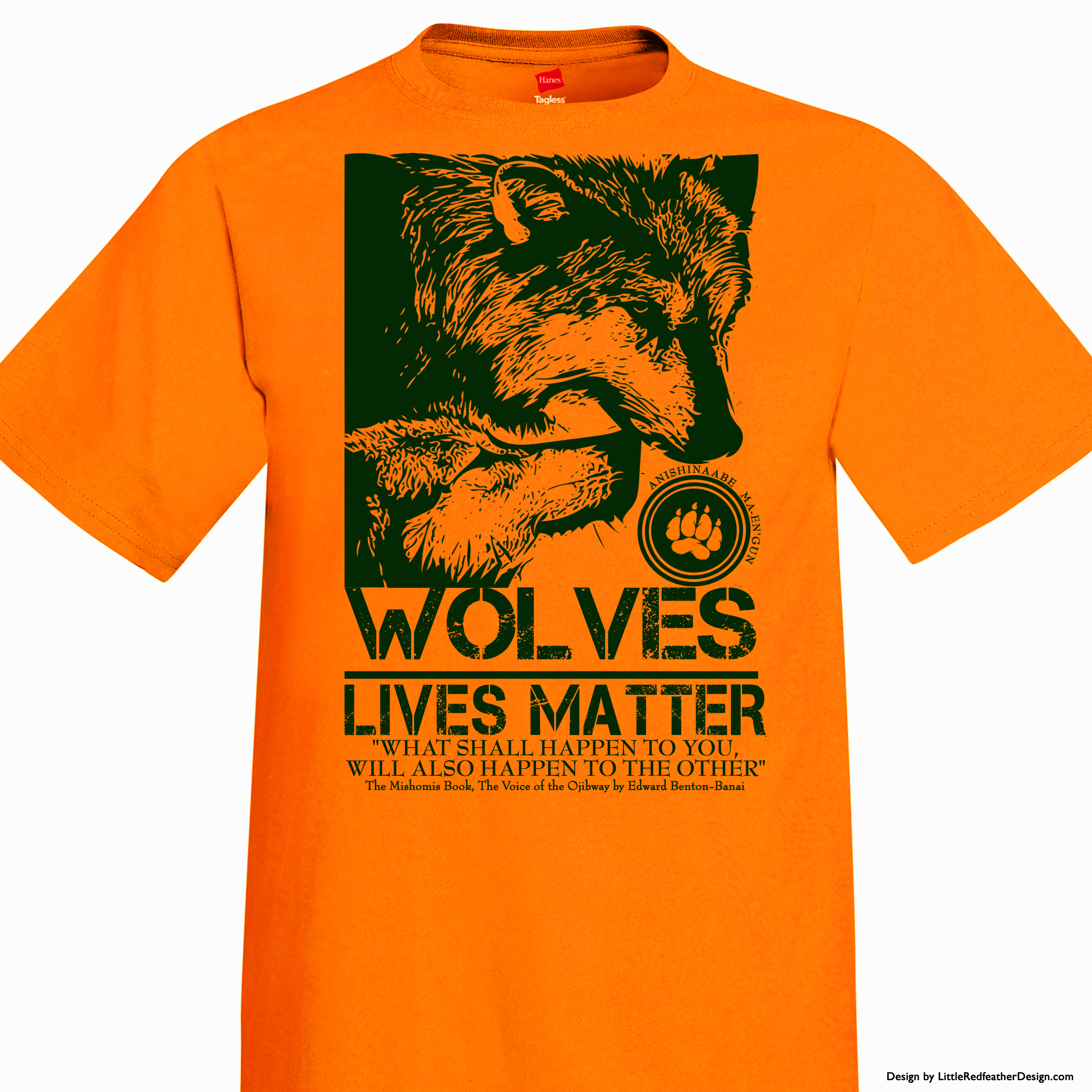
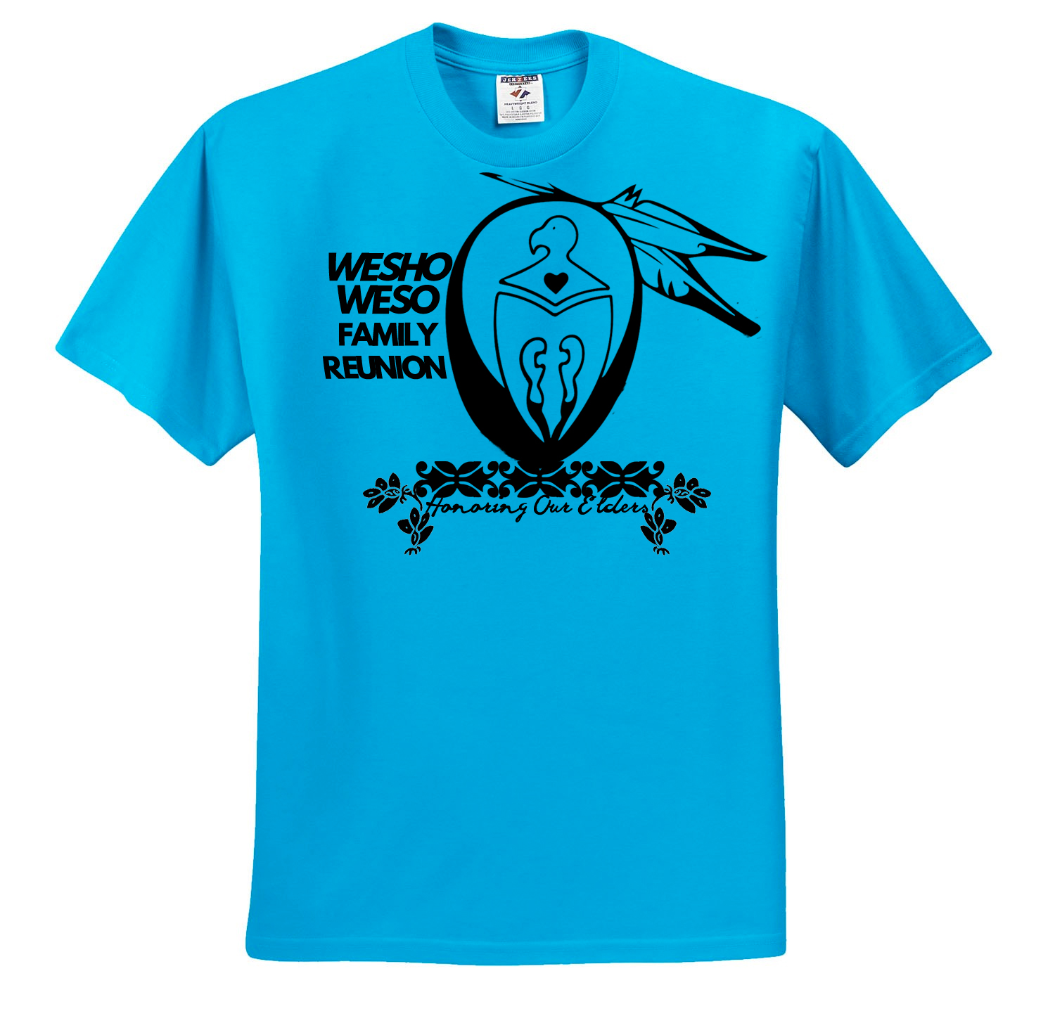
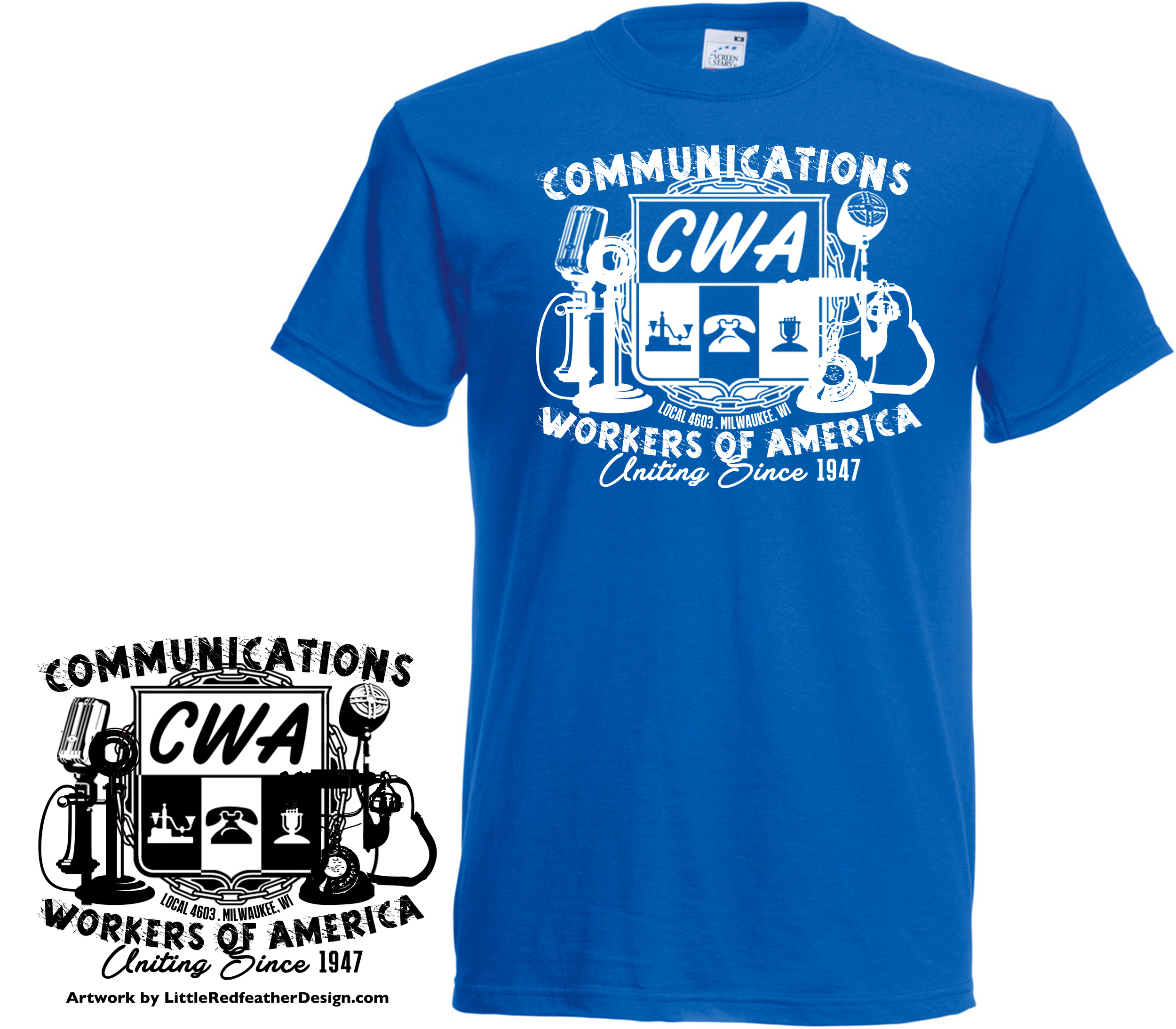

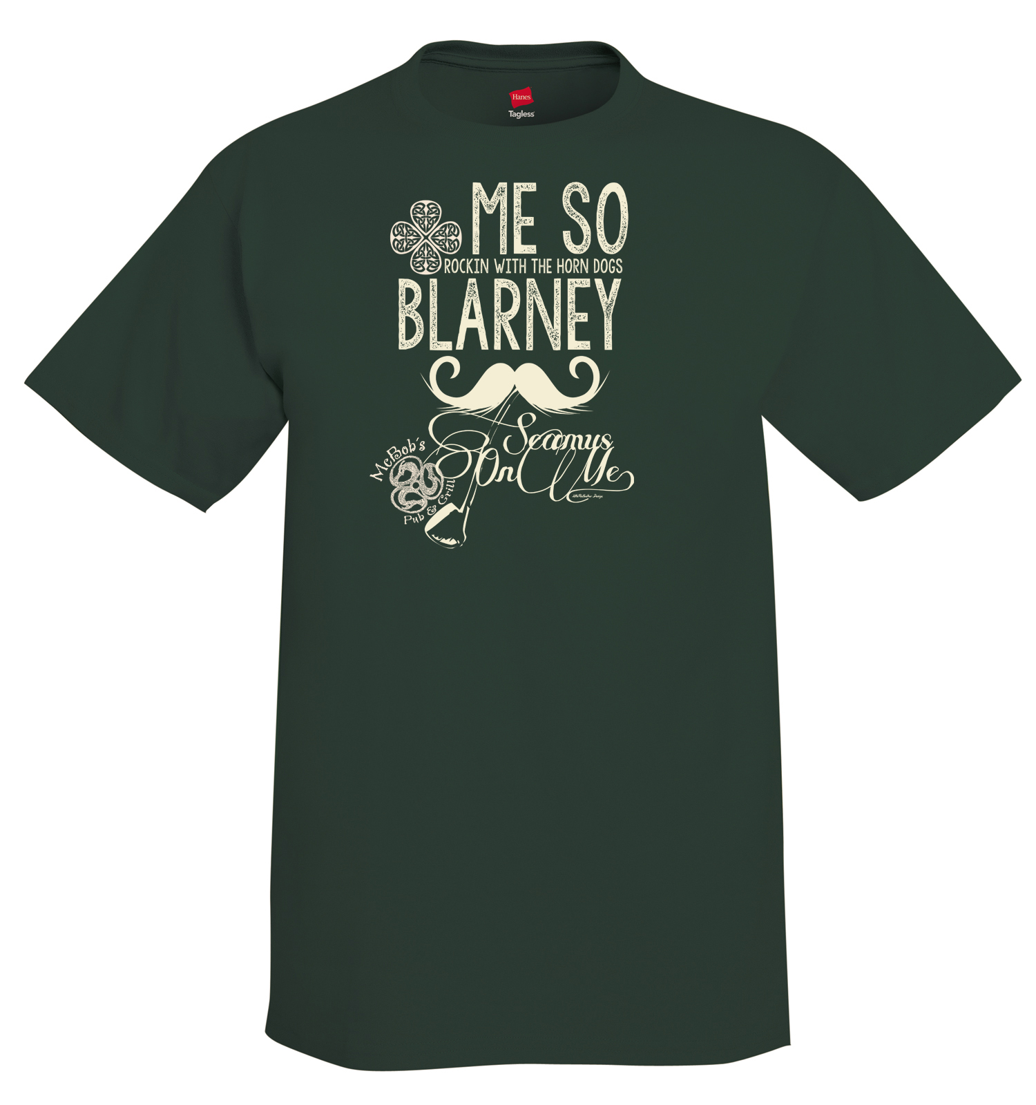
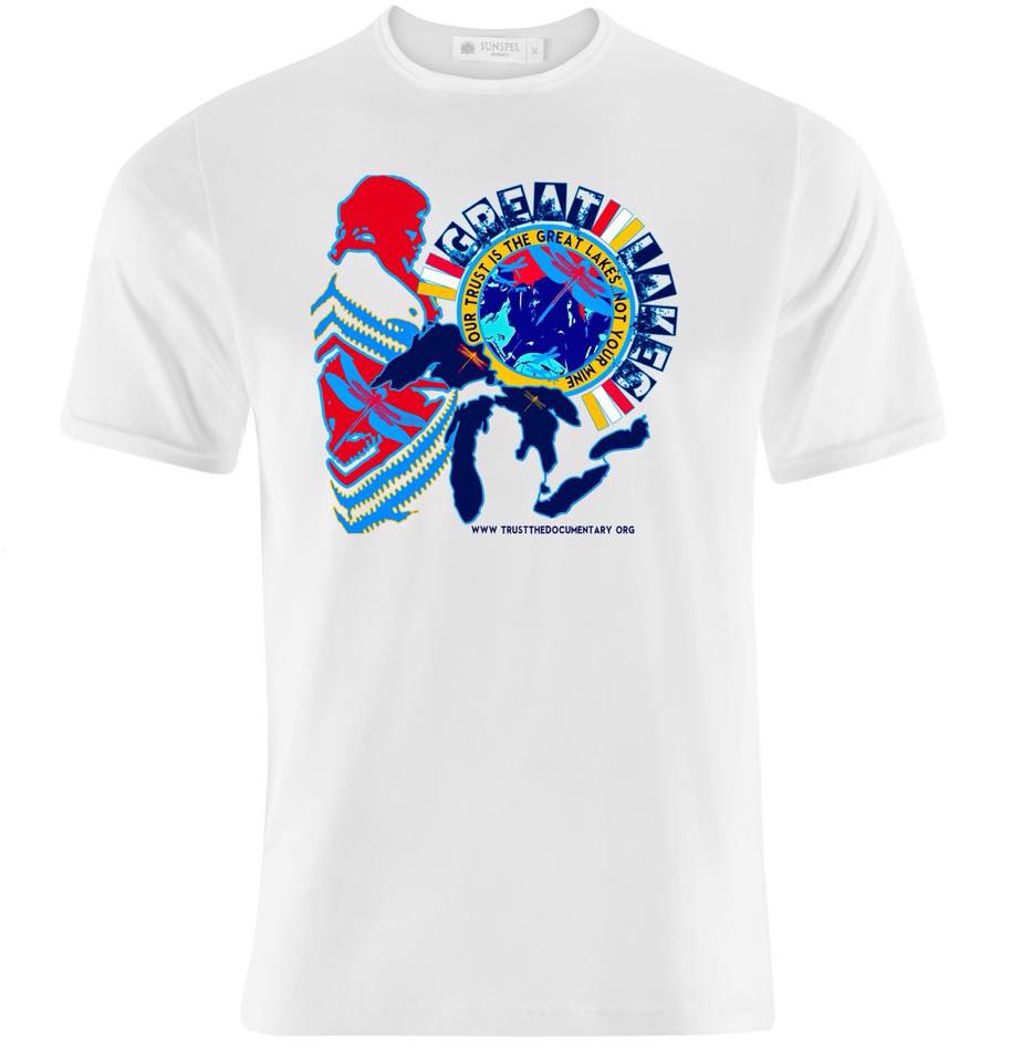

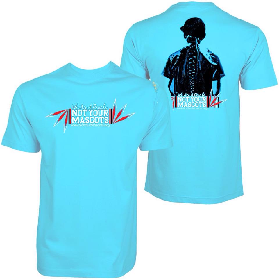

Shirts Merchandise Designs
Video Presentations Including Photography